Marker Text | xiaoxiaodong
Created by xiaoxiaodong
Marker Text | xiaoxiaodong
Created by xiaoxiaodong
Showcase
Description
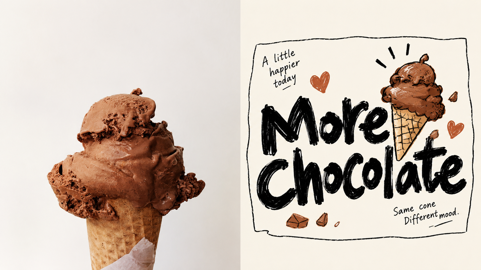
Ideal for turning a photo's metaphor into a single line of large text for small brand visuals, stickers, or menu covers. The upper half features the original photo; the lower half stars a short phrase in bold black marker handwriting across the middle with generous whitespace on both sides, featuring wonky lettering, irregular sizes, and uneven stroke weights. The main subject and two or three small objects from the photo are rendered as palm-sized clumsy doodles, outlined in thin black lines with flat bright color fills that often spill outside the lines, leaning against the text, sitting on strokes, or peeking out from behind. The entire set is loosely enclosed by a non-closed crooked thin-line border, accompanied by two small handwritten notes at an angle, with a warm white background taking up most of the space. Avoid this if you need to preserve the scene, lighting, or true proportions, if you do not want large text or prefer neat printed fonts, or if you are looking for polished, refined illustration lines and smooth commercial cartoons.
Recommended by
Dancang
Why we love this skill
Transforms photos into striking bold handwritten headlines, using a few colorful, clumsy doodles and line borders to create metaphorical interactions. It rejects realistic replication and neat layouts, offering a unique poster feel through warm whitespace, exaggerated typography, and imperfect strokes.
Related Skills
View all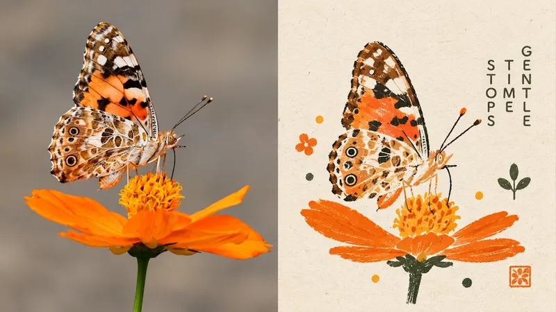 Image
Folk Art, New Chapter
Ideal for turning an ordinary photo into a cultural symbol somewhere between an old picture book and an independent brand. The upper half is the original image; the lower half reworks the subject with wobbly hand-drawn outlines, large areas of flat color, and simplified geometry. Proportions can be exaggerated while still clearly evoking the original. A tiny related symbol may be added, but it must not grow into a scene. Preserve the feel of gouache, crayon, and Riso misregistration. Use 2–5 colors drawn from the original image—warm, bright, and full of character, but not sugary or cartoonish. Keep the emblem small, leave plenty of negative space, and place text at a distance from the subject. Avoid full character illustrations, commercial logos, cartoon IP, 3D, and smooth vector graphics.
 Image
xiaoxiaodong P121 | Doodle
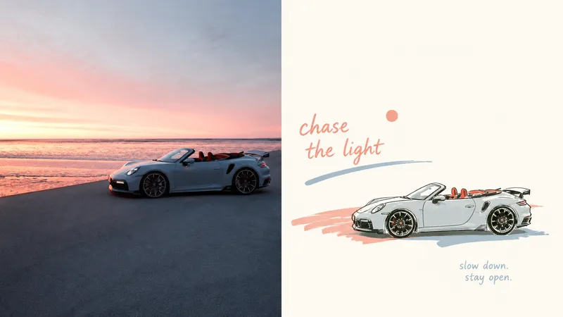
An everyday photo may contain a compelling pose or relationship, yet ordinary composition and a cluttered background can distract from it. Panel 121 preserves the photo’s authentic identity, re-extracts the most recognizable subject, and uses relaxed marker-style doodles, edited handwritten text, and generous negative space to turn a slice of life into a finished work. Best for People, everyday objects, and scenes that need to become independent magazine or lifestyle editorial illustrations. You want to preserve the subject’s outline, pose, and narrative relationships while actively removing most of the background and secondary objects. You like the relaxed feel of naive hand-drawing, while still caring about the mature arrangement of graphics, text, and empty space. You need consistent delivery formats, including top-and-bottom, left-and-right, design-only, multiple aspect ratios, wallpaper, or catalog batches. What it solves Even ordinary photos can establish a new visual focus through reduction, rearrangement, cropping, and changes in scale. Graphics and text first share an invisible grid, visual axes, and a reading path, avoiding “one line of text above, one person below.” Graphic elements occupy only a small proportion of the composition. Negative space provides distance, pauses, and breathing room instead of being filled with random small icons. Comparison images use two strict 50:50 areas and are generated directly from the original image in this run, avoiding a third band and secondary stylization.
 Image
P313 Stamp | xiaoxiaodong
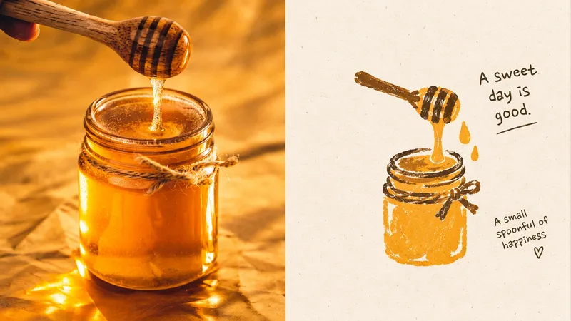
A plain photo transformed into an independent zine or a personal mark in an artist’s notebook. The upper half shows the original photo; the lower half uses a bold outer contour, a few identifying features, and slightly awkward proportions, with a touch of hesitation, repetition, and incompleteness in the linework. Flat spot colors, paper texture, and printing imperfections coexist. There is only one focal point, kept small, with plenty of paper left to breathe. The palette is limited to a main color, supporting colors, and black-and-white contrast—bright but restrained. Avoid commercial geometry, complete scenes, polished vectors, and over-cleaned linework.
Information
- Version
- v4
- Last updated
- Runtime credits
- Usage-based
- Models
- Auto