

YouMind Skills Gallery
Skills is your best partner for learning and creating in YouMind, assisting you in reading and thinking.


Turn your skill into rewards
Publish your skill, set your price, and earn rewards on every install. Redeem for credits or rewards.
View detailEditor's pick
See all
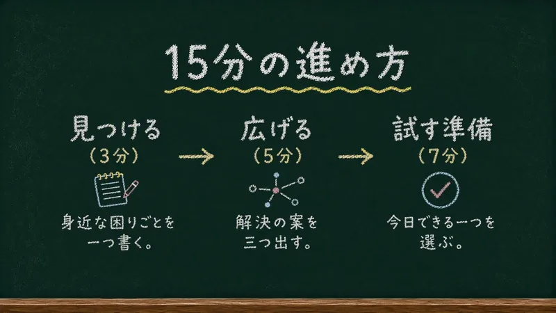
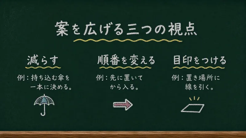
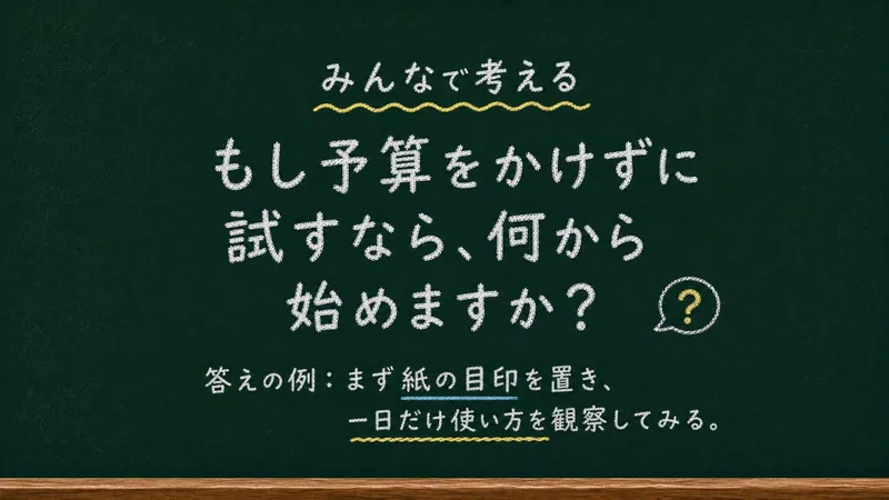
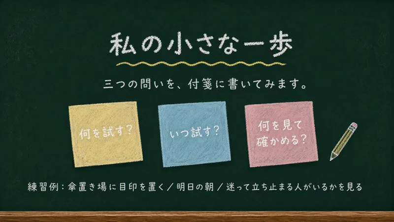
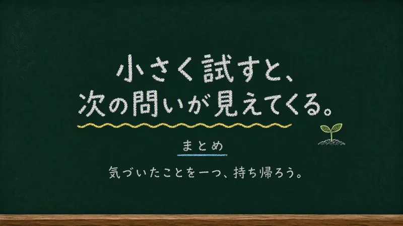
Chalkboard Chalk Presentation
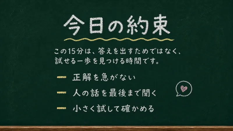
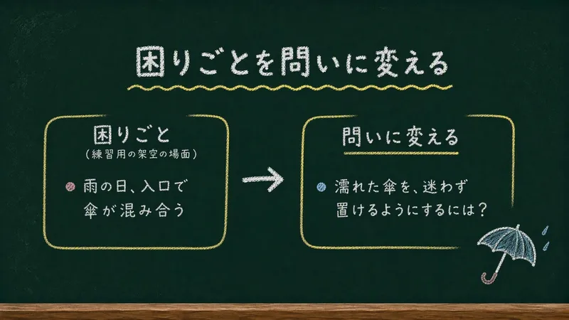
Creates static 16:9 slides on a deep green chalkboard, with rounded chalk lettering and simple doodles. Suitable for casual lessons, internal presentations, workshops, and learning showcases.
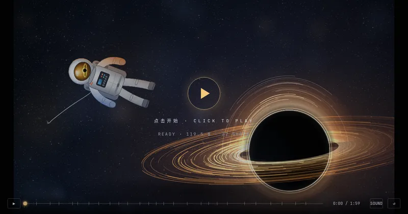
Textured Particle Science Animation
Enter a scientific concept. I’ll research it online and write a storyboard script for your approval, then gather licensed real photos and build a particle-and-vector Canvas educational animation webpage lasting about 2 minutes (customizable). The style combines a premium science documentary with museum-grade scientific visualization: six-layer parallax composition, full-frame layouts without clutter, finely rendered vector subjects with clear lighting, global bloom and film grain, plus gold-and-white starburst particles, large text, and semantic color coding. On-screen text is optimized for small phone screens, keeping only a few large Chinese key labels and clear subtitles. It includes a validated text-particle engine, consistent coordinate rules, a single-track BGM soundtrack, and shot-by-shot screenshot review. The result can be played and exported as a video with sound.
 Research
Weekly Philosophy Frontiers
First, enter the philosophy fields, optional subtopics, key figures, and keywords you want to follow. The Skill then searches for new English-language philosophical publications and academic events from the past seven days, checks your existing materials to remove duplicates, ranks the results by relevance, and produces a Chinese or multilingual weekly briefing based on your language. The briefing is saved as a document, and you are then asked whether to set up a weekly scheduled task.
 Write
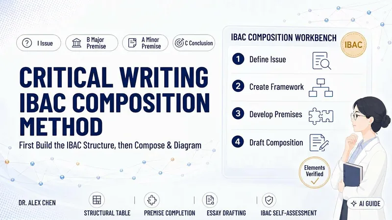
WriteCritical Writing · IBAC
Many articles lack depth not because of the writing, but because the author has not fully clarified what question they are answering or why their conclusion follows. This skill uses Tian Hongyun’s critical writing structure, IBAC— I: Issue, B: major premise (hidden assumptions and beliefs), A: minor premise (facts and evidence), and C: Conclusion—to first narrow a topic into an arguable question, then create an IBAC argument map and pause for your confirmation. Once confirmed, it turns the framework into a complete argumentative essay, along with a hand-drawn marker-style structure diagram and an IBAC self-checklist that identifies, point by point, where premises remain weak and where evidence is missing. It does not embellish or fabricate: wherever evidence is insufficient, it writes “evidence needed” rather than glossing over the gap with rhetoric. Suitable for academic writing, science communication, workplace writing, and independent media, with flexible use across contexts.
 Video
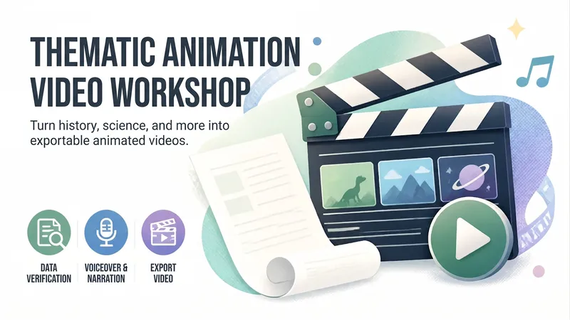
VideoAnimated Video Studio
Enter any topic and choose from 16 animation styles. It automatically handles fact-checking, scene-by-scene scripting, voiceover narration, visual assets, and an animated web page to create a 3–10 minute animated video with subtitles and music. It also includes “Export MP4” for direct downloads. Optimized for Opus 5.5.
Weekly top
 Write
WriteYouTube Video to Article
Turn a long video into an article you can finish reading. Just paste a YouTube link—or, without a link, name a person, show, or topic you want to explore, and it will help you find a few videos to choose from. The article explains the video's key ideas and context, preserves memorable quotes, and can include images when it's finished.
Create videos with Opus 5.5
Turn an idea, message, or creative brief into a polished motion video with a distinctive visual identity. This skill helps you shape the concept, key visuals, typography, color palette, composition, pacing, and transitions so every design choice supports the story you want to tell. It can create a wide range of video experiences, from expressive title sequences and promotional pieces to presentations, social content, and other visual storytelling projects. Your explicit requirements remain central, while the overall direction is developed with the judgment of a creative director and motion designer to produce engaging visual moments and smooth continuity from shot to shot. The result is a finished, browser-based video experience with carefully coordinated motion and design, checked for technical issues before delivery. Start with a clear prompt describing what you want to communicate, the tone or style you have in mind, and any must-have content or constraints.
Textured Particle Science Animation
Enter a scientific concept. I’ll research it online and write a storyboard script for your approval, then gather licensed real photos and build a particle-and-vector Canvas educational animation webpage lasting about 2 minutes (customizable). The style combines a premium science documentary with museum-grade scientific visualization: six-layer parallax composition, full-frame layouts without clutter, finely rendered vector subjects with clear lighting, global bloom and film grain, plus gold-and-white starburst particles, large text, and semantic color coding. On-screen text is optimized for small phone screens, keeping only a few large Chinese key labels and clear subtitles. It includes a validated text-particle engine, consistent coordinate rules, a single-track BGM soundtrack, and shot-by-shot screenshot review. The result can be played and exported as a video with sound.
 Image
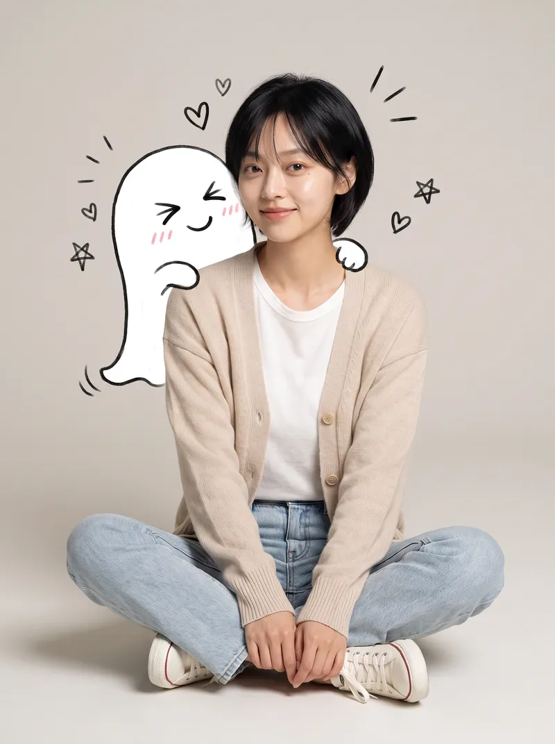
ImageReal × Cute Creature Photos
Still posting the same old selfies? Upload your photo, and AI will automatically create a heartwarming feature photo of you embracing a hand-drawn cute creature: a small white creature with black outlines peeks out from behind you, gently cupping your face with its little paws and resting them on your shoulder, surrounded by tiny hearts and sparkles. ✨ Keeps your face recognizable—no identity swaps or distortion ✨ Automatically matches the outfit to your vibe, so you don't have to style it yourself ✨ Multiple poses work beautifully: sitting, standing, crouching, or leaning ✨ A different cute creature every time: a dumpling, puppy, teddy bear, baby, and more—random surprises included ✨ Default 3:4 portrait format, ideal for Xiaohongshu and Moments; the aspect ratio is customizable One photo, one minute, and it's ready to collect likes.
 Image
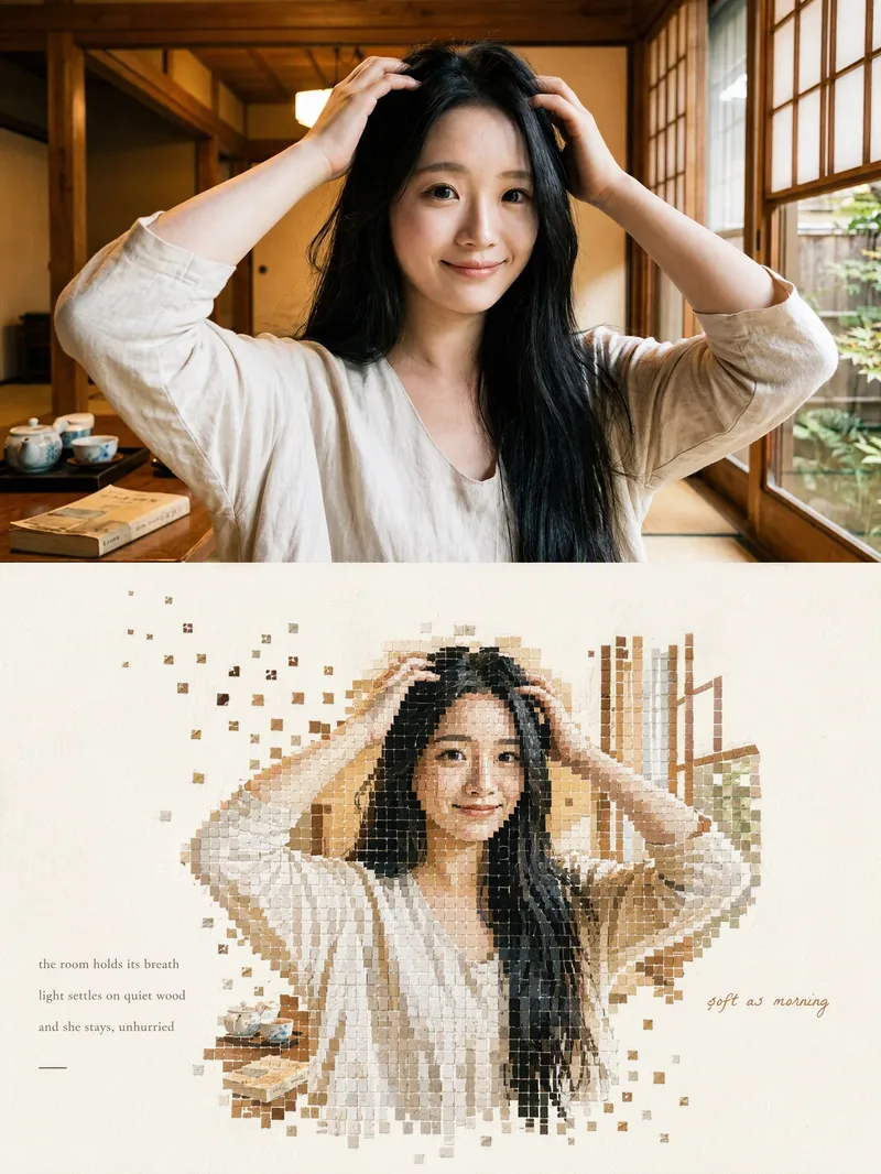
ImageMosaic Everything
Upload any photo to automatically create a minimalist art poster with a live-action photo on top and a block mosaic on the bottom. The subject is formed from hundreds of small watercolor-textured blocks, with the edges drifting outward and fading away, plus a poetic short caption. One image becomes a magazine-style design piece.
 Image
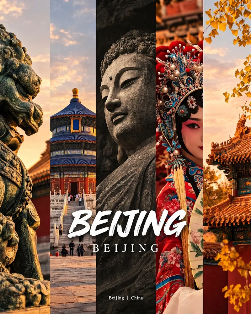
ImageCity Culture Poster Maker
Enter a place name to instantly create a polished city identity poster in a five-panel vertical-strip format. The design seamlessly combines five equal-width vertical strips: close-ups of cultural artifacts and nature on the outer panels, an architectural landmark in the second panel, local customs and cultural life in the fourth, and the city’s most soulful cultural symbol in the center. The overall look uses warm golden-hour light and cinematic color grading. The center panel is darkened and desaturated to create a "warm—cool—warm" visual rhythm. A large white calligraphic place name, its English serif name, and the small text "Administrative Region | Country" are layered below the center panel. Two ways to use it: · Upload 5 photos you took yourself and enter a place name: the system automatically sorts them by content, crops them vertically, applies consistent color grading, and combines them into a poster in the same style · Enter only a place name: the system automatically selects 5 of the area’s most representative real-world elements and faithfully generates the poster Ideal for travel blogger covers, city tourism promotion, Xiaohongshu/Instagram carousel cover images, city identity cards, and album covers.
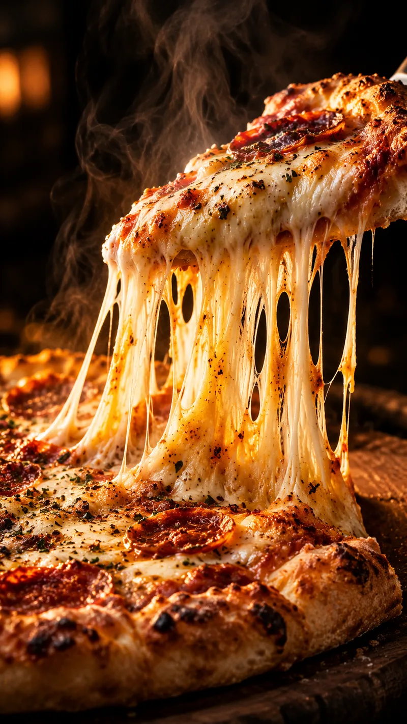
Satisfying Macro Food Video Director
Give it a dish and get a ready-to-generate satisfying food video plan. You get a 6-shot storyboard, a copy-paste prompt for every shot (macro lens, slow motion, glossy textures, warm lighting), ASMR sound cues, and a short caption with hashtags for Reels, TikTok, and Shorts. Works for desserts, street food, cheese pulls, chocolate pours, and cutting or slicing scenes. Want ready-made storyboards? Get the Satisfying Food Video Prompt Kit: 8 complete storyboards, 48 shot prompts. [https://payhip.com/b/1M0uT]
 Write
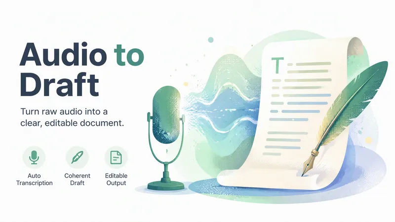
WriteAudio to Draft
Turn an audio file, voice note, spoken video, or transcript into one coherent editable draft. Missing speech text is transcribed automatically, with background continuation when needed, so the user does not have to return to resume the workflow.
 Research
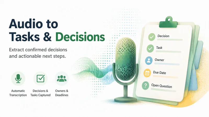
Audio to Tasks & Decisions
Turn an audio file or transcript into a concise editable record of decisions, tasks, owners, dates, blockers, and open questions. Missing speech text is transcribed automatically, with background continuation when needed, before any optional Agent actions are proposed.
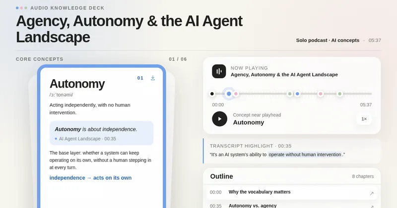
Audio to Knowledge Cards
Transform an audio file or transcript into a self-contained interactive webpage with source-grounded concept cards, synchronized audio and timestamps, transcript highlights, and a structured content outline. Card count adapts to the actual recording.
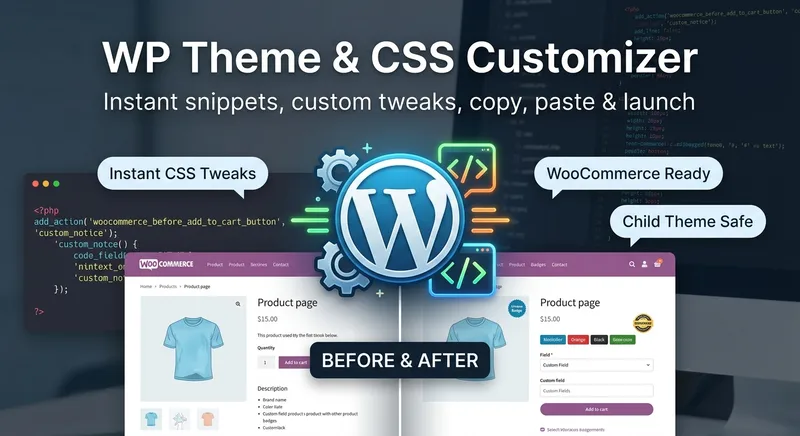
WP Theme & CSS Customizer
Get targeted WordPress theme customizations with practical, ready-to-use CSS, PHP, and JavaScript snippets. This skill helps you adjust theme styling, modify WooCommerce layouts and features, add custom fields or badges, control sidebars and page elements, and load scripts only where they are needed. Share your goal along with your theme or child theme, relevant plugins and page builders, the target page or area, and any constraints such as RTL support or avoiding functions.php. The guidance is tailored to setups including Astra, Storefront, custom themes, Elementor, and WooCommerce, so you can make focused changes without applying unnecessary site-wide edits. Each response explains the approach, provides clearly labeled code, and tells you where to add it. PHP changes that could potentially affect site stability come with an appropriate safety warning, making this useful for both small visual tweaks and more involved WordPress theme customization work.
 Image
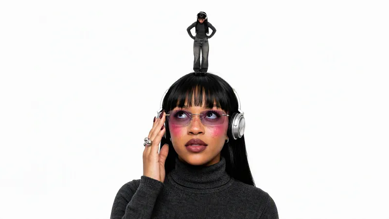
ImageMini me
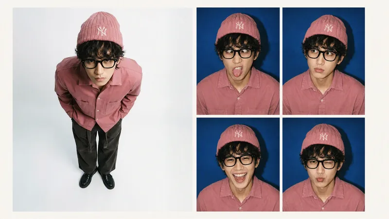
Turns an uploaded portrait photo into a finished studio shot of a giant subject interacting with a miniature version of themselves on a pure white background. It keeps the same person's face, hair, outfit, and accessories consistent across both scales, and supports contact or non-contact poses such as palm, fingertip, shoulder, top of the head, hair, or ground performance.
 Image
ImageRetro Photo Booth
Turn one clear front-facing portrait into a single 2×2 retro hard-flash photo-booth print, keeping the person's identity and styling consistent while showing four distinct expressions: a goofy face, puzzled, big laugh, and a pouty wink.

Local Business Website Growth Auditor
Analyze local business websites and turn available evidence into a practical growth plan. Identify issues affecting clarity, trust, service presentation, usability, and customer inquiries. Get prioritized recommendations, an actionable improvement checklist, and suggested performance metrics. Designed for local service businesses, website owners, and small marketing agencies.
Monthly top
 Video
Video<Storm> Staircase Dance Film
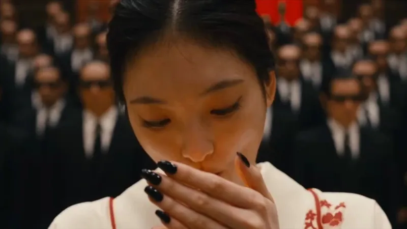
A 30-second stepped-crowd character-swap dancing short film: generate a silent 16:9 clip with Seedance 2.5 from a fixed seconds-level script, then composite the fixed MP3 in YouMind Cast. Derivative of @ GENER8ION - STORM https://www.youtube.com/watch?v=Xoi7reIF2r8
 Video
VideoSpatial Scan Effect
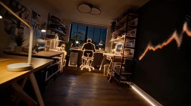
Create cinematic LiDAR reveal videos for a selected environment, with true void-to-particle-to-material construction, continuous first-person movement, synchronized audio, and optional character endings.
 Image
ImageThe Me in My Bag
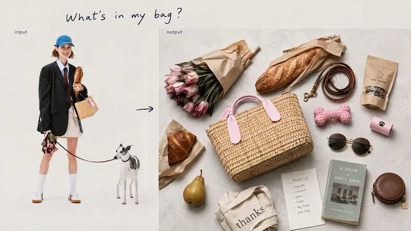
Open a bag, and you can glimpse its owner’s lifestyle and personal obsessions. From describing a scene such as “a library on a rainy day” or “the walk home after a movie,” to making inferences from a portrait or defining a specific character’s personality—we unravel the owner’s everyday life through three entry points, then turn everything from essentials to beloved accessories into a single editorial image viewed from directly overhead.
 Webpage
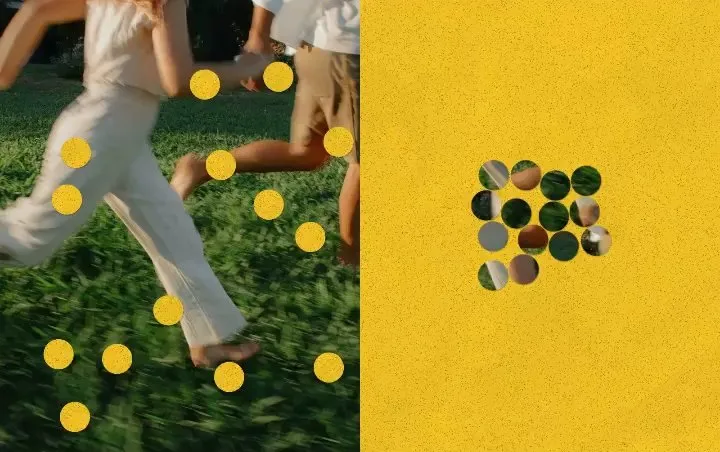
Punch Hole Photo Studio
A photo punch studio to swap cutouts between your photo and paper, then export images or animations.
WriteYouTube Video to Article
Turn a long video into an article you can finish reading. Just paste a YouTube link—or, without a link, name a person, show, or topic you want to explore, and it will help you find a few videos to choose from. The article explains the video's key ideas and context, preserves memorable quotes, and can include images when it's finished.
 Webpage
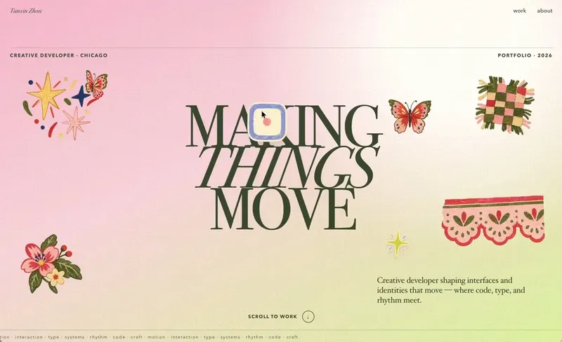
Little Gravity Portfolio
Build an intimate one-page portfolio where real work leads, airy Riso fragments decorate the margins, and small objects fall gently into motion. Use for a creative professional's personal portfolio or selected-work page; keep factual claims user-supplied and generated imagery decorative.

Mini Chibi Alter-Ego Poster
Upload a portrait photo to generate a hyper-realistic, cinematic commercial poster: the person interacts with a mini chibi 3D “alter ego” on their palm, while closely preserving their identity, hairstyle, accessories, and clothing. The skill automatically selects a varied combination from six poses and eight background color schemes, prioritizing contrast between the background and clothing. The result is a single vertical poster, defaulting to a 3:4 aspect ratio.
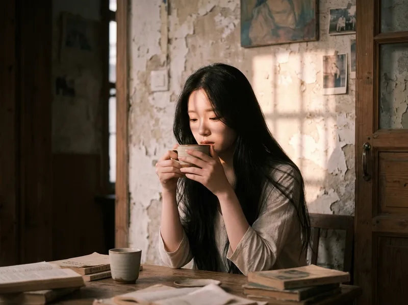
Cinematic Sunset Portraits
Upload a portrait to generate a hyper-realistic cinematic sunset portrait that closely preserves the subject’s facial features, hairstyle, and overall presence. Choose from multiple poses and color tones, or let them rotate automatically. The result is a vertical atmospheric portrait image, with the aspect ratio customizable.
Create videos with Opus 5.5
Turn an idea, message, or creative brief into a polished motion video with a distinctive visual identity. This skill helps you shape the concept, key visuals, typography, color palette, composition, pacing, and transitions so every design choice supports the story you want to tell. It can create a wide range of video experiences, from expressive title sequences and promotional pieces to presentations, social content, and other visual storytelling projects. Your explicit requirements remain central, while the overall direction is developed with the judgment of a creative director and motion designer to produce engaging visual moments and smooth continuity from shot to shot. The result is a finished, browser-based video experience with carefully coordinated motion and design, checked for technical issues before delivery. Start with a clear prompt describing what you want to communicate, the tone or style you have in mind, and any must-have content or constraints.
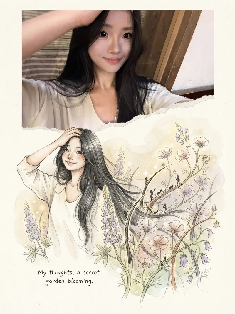
Photos into Storybooks
Using the uploaded photo as the sole reference, create a portrait-format (default 3:4) composite image with an editorial feel, combining the photo with a hand-drawn illustration: preserve the original photo in the upper half, naturally extend it into a hand-drawn storybook illustration in the lower half, and add a short handwritten-style caption in the blank space.
Textured Particle Science Animation
Enter a scientific concept. I’ll research it online and write a storyboard script for your approval, then gather licensed real photos and build a particle-and-vector Canvas educational animation webpage lasting about 2 minutes (customizable). The style combines a premium science documentary with museum-grade scientific visualization: six-layer parallax composition, full-frame layouts without clutter, finely rendered vector subjects with clear lighting, global bloom and film grain, plus gold-and-white starburst particles, large text, and semantic color coding. On-screen text is optimized for small phone screens, keeping only a few large Chinese key labels and clear subtitles. It includes a validated text-particle engine, consistent coordinate rules, a single-track BGM soundtrack, and shot-by-shot screenshot review. The result can be played and exported as a video with sound.
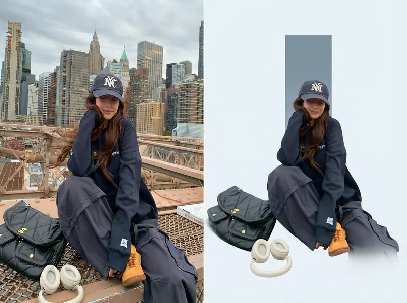
One-Click Editorial Poster
Upload one or more photos, and automatically generate a sophisticated editorial-style poster for each photo, with the left half showing the original image and the right half featuring a narrative reconstruction with a key color panel. By default, the poster uses a 4:3 landscape split-screen layout: the left side preserves the original photo, while the right distills its narrative subject and pairs it with a low-saturation geometric color panel extracted from the original image. The overall look is restrained, quiet, and spacious, with a magazine editorial style. You can switch to layouts such as 3:4, 1:1, or 9:16 as requested, with the two sections divided equally. Multiple photos are processed independently and are not combined.
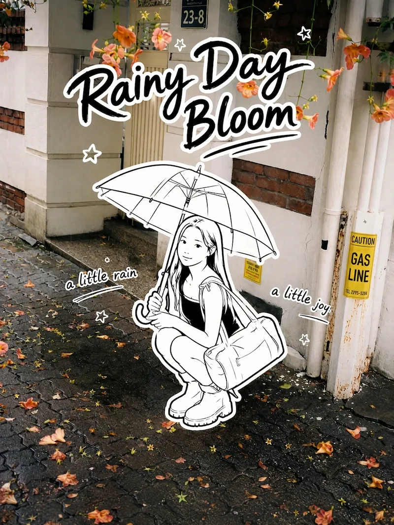
Black-and-White Sticker Poster
Transform your real-life portrait into a 3:4 vertical black-and-white sticker poster that combines a photographic atmosphere with the playful feel of an illustration: the color scene stays realistic, while the person, clothing, accessories, and handheld items appear as minimalist pure black-and-white hand-drawn stickers. Add an English handwritten title, short phrases, and a few decorative stars, suns, or wavy lines. Ideal for social media sharing, travel journals, and creating personal posters.
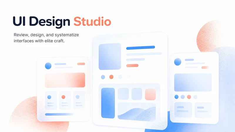
Elite UI Design Studio
An elite UI design specialist for web, mobile, and desktop. It reviews and improves existing interfaces, builds executable UI code, produces compact design systems and specs, and generates visual concept mockups, all at a high level of craft, usability, and accessibility. Every output is designed to be distinctive rather than generic, with strong hierarchy, a coherent visual system, responsive layouts, and full state coverage. It enforces a strict token-economy discipline: it delivers the artifact directly with no preamble, no restating, and no filler. Output language follows the user's language.
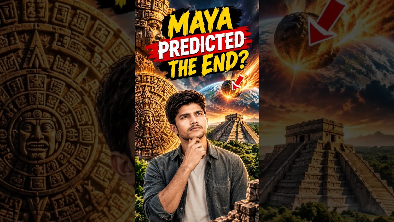
YouTube & content creation
Turn a single topic into a complete day of YouTube content for faceless history, mystery, and education channels. You’ll receive an engaging long-form video script in an accessible Roman Urdu and English mix, with cinematic storytelling, factual context, hooks, talking points, and visual suggestions ready for production. The package also includes three short-form scripts built around different angles, plus a Roman Urdu community post and an audience poll to encourage engagement. This makes it easy to extend one research topic across your main video, YouTube Shorts, and community tab without starting from scratch. To support publishing, you’ll get five copy-ready AI image prompts for thumbnails and historically accurate video visuals, along with a complete SEO and thumbnail pack. Use the suggested thumbnail text, video titles, optimized description, tags, and hashtags to shape a consistent content release around topics such as Vikings, the Great Wall, Cleopatra, and other educational subjects. Enter one topic and receive reusable content assets for a full day of channel activity.
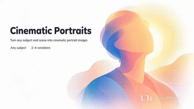
Create cinematic portraits
Describe a person and a scene — who they are, what they are wearing, where they stand, and the light or mood — and this skill composes the prompt and generates a set of cinematic, photorealistic portrait images. Any missing detail is filled with a tasteful, coherent default so a usable result always comes back. Works for any subject, culture, wardrobe, or environment.
Chalkboard Chalk Presentation
Creates static 16:9 slides on a deep green chalkboard, with rounded chalk lettering and simple doodles. Suitable for casual lessons, internal presentations, workshops, and learning showcases.
 Image
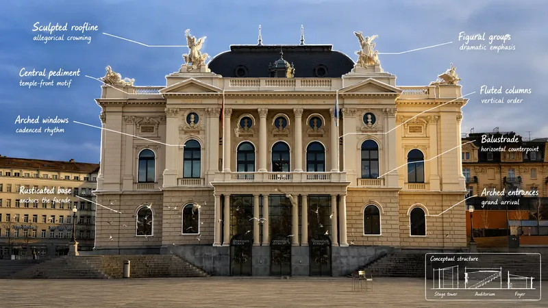
ImageVisual Scene Annotator
Turn a photo into a visual explanation of why its details matter. The Skill traces meaningful angles, shapes, joints, layers, and components on the original image, then explains their function, visual meaning, relevant background, and possible design influences. When useful, it adds a clearly labeled conceptual cutaway or exploded view beside the photo to show how the subject may be structured inside. Observed facts, verified context, and visual inference remain clearly separated.
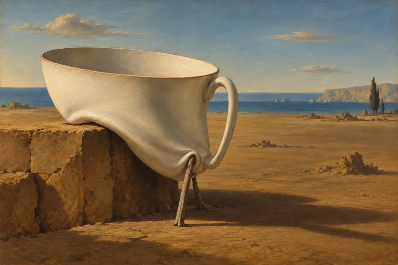
Dalí-Style Surreal Art
Turn a theme into a precise, eerie, and recognizable Dalí-style surreal painting, giving familiar objects new meaning through impossible connections, proportions, and supports. The work draws on the hallucinatory oil-painting language of the 1930s, combining clear contours, sculptural light and shadow, deliberately warped forms, and selectively refined details to create a vast, silent, and unsettling space. Whether creating a wordless image from a brief concept, preserving specified objects from a detailed description, or transforming a photo into a surreal scene, the visual relationships can be chosen around soft-hard reversals, shape transformations, double images, or mismatched scale. When appropriate, recognizable Dalí motifs—such as soft watches, fragile supports, or slender animals carrying architecture—can be integrated into the composition and narrative rather than left as decoration. The identities of people in photos, product structures, architectural features, and explicitly requested elements are also respected. You will receive a finished image suited to the subject and aspect ratio, along with the creative prompt actually used. You can also request only a prompt, visual analysis, or a critique of the finished image. For posters, clear, readable text design that responds to the forms in the image can be added; by default, the artwork includes no title, signature, or caption.
ImageReal × Cute Creature Photos
Still posting the same old selfies? Upload your photo, and AI will automatically create a heartwarming feature photo of you embracing a hand-drawn cute creature: a small white creature with black outlines peeks out from behind you, gently cupping your face with its little paws and resting them on your shoulder, surrounded by tiny hearts and sparkles. ✨ Keeps your face recognizable—no identity swaps or distortion ✨ Automatically matches the outfit to your vibe, so you don't have to style it yourself ✨ Multiple poses work beautifully: sitting, standing, crouching, or leaning ✨ A different cute creature every time: a dumpling, puppy, teddy bear, baby, and more—random surprises included ✨ Default 3:4 portrait format, ideal for Xiaohongshu and Moments; the aspect ratio is customizable One photo, one minute, and it's ready to collect likes.
Rising stars
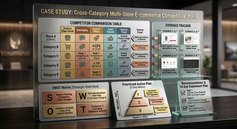
Competitor Store Opportunity Analyzer
Compare online stores using available evidence about product pages, messaging, offers, visible pricing, trust signals, and customer experience. Discover competitive strengths, identify improvement opportunities, and build a prioritized action plan. Ideal for e-commerce owners, online sellers, and digital marketing consultants.
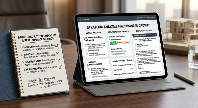
B2B Lead Research & Outreach Planner
Research potential B2B customers, identify relevant business opportunities from available evidence, qualify prospects, and create personalized outreach drafts. Includes source tracking, confidence labels, and professional follow-up suggestions. Designed for freelancers, consultants, sales teams, and small agencies.
Local Business Website Growth Auditor
Analyze local business websites and turn available evidence into a practical growth plan. Identify issues affecting clarity, trust, service presentation, usability, and customer inquiries. Get prioritized recommendations, an actionable improvement checklist, and suggested performance metrics. Designed for local service businesses, website owners, and small marketing agencies.
WP Theme & CSS Customizer
Get targeted WordPress theme customizations with practical, ready-to-use CSS, PHP, and JavaScript snippets. This skill helps you adjust theme styling, modify WooCommerce layouts and features, add custom fields or badges, control sidebars and page elements, and load scripts only where they are needed. Share your goal along with your theme or child theme, relevant plugins and page builders, the target page or area, and any constraints such as RTL support or avoiding functions.php. The guidance is tailored to setups including Astra, Storefront, custom themes, Elementor, and WooCommerce, so you can make focused changes without applying unnecessary site-wide edits. Each response explains the approach, provides clearly labeled code, and tells you where to add it. PHP changes that could potentially affect site stability come with an appropriate safety warning, making this useful for both small visual tweaks and more involved WordPress theme customization work.
Satisfying Macro Food Video Director
Give it a dish and get a ready-to-generate satisfying food video plan. You get a 6-shot storyboard, a copy-paste prompt for every shot (macro lens, slow motion, glossy textures, warm lighting), ASMR sound cues, and a short caption with hashtags for Reels, TikTok, and Shorts. Works for desserts, street food, cheese pulls, chocolate pours, and cutting or slicing scenes. Want ready-made storyboards? Get the Satisfying Food Video Prompt Kit: 8 complete storyboards, 48 shot prompts. [https://payhip.com/b/1M0uT]
Create cinematic portraits
Describe a person and a scene — who they are, what they are wearing, where they stand, and the light or mood — and this skill composes the prompt and generates a set of cinematic, photorealistic portrait images. Any missing detail is filled with a tasteful, coherent default so a usable result always comes back. Works for any subject, culture, wardrobe, or environment.
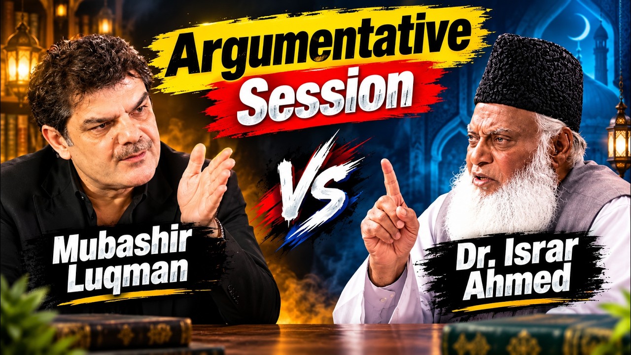
Islamic Thought Lab – Deep Reflections
Turn an Islamic topic into a thoughtful, research-informed reflection for audiences exploring faith, doubt, meaning, and modern life. Islamic Thought Lab brings together Quranic insight with tafsir context, authentic Hadith, moments from the Seerah and early Islamic history, and relevant perspectives from modern psychology or contemporary life. Each reflection is written in calm, poetic English and shaped around a compelling question, deeper interpretation, historical perspective, and connections to experiences such as anxiety, social media, overthinking, and hustle culture. It also includes prompts for personal tadabbur and a practical dua or dhikr, helping readers move from contemplation toward sincere self-examination. The result is suited to Islamic education content, YouTube scripts, podcast discussions, study circles, and personal reflection—especially for English-speaking young adults seeking depth without judgment or simplistic answers. It offers reflective guidance rather than religious rulings, with citations where available and a clear reminder to consult a trusted scholar for personal fiqh matters.
YouTube & content creation
Turn a single topic into a complete day of YouTube content for faceless history, mystery, and education channels. You’ll receive an engaging long-form video script in an accessible Roman Urdu and English mix, with cinematic storytelling, factual context, hooks, talking points, and visual suggestions ready for production. The package also includes three short-form scripts built around different angles, plus a Roman Urdu community post and an audience poll to encourage engagement. This makes it easy to extend one research topic across your main video, YouTube Shorts, and community tab without starting from scratch. To support publishing, you’ll get five copy-ready AI image prompts for thumbnails and historically accurate video visuals, along with a complete SEO and thumbnail pack. Use the suggested thumbnail text, video titles, optimized description, tags, and hashtags to shape a consistent content release around topics such as Vikings, the Great Wall, Cleopatra, and other educational subjects. Enter one topic and receive reusable content assets for a full day of channel activity.

Mini Chibi Alter-Ego Poster
Upload a portrait photo to generate a hyper-realistic, cinematic commercial poster: the person interacts with a mini chibi 3D “alter ego” on their palm, while closely preserving their identity, hairstyle, accessories, and clothing. The skill automatically selects a varied combination from six poses and eight background color schemes, prioritizing contrast between the background and clothing. The result is a single vertical poster, defaulting to a 3:4 aspect ratio.
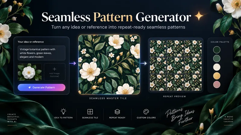
Seamless Pattern Generator
Turn any idea, motif, or reference image into a polished, repeat-ready seamless pattern. Seamless Pattern Generator works like an AI surface pattern designer. It transforms creative direction into visually balanced patterns for fabric, wallpaper, wrapping paper, packaging, stationery, home decor, digital paper, print-on-demand products, and more. No technical pattern-design knowledge is required. Describe what you want or upload a visual reference. The Skill plans motif hierarchy, scale, density, spacing, palette, orientation, repeat structure, visual rhythm, negative space, and edge-aware motif placement. It creates the master pattern tile and checks how the design behaves as a repeating surface, looking for visible seams, awkward edge cuts, empty channels, motif collisions, obvious grid effects, and repetitive clusters. When problems appear, it focuses on correcting the affected structure while preserving the creative direction. Start with a text idea, color palette, motifs, visual style, reference image, existing artwork, or intended application. The final result can include a clean master tile, repeat preview, and concise pattern specification. You can also create new colorways, change motif scale or density, adjust the background, or develop alternative versions while preserving the same visual identity. Example prompts: • “Create a dark botanical pattern with burgundy roses, antique-gold leaves, and a deep emerald background for premium wrapping paper.” • “Use this image as inspiration and create an original seamless pattern that preserves its color mood and botanical character.” • “Create a playful non-directional fabric pattern with foxes, mushrooms, leaves, and tiny stars.” • “Keep the same motifs, make the pattern less dense, enlarge the main flowers, and change the background to burgundy.” From creative idea to repeat-ready surface design — without the technical complexity.
Photos into Storybooks
Using the uploaded photo as the sole reference, create a portrait-format (default 3:4) composite image with an editorial feel, combining the photo with a hand-drawn illustration: preserve the original photo in the upper half, naturally extend it into a hand-drawn storybook illustration in the lower half, and add a short handwritten-style caption in the blank space.

SwiftUI Expert Companion
An elite engineering companion for SwiftUI developers. It covers the full range of day-to-day SwiftUI work: analyzing and debugging issues, making architectural decisions, designing view composition and state management, building new features, reviewing and optimizing existing code, and applying modern SwiftUI best practices (Swift 6 concurrency, the Observation framework, NavigationStack), performance, accessibility, and Apple Human Interface Guidelines. It adapts its depth to the task: a concise fix for small problems, and a full engineering report (diagnosis, architectural rationale, code, trade-offs, self-check) for complex ones. It always aims to return compiling, up-to-date, production-ready SwiftUI code, and responds in the user's language.
Elite UI Design Studio
An elite UI design specialist for web, mobile, and desktop. It reviews and improves existing interfaces, builds executable UI code, produces compact design systems and specs, and generates visual concept mockups, all at a high level of craft, usability, and accessibility. Every output is designed to be distinctive rather than generic, with strong hierarchy, a coherent visual system, responsive layouts, and full state coverage. It enforces a strict token-economy discipline: it delivers the artifact directly with no preamble, no restating, and no filler. Output language follows the user's language.
Cinematic Sunset Portraits
Upload a portrait to generate a hyper-realistic cinematic sunset portrait that closely preserves the subject’s facial features, hairstyle, and overall presence. Choose from multiple poses and color tones, or let them rotate automatically. The result is a vertical atmospheric portrait image, with the aspect ratio customizable.
Dalí-Style Surreal Art
Turn a theme into a precise, eerie, and recognizable Dalí-style surreal painting, giving familiar objects new meaning through impossible connections, proportions, and supports. The work draws on the hallucinatory oil-painting language of the 1930s, combining clear contours, sculptural light and shadow, deliberately warped forms, and selectively refined details to create a vast, silent, and unsettling space. Whether creating a wordless image from a brief concept, preserving specified objects from a detailed description, or transforming a photo into a surreal scene, the visual relationships can be chosen around soft-hard reversals, shape transformations, double images, or mismatched scale. When appropriate, recognizable Dalí motifs—such as soft watches, fragile supports, or slender animals carrying architecture—can be integrated into the composition and narrative rather than left as decoration. The identities of people in photos, product structures, architectural features, and explicitly requested elements are also respected. You will receive a finished image suited to the subject and aspect ratio, along with the creative prompt actually used. You can also request only a prompt, visual analysis, or a critique of the finished image. For posters, clear, readable text design that responds to the forms in the image can be added; by default, the artwork includes no title, signature, or caption.

-
Audience: Beginners familiar with submitting prompts; no technical background required.
-
Goal: Produce a stronger, fact-preserving draft using a shared rubric, separate AI reviews, targeted revisions, and a defensible human acceptance decision.
-
Narrative mode: Tutorial.
-
Slide count range: 15 slides proposed.
Suggested session: 35–45 minutes including practice; instructional estimate, not a verified five-minute method.
Running example: A fictional operations manager announcing a move into workflow consulting on LinkedIn.
Companion handout: Detailed tutorial and teaching guide. Full prompts, scoring anchors, checkpoints, and implementation checklist stay in the handout.
Source: My Simple But (WEIRD) Way of Getting Better ChatGPT Results, full available transcript, 0:00–8:38. Visuals were not independently inspected. All exercises and operational rubric definitions are course additions.
1) Improve the draft—not just its score
Turn one career-change announcement into a draft you can defend with evidence. Promise a repeatable review method, not guaranteed results or a perfect score. Introduce the presenter's “force prompting” as the source concept; teach explicit criteria and human oversight. Finish with a baseline, reviewed revision, and a brief acceptance rationale.
2) A confident self-rating can hide generic writing
-
Contrast the presenter's reported 9/10 self-rating with his objections to “safety net” and “tectonic shift.”
-
Ask what those phrases actually tell the reader about this person's decision.
-
Separate an enthusiastic rating from evidence that the brief was met.
-
Anchor to 1:05–2:35; frame the example as presenter-reported, not a model benchmark.
3) Follow the learning path from brief to decision
-
Define the audience and preserve a baseline.
-
Set standards and obtain separate, evidence-based reviews.
-
Revise, investigate disagreement, and compare versions.
-
Accept the draft only when a human can justify the result.
YouTube to Course Slides
Turn YouTube videos or transcripts into a detailed tutorial, an approved course outline, and course slides with a three-slide preview. Defaults to spacious blue (#0965FF), grayscale imagery, and editorial typography.
 Image
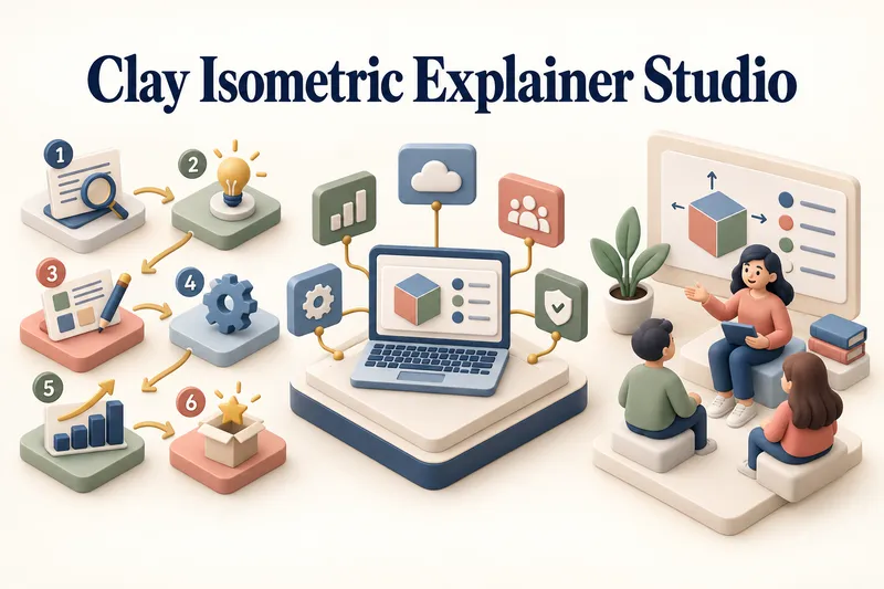
ImageClay Isometric Explainer Studio
Turn any topic into a clear, memorable visual explanation. Clay Isometric Explainer Studio transforms products, processes, services, systems, and educational subjects into polished hybrid 3D clay and isometric visuals. You can start with only a topic. The Studio performs a focused research snapshot, identifies the core message, recommends the clearest visual direction, and guides you through the creative process step by step. It builds the information architecture, maps each idea to a visual object, defines a consistent style system, and prepares a complete production prompt. Titles, numbered stages, information cards, labels, and short explanations are planned and included directly during image generation. Choose an Explainer Scene, Process Flow, Product Feature Board, Educational Visual, or a coherent 3–5-piece Visual Series. After the still image is approved, optionally turn it into a short image-to-video animation with subtle object motion, natural clay character gestures, or guided focus through numbered stages. Ideal for presentations, websites, social posts, posters, PDF pages, product communication, onboarding, and learning materials. Not intended for decorative 3D scenes without an explanatory purpose, random visual elements, dense paragraphs inside images, or final editable design files.
 Image
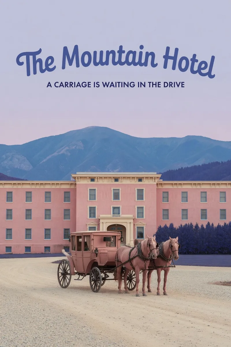
ImageWes Anderson–Style Poster
Turn a one-sentence theme or reference photo into a movie poster or scene with Wes Anderson–style order and theatrical atmosphere. People, animals, buildings, and props are arranged into clear little worlds through frontal or symmetrical framing, retro production design, carefully designed spatial relationships, and a restrained sense of anticipation, humor, or detachment. The style is expressed through the structure of the image—not just layered filters and retro adjectives. Posters default to a 2:3 portrait format with an English main title and subtitle. When you need a text-free film still or movie scene, the canvas can be adjusted to a suitable aspect ratio. Titles are treated as part of the overall composition, with attention to typography, reading flow, scale, rhythm, and negative space. The palette, film tones, lighting, and material textures work together in service of the theme while preserving important content from the photo, including people’s identities, key structures, the number of people, poses, and recognizable markings. You will receive the finished image and the actual image prompt used. If you only need a prompt, photo-editing suggestions, or a visual review, you can specify that directly. Suitable for creating retro movie posters, character scene portraits, architectural and prop displays, nature-themed images, and stylized work based on source images.
Featured packs
For better writing
Fun for life
Design studio
Hand-drawn masterpiece
Pinned for you
Explore skills
 Image
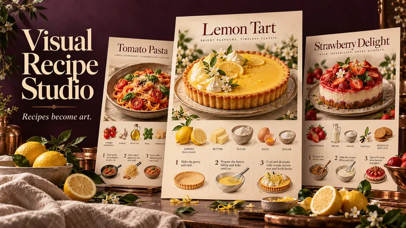
ImageVisual Recipe Studio
A recipe worth making deserves a poster worth displaying. Visual Recipe Studio transforms a dish name or your own recipe into three beautifully different food posters—each a complete visual guide to making the dish. THE DISH TAKES CENTER STAGE Every poster features an appetizing, full view of the finished dish at the top. Below, illustrated ingredients, clear quantities, and step-by-step preparation turn the recipe into a visual story you can follow. ONE RECIPE. THREE CREATIVE INTERPRETATIONS. Receive three separate, complete posters—not three color variations. Each explores a distinct composition, typography, atmosphere, and visual treatment, while preserving the same approved recipe. DESIGNED AROUND YOUR DISH A rustic loaf might inspire a warm, flour-dusted composition. A lemon tart could become a bright culinary editorial. The creative direction grows from the food itself, without forcing every recipe into the same template. START WITH A NAME OR A FULL RECIPE Share a dish name, paste a family recipe, or provide a readable recipe image or document. When research is needed and available, the skill finds a suitable recipe and presents sources. You review and approve the recipe before poster creation begins. A SIMPLE, GUIDED FLOW Share your dish → approve the recipe → choose a poster format → receive three distinct designs. The conversation and poster text follow your language unless you request another. Refine individual posters afterward, from colors and atmosphere to text size and layout. Made for kitchen inspiration, recipe collections, food content, and thoughtful culinary gifts.
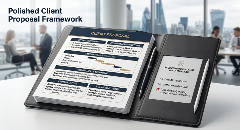
Proposal & Scope-of-Work Builder
Create polished client proposals with defined objectives, deliverables, timelines, assumptions, exclusions, responsibilities, and commercial terms. Identify missing requirements before they become project risks. Suitable for freelancers, consultants, software developers, and service agencies.
Competitor Store Opportunity Analyzer
Compare online stores using available evidence about product pages, messaging, offers, visible pricing, trust signals, and customer experience. Discover competitive strengths, identify improvement opportunities, and build a prioritized action plan. Ideal for e-commerce owners, online sellers, and digital marketing consultants.
 Image
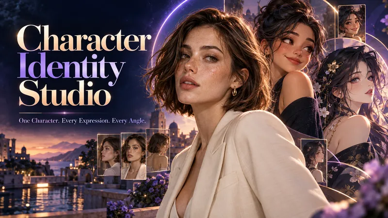
ImageCharacter Identity Studio
Give your character a clear identity—from the first look to every expression and angle. Character Identity Studio guides you through character creation with interactive selections. Explore ultra-realistic photography, realistic 3D, stylized 3D animation, 2D animation, anime, or illustration. Create a human, a fantasy character, or an animal mascot. DESIGN YOUR CHARACTER Choose appearance, facial features, hair, body type, clothing, and distinctive details. Describe exactly what you want or let the studio fill in the creative details. The guided workflow follows your language. APPROVE THE FIRST LOOK Start with one full-body character image. Refine specific features or request a new alternative. Reference production begins only after you approve the character. BUILD YOUR REFERENCE SET Receive three separate images, each arranged as a clean reference sheet: • 6 Facial Expressions: Neutral, gentle smile, laughter, sadness, anger, and surprise. • 6 Head Angles: Front, right profile, left profile, rear, and two 45° views—with neutral expressions wherever the face is visible. • 3 Full-Body Views: Front, side, and rear in a relaxed, neutral stance. Every sheet uses your approved image as its primary visual reference, helping preserve facial identity, hairstyle, outfit, proportions, and visual style. YOUR FINAL COLLECTION One approved character image + three reference sheets containing 15 panels. A practical visual foundation for AI character projects, animation planning, storytelling, and future image or video creation.
B2B Lead Research & Outreach Planner
Research potential B2B customers, identify relevant business opportunities from available evidence, qualify prospects, and create personalized outreach drafts. Includes source tracking, confidence labels, and professional follow-up suggestions. Designed for freelancers, consultants, sales teams, and small agencies.
Local Business Website Growth Auditor
Analyze local business websites and turn available evidence into a practical growth plan. Identify issues affecting clarity, trust, service presentation, usability, and customer inquiries. Get prioritized recommendations, an actionable improvement checklist, and suggested performance metrics. Designed for local service businesses, website owners, and small marketing agencies.
ImageRetro Photo Booth
Turn one clear front-facing portrait into a single 2×2 retro hard-flash photo-booth print, keeping the person's identity and styling consistent while showing four distinct expressions: a goofy face, puzzled, big laugh, and a pouty wink.
ImageMini me
Turns an uploaded portrait photo into a finished studio shot of a giant subject interacting with a miniature version of themselves on a pure white background. It keeps the same person's face, hair, outfit, and accessories consistent across both scales, and supports contact or non-contact poses such as palm, fingertip, shoulder, top of the head, hair, or ground performance.