[Brand]: HOLLOW
[Product]: Short-shouldered transparent square bottle with amber whisky, black cap
[Title]: EMBER
[Category]: WHISKY
[Side Materials]: Dark oak cross-section / Thick-walled amber glass
[Scene & Camera]: Wine cellar oak countertop, low-angle three-quarter view, warm side backlighting
[Optical Event]: The liquid locally tints the title amber and slightly magnifies it; restrained caustics appear on the surface
[Main Color]: Amber Brown
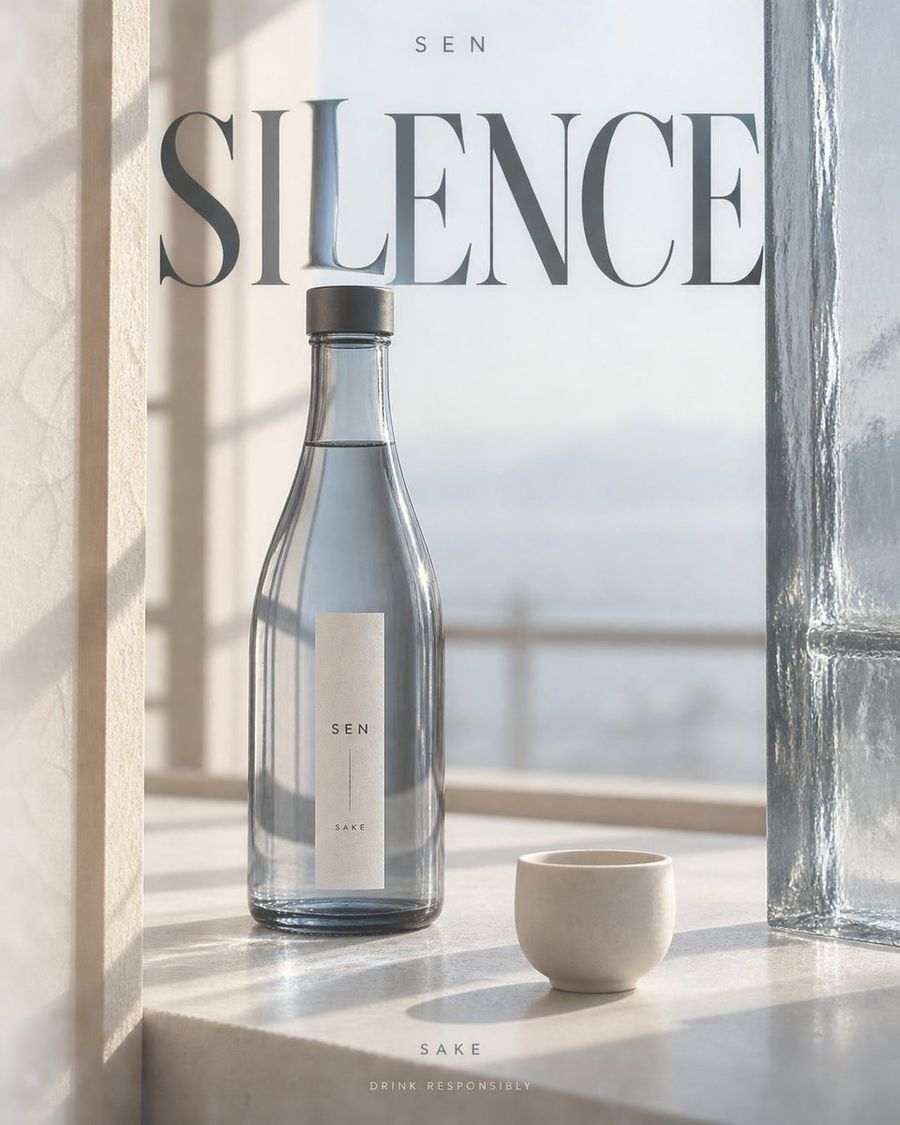
Create a 4:5 vertical liquor advertising poster, outputting one independent finished piece at a time.
Fixed visual language: Realistic commercial still-life photography, warm ivory negative space, huge high-contrast serif titles, restrained editorial layout. Use the wine bottle and transparent medium to refract text, combined with bright channels formed by side materials; avoid neon, glowing outlines, generic e-commerce cards, or golden luxury decorations.
Arrange [Product] according to [Scene & Camera]. Let [Side Materials] enter the frame as close-ups with partial cropping, forming asymmetric vertical negative space; openings can slowly expand/contract with the camera, do not make them mirror-image door frames. The bottle occupies about half to two-thirds of the screen height, fully recognizable within the negative space, with slight occlusion from one side material; upper part must have breathing room. Side materials must come from the storage, packaging, or drinking context of this liquor type; do not add irrelevant caves, flower fields, or uniformly copied photographic backgrounds.
Place the large title [Title] across layers in the middle-upper area, letting a small segment of strokes pass behind the wine bottle or transparent medium, undergoing local magnification, displacement, or color filtering in [Optical Event]. Parts of the text not passing through the medium remain normally clear; distortion is limited to the translucent area, do not twist the entire title into waves. Use [Main Color] as the only strong color, with warm ivory and charcoal black as auxiliaries; liquid translucency, glass thickness, contact shadows, condensation, and projections must be believable; do not draw optical effects as lasers.
Place [Brand] at the top in a small, sparse sans-serif font; place [Category] and "Drink Responsibly" at the bottom as two lines of small text. Bottle labels use only brand and category, leaving clean information density. Only the above text is allowed in the entire image; do not automatically add slogans, vintages, alcohol content, awards, origins, prices, or unprovided product claims. No people in the scene, do not express excessive drinking.
Preserve delicate natural material textures and precise glass highlights; avoid heavy CGI, floating products, extra bottles, random letters, glare stacking, collages, and watermarks. Scene, camera, bottle shape, and optical events change with variables, but the visual language of warm ivory negative space, serif main titles, and localized refraction remains consistent.