
Caption Layout Guide
What makes captions look polished
Caption Layout Guide
What makes captions look polished
Showcase
Description
There is only one standard for judging captions: when viewed on a phone, at thumb size, with the sound off, can the sentence still be understood at a glance? 【Caption Layout Guide】 starts with three non-negotiables: safe zones, explaining how much space to leave on each side for vertical and horizontal video; a maximum number of characters per line, including why it matters and why there is a limit to how many characters people can read in one second; and a two-level hierarchy only, with main text and emphasis text, because a third level creates confusion. It then provides a fill-in-ready layout parameter table covering captions, titles, keyword emphasis, names and places, numbers, and proper nouns. For each, it specifies placement, relative size, font weight, whether to use a background, and when it should appear and disappear, while marking areas to avoid around faces and platform buttons. Keyword emphasis is limited to three methods—change the color, add a background, or enlarge the text—with a clear explanation that you may choose only one. It also includes six practices that look the most amateurish and how to fix them, plus a simple muted-phone viewing check. Ground rules: no dialogue or script writing, no recommendations for specific font files, no instructions for disguising or obstructing text to evade platform moderation, no judgments about the user's appearance or accent, and no promises about completion rates.
Recommended by
淡苍
Why we love this skill
Turns subtitles from merely visible into instantly readable on a phone with practical rules for safe areas, text limits, hierarchy, and timing, plus fill-in parameters and checks for muted viewing and auto-caption issues.
Best for
Content creators and video editors who need consistent layouts for captions, titles, and keywords.
How to use this Skill
Provide your input
Provide the video platform, orientation and length, content type, and current caption issues, such as being too small, covering faces, or being hard to read in time.
Run the Skill
Organize layout recommendations for muted phone viewing, covering safe zones, character limits, hierarchy, placement, emphasis, and timing.
Review your result
Get a fill-in-ready caption layout parameter sheet, fixes for common problems, and a muted phone-viewing checklist.
Related Skills
View all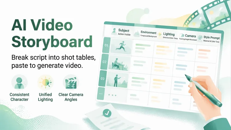
AI Video Storyboard Sheet
Two of the most common ways AI videos go wrong are unclear instructions to the model (for example, “a vibrant person welcoming a new day” is too vague to execute) and characters who look different from one shot to the next. 【AI Video Storyboard Sheet】 breaks your script into a table you can copy and paste into an AI video tool for shot-by-shot generation. Each shot covers five elements: subject (who is performing what visible action), environment (what appears in the foreground and background), lighting (direction, softness, and color temperature), camera (shot size, camera height, and movement), and a style line (materials and color palette). The most important part is the “three-step consistency method”: write the main character description as a fixed text block and copy it exactly each time while changing only the action; repeat the same lighting and scene description in every shot; and anchor the sequence with a first-frame image before letting the video tool use it as a reference, which is much more effective than repeatedly revising text prompts. It also provides duration breakdowns and transition suggestions, along with six common failure points and ways to avoid them: distorted faces when multiple people appear together, warped forms during fast movement, garbled text in the frame, incorrect hands in close-ups, blurry reflective materials, and clothing color changes between shots. Strict rules: it does not generate videos, use real-person portraits, or perform face swaps; it does not include existing cartoon, anime, game, or film characters; it does not imitate living directors or artists, even without naming them; it does not generate images of minors or exposed content; and it does not teach users to present generated footage as real news.

One-Click Script & Cover Gen
The biggest hurdle in talking-head videos isn't being on camera—it's writing the script. You agonize over a topic, the opening hook gets swiped away, you spend all night polishing a word-for-word script, and then you still need to find a cover template. Before you've even posted a single video, you're already burnt out from the prep work. Feed in a topic and get a complete ready-to-shoot package: hook opening + word-for-word script + scene breakdown + title and description + matching cover image. ✨ Core Capabilities 1. Golden 3-second hook: 4 opening formulas—suspense/pain point/counter-intuitive/benefit—designed to beat high swipe rates. 2. Word-for-word script: Written in a conversational rhythm, with clear sentence breaks, pauses, and emphasis markers—just read it aloud. 3. Scene breakdown: Each segment includes visual, camera movement, and subtitle suggestions, plus BGM style. 4. Title and description set: 3 title options + description + hashtags. 5. Cover image generated directly: Large hook text + anti-AI-style layout, with 9:16, 3:4, or 16:9 aspect ratios selectable per platform. 6. Compatible with Douyin, WeChat Channels, Bilibili, and Xiaohongshu videos at different lengths (15s, 60s, 3min). 📱 Use Cases Talking-head creators, paid knowledge instructors, brand short videos, personal IP. One-stop solution for scripts and covers on Douyin, WeChat Channels, Bilibili, and Xiaohongshu. Topic in, shoot out—give the late-night writing hours back to sleep.
 Image
ImageLong-Form Carousel Splitter
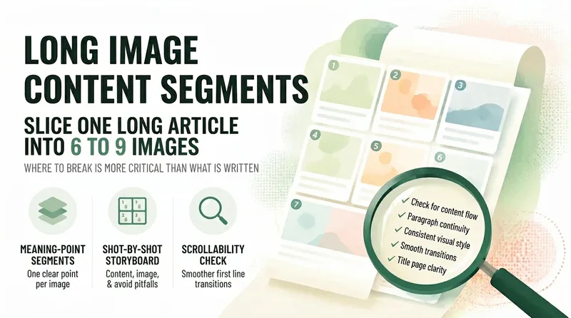
Long posts rarely get read to the end, so everyone wants to split them into slides—but most people split them the wrong way: dividing by word count leaves every slide feeling like a mini essay, the first slide gives away the conclusion and stops people from swiping, and the last slide burns goodwill with a forced follow prompt. 【Long-Form Carousel Splitter】doesn’t split by word count. It splits by "how many complete ideas there are": one idea per slide, with fewer slides preferred over more. So it may first tell you, "This piece is really only enough for 7 slides," instead of forcing it into nine. It then provides a slide-by-slide storyboard: what each slide covers, which sentences to include (with word counts), visual requirements, and the most common mistake to avoid on that slide. The first slide only needs to make people stop, with the minimum necessary information. The last slide only needs to leave them with one memorable line, not a summary. It also includes a practical swipeability check: read the first line of each slide together as a standalone passage. If it sounds like a complete sentence, the breakpoints are probably right. Hard rules: It does not generate images, put text in visuals, rewrite the original copy for you, include any existing IP characters, imitate the layout of a specific account, or promise completion rates.
Information
- Version
- v2
- Last updated
- Runtime credits
- Usage-based
- Models
- Auto
- Use cases
- Images & designVideo & audio
- What you get
- DocumentPlan