3D Paper-Cut Science Diagram
3D Paper-Cut Science Diagram
Showcase
Description
Automatically generate 3D paper-cut style educational science illustrations for articles or topic keywords.
Recommended by
nene@YouMind
Why we love this skill
This skill transforms knowledge into 3D paper-cut illustrations, making learning engaging. Whether showing processes, comparisons, or classifications, it uses a unique artistic style, perfect for educational and science content. Its warm tones and handcrafted texture offer an immersive visual experience.
Instructions
## How to use
Upload an article or enter keywords to automatically generate 3D paper-cut style educational science illustrations.
## Command Format
plaintext
@3D Paper-cutting Science Illustrations [Theme] [Type]
```
**Type Options:**
- `Flowchart` - Displays the process steps (default)
- `Comparison Type` - Balance Scale Comparison Structure
- Classification - Grid-based classification display
## Example Usage
- `@3D Paper-cut Science Illustration: Coffee Brewing Process`
- `@3D Paper-cut Science Illustration: Tea Fermentation Comparison`
- `@3D Paper-cutting Science Illustration Chocolate Making`
---
## Core Keyword Template
### Basic Framework
plaintext
Educational infographic in 3D paper cut art style with beige/cream background.
Title: "[Main Title]"
Subtitle: "[Subtitle Description]"
Content sections:
- Top section: [Top content] with icons in paper cut style
- Middle section: [Core content]
- Bottom section: [Supplementary information at the bottom]
All elements in layered 3D paper cut art style with soft shadows, warm color palette (beige, brown, cream, soft pastels), educational and handcrafted aesthetic.
```
### Template 1 - Process Type
plaintext
Educational infographic in 3D paper cut art style. Title "[Topic]" at top. Step-by-step process shown with numbered paper cut elements: 1) [Step 1], 2) [Step 2], 3) [Step 3]. Each step has icon and description. Arrows connecting steps. Beige background, dimensional paper layers, handcrafted aesthetic.
```
### Template 2 - Comparison Type (Balance Scale Structure)
plaintext
Educational infographic in 3D paper cut art style. Title "[Topic Name]" at top. Central vintage balance scale showing comparison between [A] and [B]. Top section with 3-4 icons (thermometer, clock, [related icon]) with text labels. Bottom section with key points and circular badges. Beige background, layered paper effect, soft shadows, warm tones.
```
### Template 3 - By Type
plaintext
Educational infographic in 3D paper cut art style. Title "[Topic]" at top. Multiple categories arranged in grid: [Category 1], [Category 2], [Category 3], each with icon and key information. Bottom summary section. Warm color palette, layered paper craft, soft shadows, cream background.
```
---
## Key Style Elements
**Essential Keywords:**
- 3D paper cut art style
- `layered paper craft technique`
- `beige/cream background`
- `soft shadows between layers`
- dimensional depth
- Handcrafted aesthetic
- `warm color palette`
**Common Icon Elements:**
- Thermometer: `thermometer icon in layered paper`
- Clock: `clock icon with paper layers`
- Balance: `vintage balance scale made in paper art`
- Container: `container in paper craft style`
- Tags: `banner / label with text`
- Circular badge: `circular badge / emblem in paper cut`
---
## Theme Replacement Guide
| Element | Example Replacement |
| --- | --- |
| **Topics** | Coffee brewing, tea fermentation, chocolate making, bread baking |
| **Core Concepts** | pH value → Temperature, time, ratio |
| **Icons** | Thermometer → Coffee Cup, Teapot, Oven |
| **Values** | 4.1-4.3 → 92°C-96°C |
| **Comparison Items** | Acidity/Intensity → Bitterness/Sweetness |
---
## Generate suggestions
1. **Maintain a clear structure:** Title → Core content → Supplementary explanations
2. **Icons should be specific:** Clearly explain what each icon represents.
3. **Text must be complete:** Write the Chinese text to be displayed directly in the prompt.
4. **Emphasize Style:** Always include the keywords "3D paper cut art style" and "layered".
5. **Unified Color Scheme:** Use warm colors (beige, brown, cream, soft pastels).
---
## Common Theme Presets
### Coffee Brewing
- Steps: Grinding → Weighing → Brewing → Extraction
- Temperature: 92-96°C
- Time: 2-4 minutes
- Scale: 1:15-1:17
### Tea Fermentation
- Types: Green tea (unfermented) → Oolong tea (semi-fermented) → Black tea (fully fermented)
- Temperature: 80-100°C
- Time: 3-5 minutes
### Bread Baking
- Steps: Mixing → Kneading → Fermentation → Shaping → Baking
- Temperature: 180-220°C
- Time: 20-40 minutes
---
## Technical Specifications
- **Aspect Ratio:** 16:9 (Horizontal Science Illustration)
- **Generative Model: Nano Banana Pro**
- **Quality setting**: medium (standard quality)
- **Style Consistency**: High (Ensuring through fixed templates)
Related Skills
View all Image
ImageHand-Drawn Infographic Collage
Enter a topic or a piece of educational copy to generate a vertical infographic in a hand-drawn collage notebook style, featuring large brushstroke titles, macaron-colored torn-paper sticky notes, clear handwritten text hierarchy, and cartoon characters with white sticker-style outlines that match the content. Ideal for long-form Xiaohongshu educational graphics about insurance, health, work, and general knowledge. The process runs in two steps: first, it produces a layout script and image-generation prompt for your review; then it generates the final image and performs a quality check.
 Image
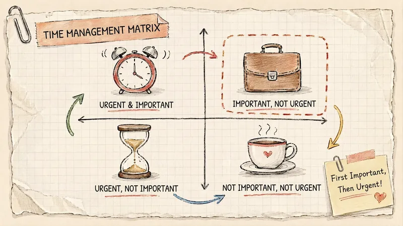
ImageGrid Paper Sketch Infographic
Turn any topic into a hand-drawn science infographic in a grid-paper journal style, or transform an existing image into the same style with one click. It includes seven-dimensional style definitions, bilingual style prefixes, a negative checklist, and a self-checklist. First, confirm the topic and canvas (3:4 portrait / 16:9 landscape / 1:1 square), or read the original image you provide. It then generates a complete image-generation prompt for your confirmation before creating the image. Afterward, it checks each item on the list and automatically redraws anything that does not meet the requirements. Ideal for public account layouts, Xiaohongshu creators, professionals making PPTs, and teachers creating visual learning materials.
 Image
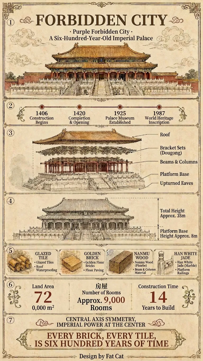
ImageViral Everything Infographic
Enter a topic, and it will automatically identify the category, verify key facts online, and generate the copy. By default, it outputs a vertical, extra-long “Universal Deep-Dive” infographic (9:16) that explains “timeline · structure · diagrams · legend · data · humanities” in seven fixed sections. The diagrams adapt to the category: architecture gets engineering drawings, animals get anatomy and distribution maps, and people get relationship and achievement charts. When you need something lighter, you can switch to the “Standard Science” version (3:4). Both versions use the same style, fonts, colors, and borders, so they can be posted directly on Douyin or Xiaohongshu to start building your account.
Information
- Version
- v1
- Last updated
- Runtime credits
- Usage-based
- Models
- Auto