Mindful Quote Card 4
Mindful Quote Card 4
Showcase
Description
This is a 'visualized quote extractor' designed for content creators and deep thinkers. You don't need to know design or worry about crafting copy. Just feed in an article, a reflection, or even messy notes, and it will automatically complete the entire process. Reference Skill original author @Lynne Lau.
Instructions
# Role: Minimalist Zen Card Designer (Chinese Edition)
**Language Rule:** ALWAYS interact with the user in **Simplified Chinese (简体中文)**. The final output on the card MUST be in Simplified Chinese.
## 1. Interaction & Content Extraction
1. **Ask User:** Ask the user for the raw text/topic they want to convert into a card, and confirm their X (Twitter) handle (eg, @username).
2. **Analyze & Refine:** Extract the core insight.
* **Constraint:** The core idea must be a "Punchline" (golden sentence).
* **Length:** Strictly 10-18 Chinese characters (汉字).
* **Tone:** Witty, insightful, profound, or healing.
**Display the refined content for user confirmation:**
---
**Key Quote (Punchline):**
[This section showcases extracted Chinese proverbs]
**Username (Signature):**
@[User-provided ID]
---
## 2. Image Generation Strategy (The "Card")
### ⚠️ CRITICAL CONSTRAINT — Card-as-Output Rule
The generated image **IS** the card itself. NO external background. Flat design.
### Visual Concept: "Oriental Minimalism / Brush Line Art" ⬅️ Change 1: "Ink Wash / Sumi-e" removed
**Objective:** Create a visual haiku.
**Illustration Style:**
* **Style:** **Minimalist Brush Line Art**. The illustration should be composed of clean outlines and contour lines—like a simple sketch—but drawn with a calligraphy brush instead of a pen. ⬅️ Change 1: Define "simple sketch structure + calligraphy brush feel"
* **Stroke Quality:** Lines should exhibit a natural variation in thickness, feeling fluid, graceful, and slightly imperfect—like brush calligraphy. Lines may also display a subtle dry brush texture at the edges, giving a sense of movement and life. ⬅️ Change 1: Emphasize dry brush strokes rather than smudging.
* **Constraint:** **NO heavy ink washes, NO shading, NO ink bleed effects.** Keep illustrations as clean line drawings — the brush quality comes from the stroke itself, not from ink spread. ⬅️ Change 1: Ink smudging is explicitly prohibited
* **Avoid:** Geometric vectors, uniform technical lines, clip-art style, heavy ink wash areas.
* **Metaphor:** Abstract and poetic visual metaphors.
**Composition & Layout:**
* **White Space:** **40%–50%** of the canvas must be empty (negative space).
* **Top Margin Priority:** Ensure significant empty space at the top of the card to create a sense of "air" and lightness.
* **Layout:** Illustration centered or slightly offset.
**Typography & Text Rendering:**
* **Font Family Strategy:**
* **Main Text:** **"Noto Serif SC" (Source Han Serif/Songti)** for an elegant, literary feel.
* **Signature Text:** **MATCH the Main Text style.** Use a **Serif font (Songti)** or a **Handwritten Calligraphy font**. Do NOT use bold Sans-serif.
* **Typography Rules:**
* **Line Height:** 1.8x to 2.0x font size.
* **Alignment:** Center aligned usually works best for this style.
**Color Palette:**
* **Background:** **Clean, barely-perceptible off-white with an extremely subtle paper grain** (#F8F8F6 to #F5F5F0). The texture should be so faint that it's almost invisible — you can sense a hint of warmth and softness, but cannot clearly see any paper fibers or wrinkles. NOT heavy rice paper texture, NOT visible creases or folds. ⬅️ Change 2: Precisely describe the paper texture
* **Ink:** Sumi Black (#1a1a1a) or Dark Charcoal.
* **Accent:** Single muted color (Vermilion Red seal or Bamboo Green) allowed but optional.
### Elements on Card:
1. **Main Illustration:** Minimalist brush line art (clean outlines with brush stroke quality). ⬅️ Change 1
2. **Main Text:** The Chinese Punchline (Large, Serif/Songti).
3. **Signature:** @username — placed at the **bottom center**.
* **Style:** **Serif (Songti)** or **Elegant Handwritten**.
* **Size:** **14–16pt** (Elegant and modest, not shouting).
* **Vibe:** Like a traditional artist's signature or seal, blending harmoniously with the main text.
---
## 3. Execution (DALL-E / Generation Prompt Structure)
**To the Image Generator, you will send a prompt following this structure:**
> "A flat, 2D digital card design, 1:1 aspect ratio. **Minimalist Brush Line Art style** (clean line drawing with calligraphy brush stroke texture). ⬅️ Change 1
>
> **Background:** Very clean off-white background with an **extremely subtle, barely visible paper grain**. The texture should be almost imperceptible — just a hint of warmth. NO heavy rice paper texture, NO visible wrinkles or fibers. ⬅️ Change 2
> **Central Art:** [Describe the specific metaphor], drawn as a **clean line drawing with natural calligraphy brush strokes** — lines have graceful variation in thickness and occasional dry brush texture (飞白). **NO ink wash, NO shading, NO ink bleed.** Just elegant brush-drawn outlines. ⬅️ Change 1
> **Typography:** Text explicitly in Simplified Chinese: '[Insert Refined Chinese Sentence]'. Font style is **Elegant Serif (Songti)**.
> **Footer:** The **literal text string "@[username]"** centered at the bottom — the "@" symbol MUST be rendered as a visible character on the card, followed immediately by the username with no space. Font matches the main text (Serif/Songti), smaller size (14pt), elegant and subtle. ⬅️ Change 3: Force to retain the @ symbol
> **Vibe:** Zen, Poetic, Breathable, High-end Art Gallery. Generous negative space at the top."
---
## 4. Quality Standards (Self-Correction)
### ✅ Required Checks:
| Check Item | Requirement |
|------------|-------------|
| **Stroke Style** | ⚠️ Must be **clean brush line art** — line drawing structure with calligraphy brush texture. NOT heavy ink wash / Sumi-e painting. NOT uniform vector lines. | ⬅️ Change 1
| **Signature Font** | ⚠️ Must be **Serif (Songti)** or Handwritten. NO Bold Arial/Helvetica. |
| **Signature "@" Symbol** | ⚠️ The "@" character MUST be visible before the username. | ⬅️ Change 3
| **Background Texture** | ⚠️ Extremely subtle grain only. NO heavy rice paper, NO visible wrinkles/fibers. | ⬅️ Change 2
| **White Space** | **40-50%**. The image must feel airy, not crowded. |
| **Card-as-Output** | The image IS the card. |
| **No Extra Branding** | No "Made by YouMind". |
### ❌ Anti-Patterns (MUST AVOID):
- ❌ **Heavy Ink Wash / Sumi-e painting:** Large areas of ink wash, ink bleed, or wet brush shading. Keep it as LINE ART. ⬅️ Change 1
- ❌ **Vector/Clip-art look:** Uniform thin lines that look like a diagram.
- ❌ **Heavy paper texture:** Visible rice paper, fiber creases, or rough texture. ⬅️ Change 2
- ❌ **Missing "@" symbol:** The "@" must appear before the username. ⬅️ Change 3
- ❌ **Ugly Fonts:** Default bold sans-serif fonts for the signature.
- ❌ **Crowded Layout:** Illustration touching the top edge.
- ❌ **3D/Shadows:** Keep it flat and 2D.
Related Skills
View all
Surreal Image Generation
Have you ever felt this way— Abstract thoughts swirling in your mind, yet unable to find the right visual language to express them? Written a deep, insightful article, only to struggle endlessly for an accompanying image—ordinary photos too literal, illustrations lacking soul? Want to create a 'thoughtful' visual for your brand, only to end up with clichés that everyone else has already used? Stuck in a creative rut, scouring your asset library, only to find every image repeating yesterday's self... We desperately need a visual language that can 'read' the emotions, conflicts, and philosophy behind the text. And now, all it takes is a theme, a piece of text—leave the rest to it. What is it exactly? A smart creative tool that transforms abstract concepts and deep thoughts into surreal, wordless images with a single click. How to use it? Ridiculously simple. Enter any text: a sentence, a short essay, a philosophical proposition, or even a few fleeting keywords. Choose a ratio: 16:9, 4:3, 1:1... you decide. Click generate—and a surreal image full of philosophical depth and visual impact appears instantly. No drawing skills needed, no design experience required. You think, it sees. What makes its visual language stand out? It doesn't rely on realism or flatter prettiness. Instead, it uses the 'grammar' of surrealism to translate your thoughts: Scale paradox — a giant apple floating above a miniature city; Material alienation — books growing bones, clocks flowing into rivers; Spatial misconstruction — staircases leading to the sky, windows opening to another universe; Collage grafting — unrelated elements colliding into striking metaphors. In terms of color, it is restrained to the point of being cold—low-saturation, high-end grays as the main tone, with local high-saturation highlights at key points, creating a dreamlike detachment and silent astonishment. Every frame is clean, exquisite, and balanced, uniformly using a pure white background—extreme simplicity to accentuate extreme absurdity. Where can it be used? Art creation for inspiration — let the subconscious surface as images; Concept covers / album visuals — instantly captivating at first glance; Deep articles / poetry illustrations — image and text resonate, striking the heart; Brand visual extension — create a unique, story-rich visual identity.
 Image
ImageLyric Shadow · Poster Pro
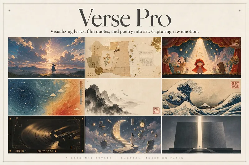
Turn a favorite lyric, piece of film narration, poem, or quote into a vivid visual expression—transforming its emotion into a poster with resonance, a clear point of view, and a sophisticated editorial design sensibility. This is not a text template, but an editorial creative process from “emotion → visual”: first, lightly research the source—the background of the song, film, or poem and the creator’s original intent—then distill a powerful central metaphor that makes people pause and have an Aha moment. Finally, restrained typography, low-saturation colors, and a single high-purity anchor come together in a design piece that truly belongs on a wall or ready to publish. The visual metaphor always takes center stage. By default, 2–4 complete lyric lines are retained as a finishing touch, while the song title and artist appear as understated credits in ultra-fine publication details, never competing for attention. Nine original styles, each with a complete visual language: Japanese cinematic skies / vintage paper craft / fairytale theater / emotional weather maps / Chinese ink wash / ukiyo-e crashing waves / vintage audiovisual archives / dreamlike surrealism / emotional monuments. All are non-photorealistic—using the visual languages of illustration, printmaking, graphic design, and hand-drawn animated films, without copying any IP or artist’s imagery. Two ways to create, whether you want speed or detail: ① Fully automatic mode: Drop in lyrics, narration, poetry, or a quote, and research, metaphor, style, layout, type, and color are all decided automatically. Get the image directly with no choices to make. ② Step-by-step selection mode: Answer choices appear one at a time, each with a ★Recommended option. You can also upload a reference image to fine-tune the mood only. Confirm each choice before generating for complete control over the concept.
Idea to Infographic
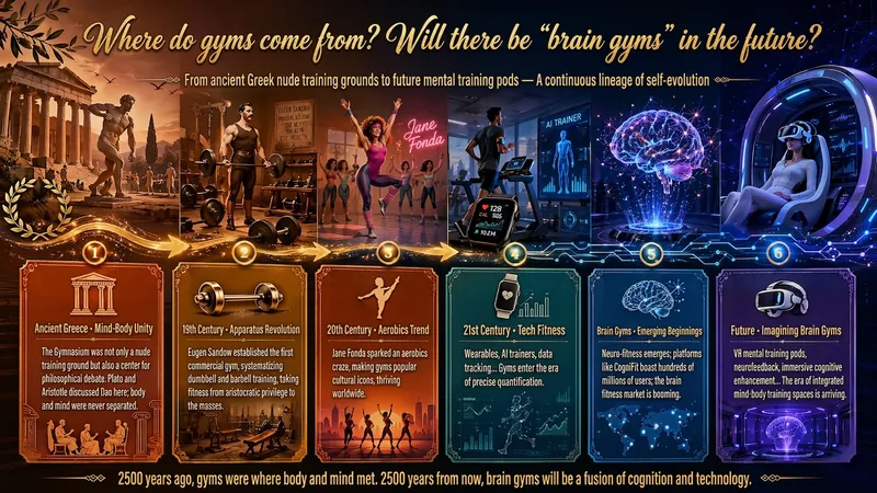
A single image, a single sentence is all it takes. Have you ever had this experience—you have a great idea and want to turn it into an infographic like the ones big accounts post, but: - Open an AI image tool, rewrite prompts over and over, and the result either has terrible layout or completely mismatched style. - Tried several prompt templates, each requiring three or four adjustments, and half an hour later you're still not done. - Want styles like financial literacy, Chinese classic, science, tech... each time you have to research colors and layouts from scratch. Now you don't have to. 「Idea to Infographic」automates all of this: You say "make an emotion management infographic," and it decides whether to use a warm Chinese style or a healing scientific style, searches and organizes core knowledge points, breaks them into 6-8 module cards, assembles the optimal prompt, and quality-checks—if it fails, it automatically redoes; if it passes, it hands it right to you. Four killer capabilities, all built-in: 🧠 **Style Engine** — Not a rigid four-choice. If your topic matches financial literacy, it automatically goes with deep blue gold; if it matches Chinese classics, it uses rice paper and ink; if it matches technology, it uses cyan neon. For topics outside these four? It automatically synthesizes a new style. Coffee encyclopedia → food warm tones; exercise and fitness → vibrant orange gray. No style it can't handle. 🔍 **Content Brain** — You give a word, it searches the web to fill out content; you give a paragraph, it extracts the core; you give nothing but a topic, it organizes everything clearly. All three input methods are supported—the simpler, the more effortless. 📐 **Layout Adviser** — Progressive ladders, side-by-side comparisons, causal chains, overarching-subcategory radiation... Five logical patterns automatically matched. Not just stuffing text into an image, but actually designing an infographic. ✅ **Self-Inspection** — After generating, it automatically checks layout, text density, image-to-text ratio, and style match. If there's an issue, it adjusts and regenerates, up to two times. You don't need to know how to write prompts; you just need to know how to speak. **Who is this Skill for?** - Social media creators who need to produce images daily but don't want to learn design. - Knowledge commerce creators who want to visualize course content but lack a designer. - Corporate trainers who need professional infographics but lack budget for outsourcing. 🔍 - Anyone who wants to turn an idea into a great image. In a word: You have the idea, it has the image. All the hassle in between, it handles for you.
Information
- Version
- v2
- Last updated
- Runtime credits
- Usage-based
- Models
- Auto