Geometric Composition | xiaoxiaodong P322
By xiaoxiaodong
Geometric Composition | xiaoxiaodong P322
By xiaoxiaodong
Showcase
Description
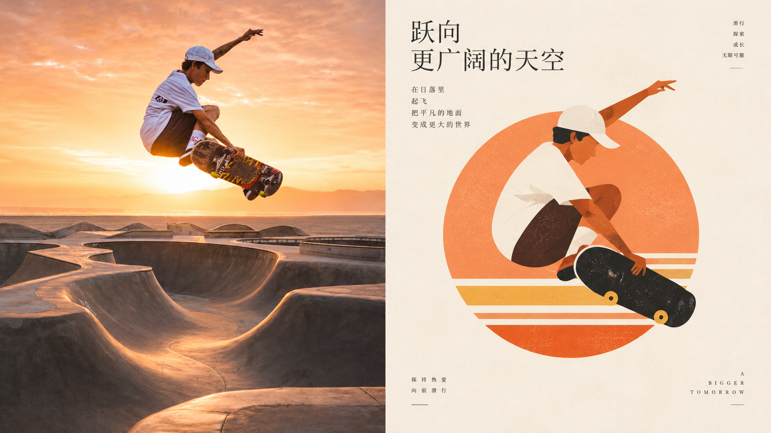
Turn an ordinary photo into a small graphic for an arts organization, cultural brand, or travel keepsake. The top half shows the original photo; the bottom half reorganizes the subject with circles, rectangles, arcs, and triangles—first forming a balanced composition, then allowing viewers to recognize the original object. You can add a ring, a horizontal line, or a structural axis to aid recognition. Extract a limited palette from the original image: clear blue, cream white, warm yellow, coral orange, soft green, peach pink, and dark brown. Build a system with a primary color, supporting colors, and accents. Keep the mark small and the negative space generous. Avoid details, complete scenes, too many supporting shapes, and generic app icons.
Recommended by
Dancang
Why we love this skill
Refines photos into restrained, recognizable geometric symbols, using simple shapes and generous negative space for balanced, editorial compositions.
Best for
For creators, brand teams, and travelers who want to turn photos into simple geometric logos or keepsake graphics.
How to use this Skill
Provide your input
Provide a photo or image directory.
Run the Skill
Reduce the photo’s subject to a balanced small graphic made of circles, rectangles, arcs, and triangles, using a limited palette drawn from the original image.
Review your result
Get a geometric composition PNG with generous negative space, suitable for an arts organization, cultural brand, or travel keepsake.
Related Skills
View all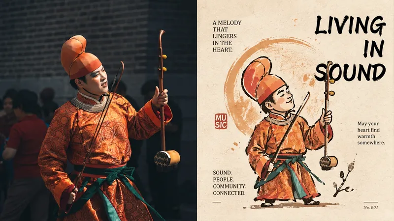 Image
xiaoxiaodong P320 Silhouette
For turning an ordinary photo into a distinctive character captured by an artist—not a commercial mascot. The top half is the original image; the bottom half first establishes a silhouette, then layers broken, overflowing, and not-quite-closed gesture lines over it. Proportions may be rounded or slightly distorted. A circle, star, or sprig of a plant can support the identity, but must not become the background. Ink lines sit on paper, loose yet controlled, forming a small collectible icon. Use a warm, limited palette: warm yellow, ochre, soft orange, off-white, dark brown, and deep red, with a small amount of cool color for balance. Avoid smooth vector shapes, excessive retouching, cute IP, and complete scenes.
Cultural Silhouette|xiaoxiaodong P278
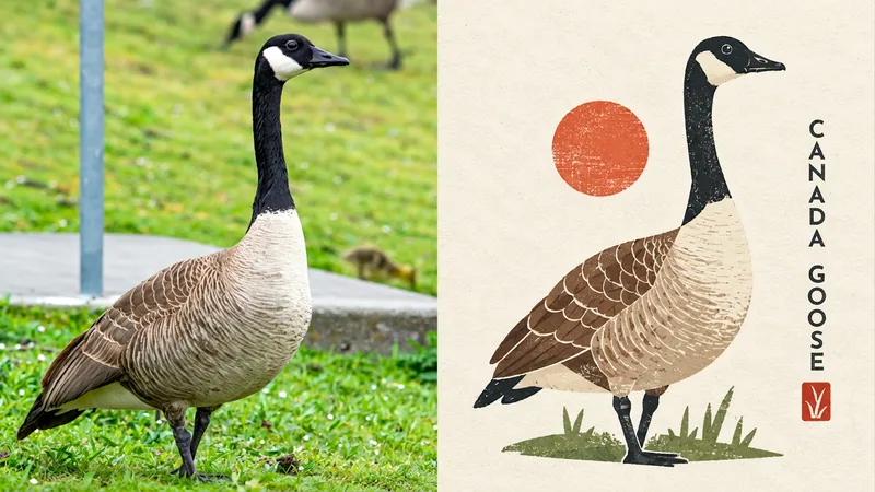
Turn an ordinary photo into a cultural emblem with a collectible feel. The upper half shows the original photo; the lower half compresses the subject into a memorable miniature identity system. Geometric simplification, paper-cut collage, flat color blocks, and symbolic forms create an abstract graphic reminiscent of a cultural institution mark, art badge, or design studio logo. The subject resembles a carefully designed miniature cultural seal, centered or slightly offset with clean space around it. Large areas of solid color, clear contours, and a few internal structure lines preserve a simulated print texture inspired by screen printing, Riso overprint misalignment, and uneven ink coverage. The palette uses warm ivory and beige paper as the background, with forest green, cobalt blue, soft yellow, and coral red shaping the subject. Avoid complex scenes, cartoon characters, commercial logo templates, and sleek corporate vector styling.
 Image
Paper-Cut Totem | xiaoxiaodong P305
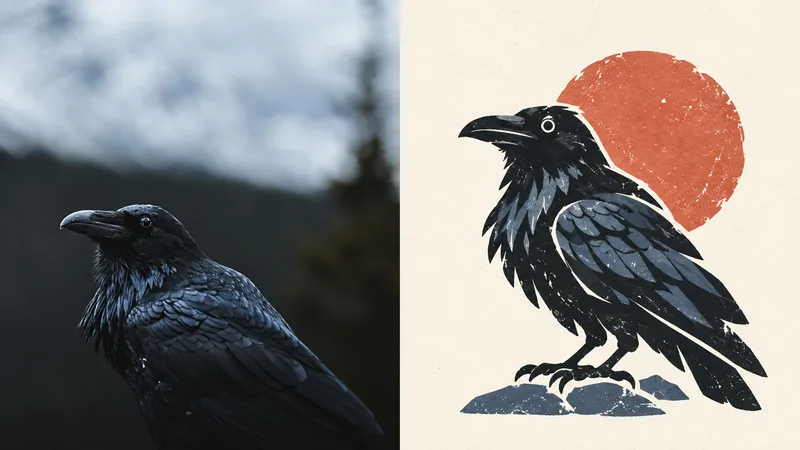
Ideal for turning an ordinary photo into a cultural symbol that remains recognizable when reduced in size. The subject is compressed directly into a standalone paper-cut visual totem, with form taking priority: bold outer contours, a few geometric shapes, and rounded edges, with slightly exaggerated proportions and a hint of charming awkwardness. Retain irregular cut edges, white paper borders, screen-print grain, uneven ink coverage, and slight color-registration shifts. Use a single core symbol with generous negative space for a stable, brand-recognizable feel. Keep the palette vivid but easy on the eyes: coral, warm yellow, botanical green, misty blue, cream, and brick red, divided into primary, secondary, and accent colors. Avoid complex textures, full figures, commercial cartoon logos, smooth vector art, gradients, and cheap candy colors.
Information
- Version
- v3
- Last updated
- Runtime credits
- Usage-based
- Models
- Auto
- Use cases
- Images & designMarketing & growthLifestyle & entertainment
- What you get
- Image
- Visual styles
- MinimalistFlat