Xiaoxiaodong × Red/Black
Created by Xiaoxiaodong
Description
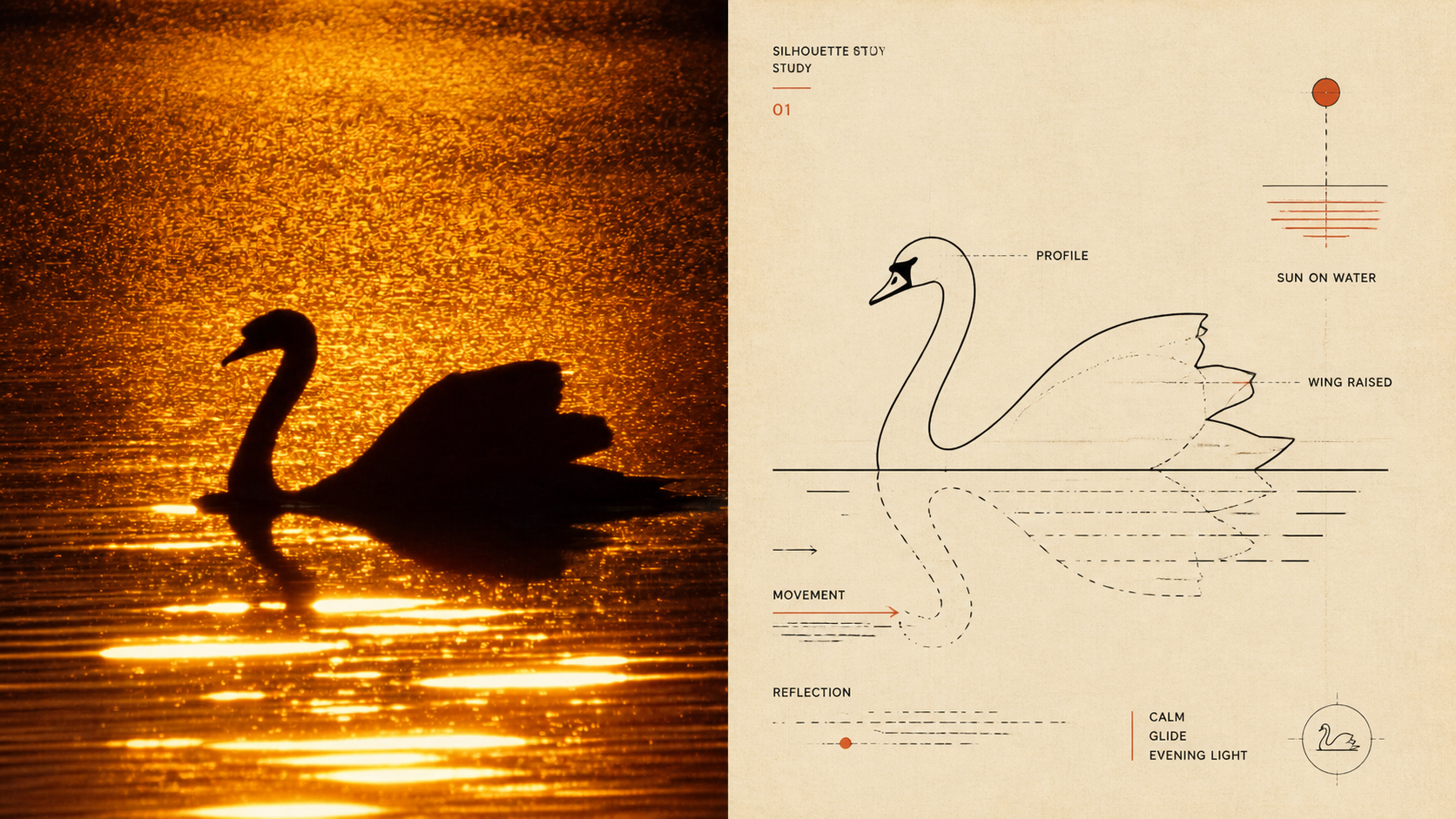
Panel 095 centers on mid-century modern diagrammatic editorial illustration: using visual shorthand, pictographic simplification, fine lines, curves, icons, partial sections, and guide lines to preserve the contours, nodes, direction, actions, and relationships that define an object’s identity. Black carries most of the information, while vermilion/coral red is used only as a precise spot color. Warm-white paper, ink grain, registration shifts, and overprint give it the feel of plates from early information design and independent publications. Ideal for these situations Need to explain complex objects clearly: Preserve identity, structure, and action with the fewest accurate visual elements. Prefer the reading path of vintage publications: Use the main diagram as the sole anchor, with supporting visuals connected through changes in scale, offset, alignment, and guide lines. Want a restrained two-color system: Black, red, and paper white create a clear rhythm, with red marking only the nodes most worth emphasizing. Need flexible delivery: Supports top-bottom, left-right, design-only, multiple-ratio, and four-edge wallpaper formats, and can also batch-process image directories.
Related Skills
View all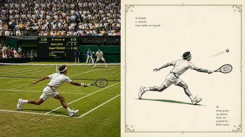
Xiaoxiaodong × Classic × Title Page × P094
Panel 094 uses delicate ink lines, selective solid black, and minimal hatching to distill a single spot color from a photograph. With generous negative space, an optional hand-drawn decorative border, and classical publishing type, it reconstructs a quiet scene reminiscent of an early 20th-century children’s book or poetry collection title page. Ideal for these situations Want to keep the subject while removing noise: Leave only the cues needed to convey identity, posture, emotion, and narrative relationships. Enjoy classic two-color publications: Pair black ink with one spot color drawn from the original image, ivory paper, and slight misregistration. Need truly meaningful negative space: The subject can be reduced, isolated, or suspended, allowing the empty space to become part of the poetry. Need flexible delivery: Supports top-to-bottom, left-to-right, pure design, multiple aspect ratios, and four-sided wallpapers, as well as batch processing of image directories.
Xiaoxiaodong x String Map P087
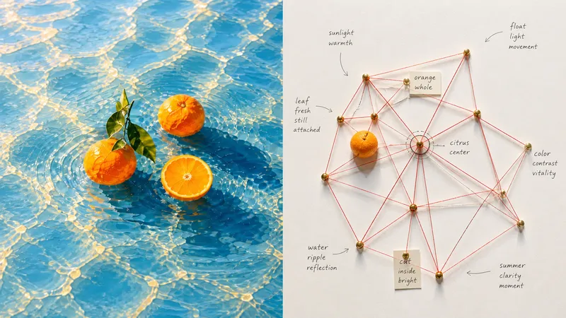
Turning a photo directly into a conventional flowchart loses the real spatial relationships between its subjects; random red strings and a wall of nodes can also become a cheap detective board or digital network UI. Panel 087 extracts subjects, outlines, structures, poses, and narrative relationships from a photo, breaks them into a small number of meaningful pushpin nodes, and reconnects them with real string to create a tactile system map. Relationships are denser at the center and gradually loosen toward the edges; vermilion or coral-red string forms emergent geometry on natural white cardstock, while preserving pin shadows, overlapping intersections, handwritten labels, and authentic handmade imperfections. Ideal for these situations Want to understand relationships between subjects: Turn movement directions, spatial positions, structural transitions, and environmental clues into nodes and connections. Need a realistic installation feel: Use pushpins, cotton string, paper labels, pin shadows, variations in tension, and slight occlusion instead of a computer-drawn network diagram. Want a complex yet orderly composition: Use a central node or relationship as the hub, keeping the center dense and the edges sparse while preserving ample negative space. Need flexible delivery: Supports vertical, horizontal, design-only, multiple aspect ratios, and four-edge wallpapers, as well as batch processing for image folders.
Xiaoxiaodong × Collage P093
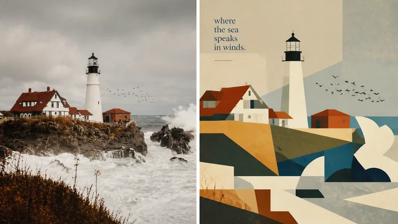
Panel 093 preserves the subject, contours, pose, and narrative relationships from a photo, then distills them into rectangles, trapezoids, triangles, circles, and a small number of freeform planes. Space is created not through realistic perspective or complex shadows, but through occlusion, changes in scale, layered color blocks, and positional relationships. Bright colors, lightly hand-drawn edges, and a matte gouache texture give the result both the flatness of paper cutouts and the polish of an independent publication. Suitable for these situations Want to make a complex photo instantly readable: Merge repeated elements while preserving the key identity-defining features with as few shapes as possible. Need vivid yet sophisticated colors: Start with the brightest, most memorable colors in the original image, then reorganize them into a limited, clear palette of combined color blocks. Seeking a refined modernist simplicity: Use flat space, lightly irregular edges, and a matte gouache/acrylic finish to avoid a glossy vector look or template-like feel. Need flexible delivery: Supports top-to-bottom, left-to-right, design-only, multiple aspect ratios, and four-edge wallpapers, as well as batch processing for image directories.
Xiaoxiaodong × Red/Black
Created by Xiaoxiaodong
Description
Panel 095 centers on mid-century modern diagrammatic editorial illustration: using visual shorthand, pictographic simplification, fine lines, curves, icons, partial sections, and guide lines to preserve the contours, nodes, direction, actions, and relationships that define an object’s identity. Black carries most of the information, while vermilion/coral red is used only as a precise spot color. Warm-white paper, ink grain, registration shifts, and overprint give it the feel of plates from early information design and independent publications. Ideal for these situations Need to explain complex objects clearly: Preserve identity, structure, and action with the fewest accurate visual elements. Prefer the reading path of vintage publications: Use the main diagram as the sole anchor, with supporting visuals connected through changes in scale, offset, alignment, and guide lines. Want a restrained two-color system: Black, red, and paper white create a clear rhythm, with red marking only the nodes most worth emphasizing. Need flexible delivery: Supports top-bottom, left-right, design-only, multiple-ratio, and four-edge wallpaper formats, and can also batch-process image directories.
Related Skills
View allXiaoxiaodong × Classic × Title Page × P094
Panel 094 uses delicate ink lines, selective solid black, and minimal hatching to distill a single spot color from a photograph. With generous negative space, an optional hand-drawn decorative border, and classical publishing type, it reconstructs a quiet scene reminiscent of an early 20th-century children’s book or poetry collection title page. Ideal for these situations Want to keep the subject while removing noise: Leave only the cues needed to convey identity, posture, emotion, and narrative relationships. Enjoy classic two-color publications: Pair black ink with one spot color drawn from the original image, ivory paper, and slight misregistration. Need truly meaningful negative space: The subject can be reduced, isolated, or suspended, allowing the empty space to become part of the poetry. Need flexible delivery: Supports top-to-bottom, left-to-right, pure design, multiple aspect ratios, and four-sided wallpapers, as well as batch processing of image directories.
Xiaoxiaodong x String Map P087
Turning a photo directly into a conventional flowchart loses the real spatial relationships between its subjects; random red strings and a wall of nodes can also become a cheap detective board or digital network UI. Panel 087 extracts subjects, outlines, structures, poses, and narrative relationships from a photo, breaks them into a small number of meaningful pushpin nodes, and reconnects them with real string to create a tactile system map. Relationships are denser at the center and gradually loosen toward the edges; vermilion or coral-red string forms emergent geometry on natural white cardstock, while preserving pin shadows, overlapping intersections, handwritten labels, and authentic handmade imperfections. Ideal for these situations Want to understand relationships between subjects: Turn movement directions, spatial positions, structural transitions, and environmental clues into nodes and connections. Need a realistic installation feel: Use pushpins, cotton string, paper labels, pin shadows, variations in tension, and slight occlusion instead of a computer-drawn network diagram. Want a complex yet orderly composition: Use a central node or relationship as the hub, keeping the center dense and the edges sparse while preserving ample negative space. Need flexible delivery: Supports vertical, horizontal, design-only, multiple aspect ratios, and four-edge wallpapers, as well as batch processing for image folders.
Xiaoxiaodong × Collage P093
Panel 093 preserves the subject, contours, pose, and narrative relationships from a photo, then distills them into rectangles, trapezoids, triangles, circles, and a small number of freeform planes. Space is created not through realistic perspective or complex shadows, but through occlusion, changes in scale, layered color blocks, and positional relationships. Bright colors, lightly hand-drawn edges, and a matte gouache texture give the result both the flatness of paper cutouts and the polish of an independent publication. Suitable for these situations Want to make a complex photo instantly readable: Merge repeated elements while preserving the key identity-defining features with as few shapes as possible. Need vivid yet sophisticated colors: Start with the brightest, most memorable colors in the original image, then reorganize them into a limited, clear palette of combined color blocks. Seeking a refined modernist simplicity: Use flat space, lightly irregular edges, and a matte gouache/acrylic finish to avoid a glossy vector look or template-like feel. Need flexible delivery: Supports top-to-bottom, left-to-right, design-only, multiple aspect ratios, and four-edge wallpapers, as well as batch processing for image directories.
Find your next favorite skill
Explore more curated AI skills for research, creation, and everyday work.