Elevate Frontend Aesthetics
Instructions
Avoid mediocre "AI slop" aesthetics and create a surprisingly unique front end.
## Five Core Dimensions
**1. Typography**
- ❌ Prohibited: Inter, Roboto, Arial, System Fonts
- ✅ Choose: Unique, distinctive fonts
- ✅ Combination: Showcase font + Body font, high contrast
- ✅ Tips: Extreme font weight contrast (100 vs 900), large font size range (3x+)
**2. Color & Theme**
- ✅ Maintain a consistent aesthetic by using CSS variables.
- ✅ Dominant color + vibrant accent color
- ❌ Avoid: Purple gradient + white background
- ✅ Inspiration: IDE themes, cultural aesthetics
**3. Motion**
- ✅ CSS animations take precedence (HTML)
- ✅ Motion Library
- ✅ Focus on High Impact: A Carefully Curated Page Load > Scattered Micro-Interactions
- ✅ Scroll trigger, hover surprise
**4. Spatial Layout**
- ✅ Asymmetrical, overlapping, diagonal flow
- ✅ Break the grid, bold use of white space OR controlled density
**5. Background Details**
- ✅ Create atmosphere and depth
- ✅ Gradient mesh, noise, geometric patterns
- ✅ Layered transparency, dramatic shadows, decorative borders
## Key Principles
- Each design should be different to avoid repetitive convergence.
- Achieving a complexity-matched aesthetic vision
Extreme complexity requires meticulous design, while minimalism requires restraint and precision.
- Break free from conventional thinking and make truly unique choices
⚡ One-line summary
Unique font + bold color scheme + meticulous animation + innovative layout + atmospheric background = unforgettable front-end design
Reject: Inter/Roboto, purple gradient white background, monotonous layout
📋 Quick Checklist
Dimensions and Inspection Items
Should the fonts avoid Inter/Roboto? Are there any unique color combinations?
Does the color scheme have a unified theme? Should purple gradients be avoided?
Does the animation have a carefully choreographed loading effect?
Does the layout deviate from the conventional grid?
Does the background create depth and atmosphere?
Description
Recommended by
nene@YouMind
Why we love this skill
Tired of the same old 'AI slop' design? This skill will help you break free from mediocrity, creating stunning front-end interfaces with unique typography, bold colors, subtle animations, innovative spatial layouts, and deeply atmospheric backgrounds. It offers a practical aesthetic guide to make your work stand out from the crowd and achieve a true visual breakthrough.
Unique font personality, dark cyberpunk aesthetics, asymmetric dynamic layout, carefully orchestrated loading animations, and immersive atmosphere creation.
Related Skills
View all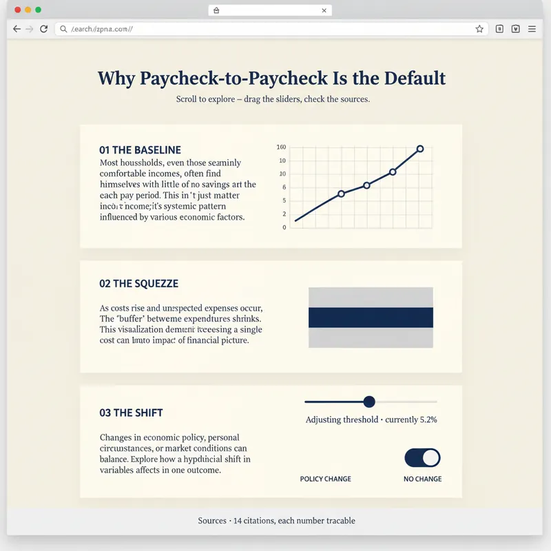 Webpage
Explorable Explainer Page Builder
A report explains. A page lets people find out for themselves. YouMind can already build webpages. Explorable Explainer decides what to build — it turns a piece of research, a dataset or a topic into a single interactive page in the tradition of newsroom graphics and explorable explanations: scroll-driven narrative, real charts, controls you can move, sources you can check. It plans before it codes. You approve a build plan first: the one question the page answers, the reveal — the moment the reader should feel "oh" — a five to eight section scroll spine, two to four interactions each justified by what the reader learns from moving it, and a data contract listing every number and where it came from. Then it builds one self-contained HTML file with no build step. Semantic markup. All numbers in a single editable DATA constant at the top. Scroll reveals that do not break on a phone. Every control a real, keyboard-operable form element with live text describing its current value. Accessibility is built in rather than bolted on: 4.5:1 contrast, visible focus rings, alt text everywhere, no meaning carried by colour alone, reduced-motion respected, responsive from 360px. Before handing over, it runs a five-point self-review and reports the results honestly: does the reveal actually land, does the page still read with JavaScript off, is the tab order sane, is every number traceable, is anything animating that a reader would want to stop. Two rules it will not break: it never invents data to make a chart look good, and it tells you when your numbers contradict your draft. For researchers, analysts, journalists, educators, indie founders and consultants who want their work to be explored rather than skimmed.
 Webpage
Soft Daylight Floating Web
Soft daylight style web design system: light sky-blue canvas (#ebf5ff), oversized display text with a fixed font weight of 500 (responsive up to 148px), 32px rounded cards + 9999px pills, near-black #181d27 solid CTA buttons, pastel color blocks, and floating 3D clay-style illustrations. Depth is achieved solely through tonal shifts from canvas to cards; content cards have zero shadow. Suitable for 'soft daylight style', '3D illustration landing pages', 'light blue canvas', 'rounded card style', 'SaaS homepage', 'Linear/Framer style', etc., with built-in accessibility and responsive constraints.
 Webpage
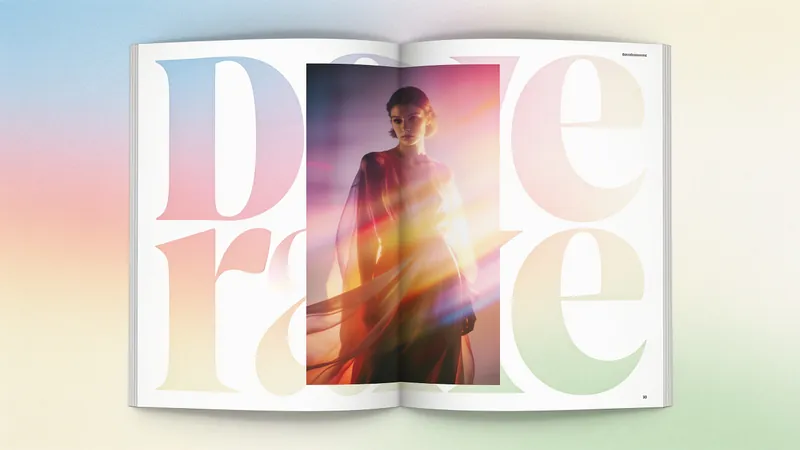
Fashion Creative Design Page
A web design system with a fashion-editorial poster style: warm cream paper canvas (#fffef7), 300-weight oversized headlines (64–84px), full-bleed photography, zero shadows, square-corner cards + pill buttons with a 1440px radius. Suitable for needs such as "fashion design style", "magazine layout", "poster style", "art portfolio webpage", "studio portfolio", "gallery page". It can rewrite any content into a high-end fashion editorial style page.
Elevate Frontend Aesthetics
Instructions
Avoid mediocre "AI slop" aesthetics and create a surprisingly unique front end.
## Five Core Dimensions
**1. Typography**
- ❌ Prohibited: Inter, Roboto, Arial, System Fonts
- ✅ Choose: Unique, distinctive fonts
- ✅ Combination: Showcase font + Body font, high contrast
- ✅ Tips: Extreme font weight contrast (100 vs 900), large font size range (3x+)
**2. Color & Theme**
- ✅ Maintain a consistent aesthetic by using CSS variables.
- ✅ Dominant color + vibrant accent color
- ❌ Avoid: Purple gradient + white background
- ✅ Inspiration: IDE themes, cultural aesthetics
**3. Motion**
- ✅ CSS animations take precedence (HTML)
- ✅ Motion Library
- ✅ Focus on High Impact: A Carefully Curated Page Load > Scattered Micro-Interactions
- ✅ Scroll trigger, hover surprise
**4. Spatial Layout**
- ✅ Asymmetrical, overlapping, diagonal flow
- ✅ Break the grid, bold use of white space OR controlled density
**5. Background Details**
- ✅ Create atmosphere and depth
- ✅ Gradient mesh, noise, geometric patterns
- ✅ Layered transparency, dramatic shadows, decorative borders
## Key Principles
- Each design should be different to avoid repetitive convergence.
- Achieving a complexity-matched aesthetic vision
Extreme complexity requires meticulous design, while minimalism requires restraint and precision.
- Break free from conventional thinking and make truly unique choices
⚡ One-line summary
Unique font + bold color scheme + meticulous animation + innovative layout + atmospheric background = unforgettable front-end design
Reject: Inter/Roboto, purple gradient white background, monotonous layout
📋 Quick Checklist
Dimensions and Inspection Items
Should the fonts avoid Inter/Roboto? Are there any unique color combinations?
Does the color scheme have a unified theme? Should purple gradients be avoided?
Does the animation have a carefully choreographed loading effect?
Does the layout deviate from the conventional grid?
Does the background create depth and atmosphere?
Description
Recommended by
nene@YouMind
Why we love this skill
Tired of the same old 'AI slop' design? This skill will help you break free from mediocrity, creating stunning front-end interfaces with unique typography, bold colors, subtle animations, innovative spatial layouts, and deeply atmospheric backgrounds. It offers a practical aesthetic guide to make your work stand out from the crowd and achieve a true visual breakthrough.
Unique font personality, dark cyberpunk aesthetics, asymmetric dynamic layout, carefully orchestrated loading animations, and immersive atmosphere creation.
Related Skills
View allWebpageExplorable Explainer Page Builder
A report explains. A page lets people find out for themselves. YouMind can already build webpages. Explorable Explainer decides what to build — it turns a piece of research, a dataset or a topic into a single interactive page in the tradition of newsroom graphics and explorable explanations: scroll-driven narrative, real charts, controls you can move, sources you can check. It plans before it codes. You approve a build plan first: the one question the page answers, the reveal — the moment the reader should feel "oh" — a five to eight section scroll spine, two to four interactions each justified by what the reader learns from moving it, and a data contract listing every number and where it came from. Then it builds one self-contained HTML file with no build step. Semantic markup. All numbers in a single editable DATA constant at the top. Scroll reveals that do not break on a phone. Every control a real, keyboard-operable form element with live text describing its current value. Accessibility is built in rather than bolted on: 4.5:1 contrast, visible focus rings, alt text everywhere, no meaning carried by colour alone, reduced-motion respected, responsive from 360px. Before handing over, it runs a five-point self-review and reports the results honestly: does the reveal actually land, does the page still read with JavaScript off, is the tab order sane, is every number traceable, is anything animating that a reader would want to stop. Two rules it will not break: it never invents data to make a chart look good, and it tells you when your numbers contradict your draft. For researchers, analysts, journalists, educators, indie founders and consultants who want their work to be explored rather than skimmed.
WebpageSoft Daylight Floating Web
Soft daylight style web design system: light sky-blue canvas (#ebf5ff), oversized display text with a fixed font weight of 500 (responsive up to 148px), 32px rounded cards + 9999px pills, near-black #181d27 solid CTA buttons, pastel color blocks, and floating 3D clay-style illustrations. Depth is achieved solely through tonal shifts from canvas to cards; content cards have zero shadow. Suitable for 'soft daylight style', '3D illustration landing pages', 'light blue canvas', 'rounded card style', 'SaaS homepage', 'Linear/Framer style', etc., with built-in accessibility and responsive constraints.
WebpageFashion Creative Design Page
A web design system with a fashion-editorial poster style: warm cream paper canvas (#fffef7), 300-weight oversized headlines (64–84px), full-bleed photography, zero shadows, square-corner cards + pill buttons with a 1440px radius. Suitable for needs such as "fashion design style", "magazine layout", "poster style", "art portfolio webpage", "studio portfolio", "gallery page". It can rewrite any content into a high-end fashion editorial style page.
Find your next favorite skill
Explore more curated AI skills for research, creation, and everyday work.