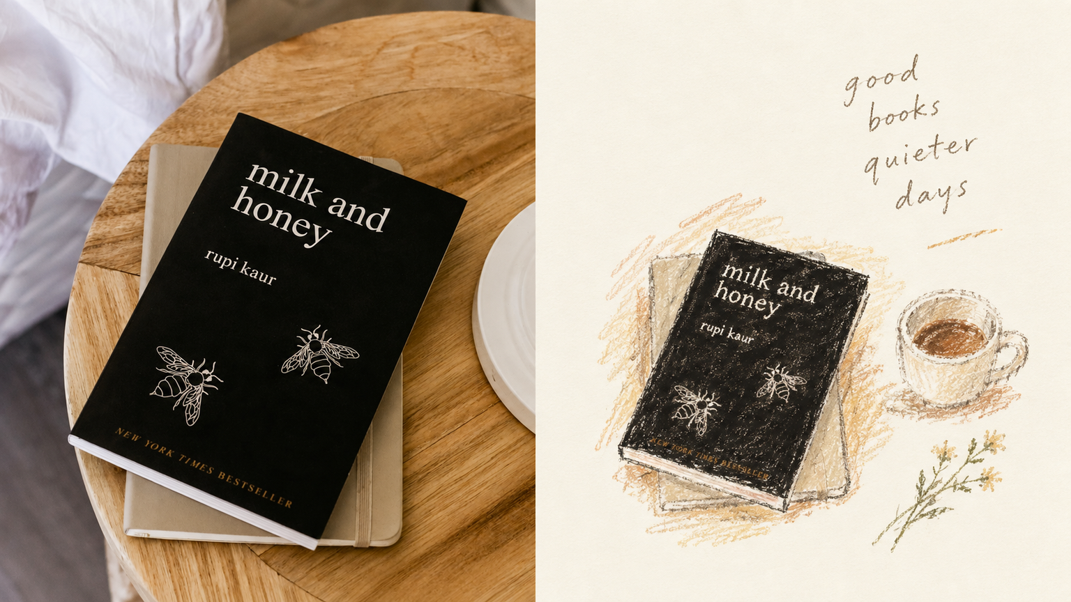
GPT2 x Crayon Visual Diary
By xiaoxiaodong · P240
GPT2 x Crayon Visual Diary
By xiaoxiaodong · P240
Showcase
Description
Ideal for turning photos into a private visual diary: travel notes, everyday moments, and independent publishing. Keep the original image recognizable in the upper half; in the lower half, retain only the one action or relationship most worth remembering. Keep the subject small—it can be off-center, close to the edge, or cropped. Let the blank space carry air and time. Use loose oil pastels and crayons, with open contours, broken edges, and the friction of paper grain and wax still visible. Deliberately stop short of completion. Derive the colors from the original image’s temperature: warm ivory, soft blue-gray, plant green, terracotta, apricot brown, and dusty pink. The result should feel quiet, intimate, slightly awkward, yet mature. Avoid filling the frame, smooth polished rendering, dark brown aging effects, fluorescent colors, and overly sweet candy tones.
Recommended by
淡苍
Why we love this skill
Turns photos into intimate crayon diaries through whitespace, off-center composition, and unfinished lines—capturing a restrained, artfully awkward mood unlike typical retro filters or commercial illustrations.
Related Skills
View all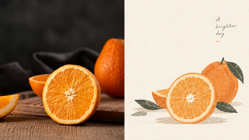 Image
ImageGPT2 x New Folk Art
Ideal for turning everyday photos into quiet, nostalgic illustrated vignettes with a contemporary folk-art sensibility—for organizing personal photography, independent publishing, exhibition studies, and lifestyle brands. The upper half preserves the original image's recognizability; the lower half does not simply apply a filter, but retains only the most identifiable shapes and relationships, reworking a beautiful moment with rounded, simplified forms, powdery gouache, and an abundance of negative space. The overall result is quiet, intimate, poetic, restrained, warm, and nostalgic: small-scale subjects, generous negative space, powder blue and ivory, botanical green, and small touches of coral red. Avoid densely filled realism, high saturation, fluorescent colors, a slick digital look, plasticity, and piles of commercial-style headlines.
 Image
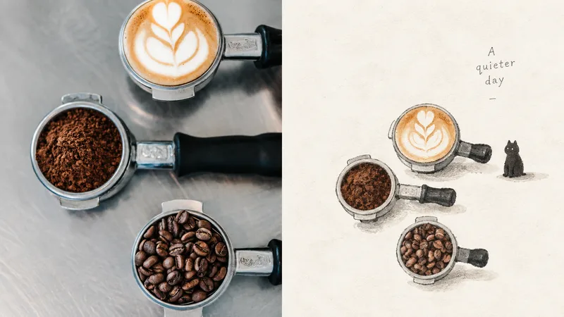
ImageGPT2 x Gothic Miniature
Ideal for turning strong or complex photos into fragile, understated picture-book metaphors for literary visuals, independent publishing, and exhibition pieces. The upper half retains a recognizable version of the original image; the lower half keeps only its most symbolic features, forming a small, isolated figure. Surround it with an enormous amount of empty space and, at most, one extremely faint cast shadow. Opaque gouache with thin watercolor, dry-brush marks, pencil, uneven blacks, and hesitant edges. The main colors are charcoal black, ivory white, and soft gray, with warm peach or pale apricot used only as tiny accents. A little dark but not frightening, a little awkward but not cutesy. Avoid smooth finishes, polished CG, commercial cartoons, complex backgrounds, and cinematic lighting.
 Image
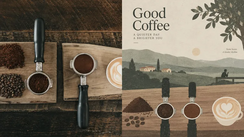
ImageGPT2 x Horizontal Folk Art
Ideal for turning photos into quiet, detached, place-aware editorial illustrations with a modern folk-art sensibility—for independent publishing, exhibition studies, and local visual work. The upper half preserves the recognizable source image; the lower half compresses the scene into shallow horizontal bands of color—fields, roads, walls, rooftops, and trees—with extremely low density and generous negative space. If people appear, they are tiny, isolated points. Matte paper, subtle screen-print grain, and the texture of vintage book illustrations. A highly desaturated palette—gray-green, sage, warm beige, light gray, faded burgundy, and earth brown—compressed from the original image. Overcast, diffused light. Avoid high saturation, fluorescents, heavy rendering, a slick digital feel, and commercial titles.
Information
- Version
- v4
- Last updated
- Runtime credits
- Usage-based
- Models
- Auto