GPT2 x Spot-Color Poster
By xiaoxiaodong · P239
GPT2 x Spot-Color Poster
By xiaoxiaodong · P239
Showcase
Description
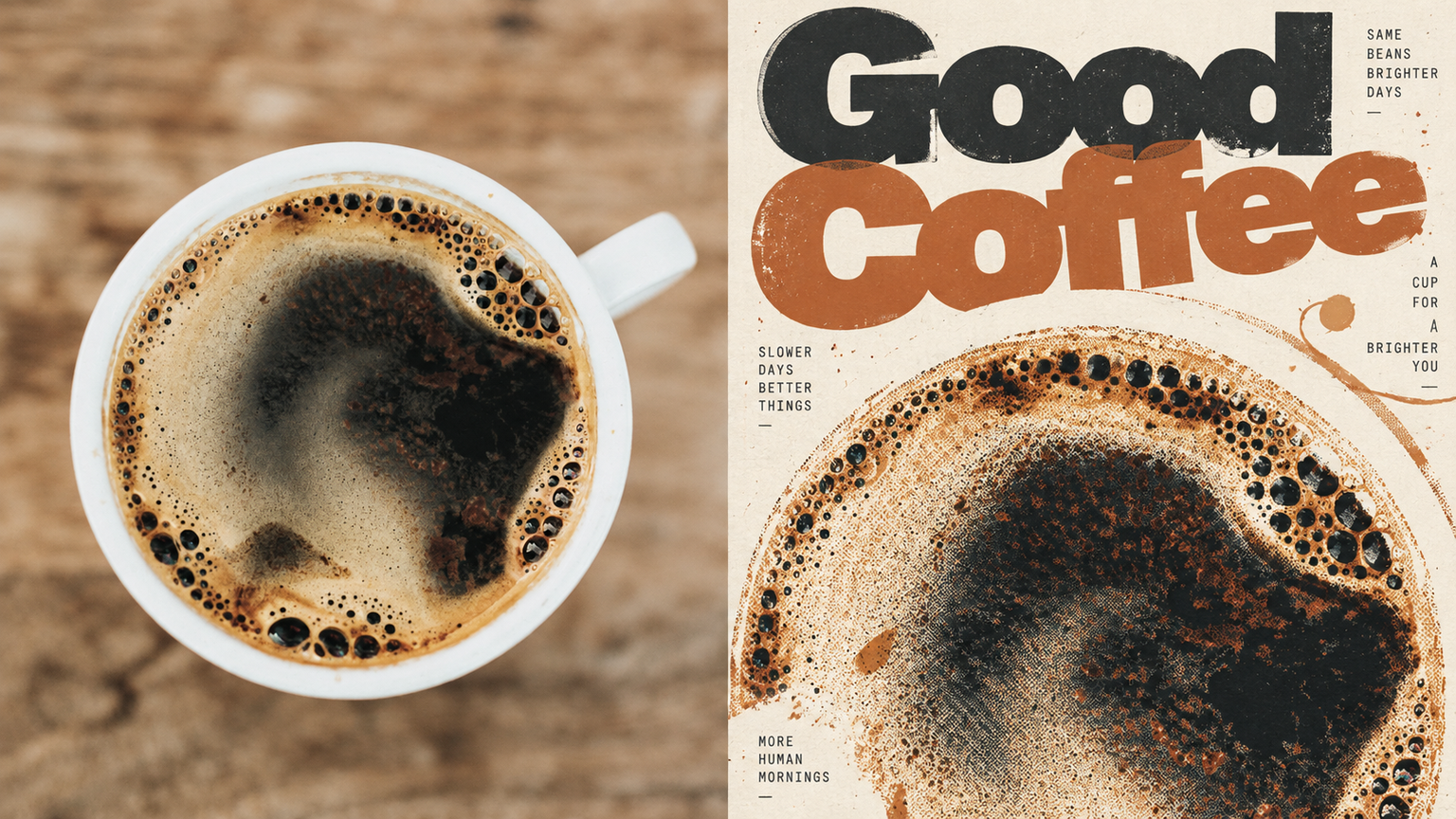
Ideal for turning photos into experimental independent magazine posters: covers, exhibition graphics, and visual studies. Keep the upper half recognizable as the original photo; rework the subject in the lower half with limited spot colors, translucent overprinting, visible halftone dots, and slight misregistration. The subject can be cropped, off-center, or partially extend beyond the frame. Use generous negative space, with every element orbiting a visual center. The title can be large enough to nearly become a graphic, overlapping and weaving through the image. Supporting text should be tiny. Use warm white, uncoated paper with visible fibers and controlled imperfection. Avoid tidy brand templates, complex collages, digital gradients, and fluorescent screen glow.
Recommended by
淡苍
Why we love this skill
Turns user photos into independent-magazine-style spot-color misprint posters using halftones, transparent overprint, slight registration shifts, and paper grain, then anchors them with bold typography.
Related Skills
View all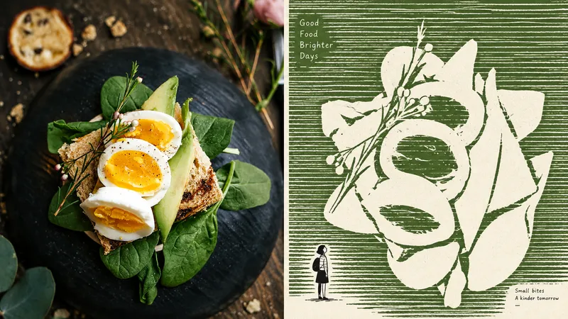 Image
ImageGPT2 x Negative Monument
For turning everyday photos into minimalist independent-publication illustrations: exhibition studies, personal photography projects, and literary visuals. The upper half retains a recognizable version of the original photo; the lower half does not depict the subject, but instead builds a field of dense, slightly shaky, broken horizontal strokes, leaving the subject as a huge, quiet expanse of negative space. A tiny, naïve figure contrasts with, passes through, or accompanies this monument. Use no more than three colors: a warm white paper ground, one soft, bright ink color drawn from the source image, and black. The image must use flat graphic forms while retaining paper texture and slight misregistration. Avoid volumetric rendering, gradients, shadows, smooth digital rendering, and flashy multicolor treatments.
 Image
ImageGPT2 x Architectural Type
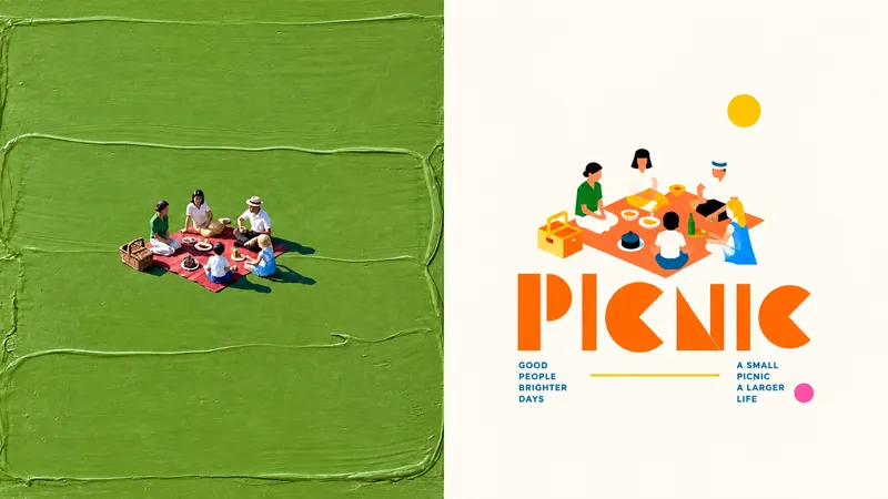
Suitable for organizing personal photography, independent publishing, exhibition studies, and lifestyle-oriented visual work. Even when the original image has an ordinary composition, a cluttered background, or a subject that is too small, you can reestablish a focal point through reduction, reorganization, cropping, and changes in scale—instead of simply applying a filter. A refined visual effect emerges from a small-scale central key visual, architectural typography, modular geometric construction, high-contrast functional color coding, and generous negative space. The style draws on the editorial language of public cultural visuals, art festival posters, architectural visual systems, and international design studios. Avoid full-bleed compositions, complex backgrounds, multiple equally weighted focal points, ordinary text layouts, realistic illustration, a cartoon feel, 3D rendering, cheap color clashes, and a templated poster look.
 Image
ImageGPT2 x Editorial Visual
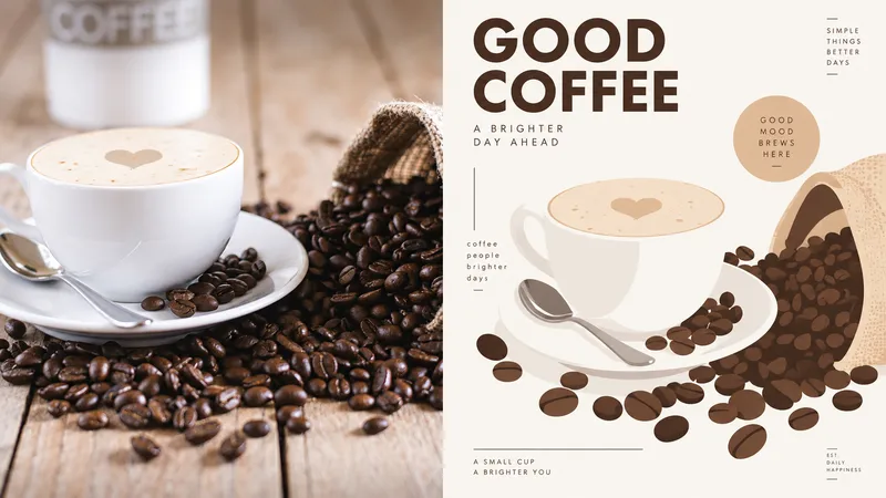
For creating key visuals for creative tools, digital magazines, or visual identities: brand exercises, covers, and exhibition graphics. Keep the original photo recognizable in the upper half; reframe it in the lower half with large solid-color blocks, simplified contours, fine lines, and a few rounded cards. The subject is the sole focus—do not crowd the surrounding space with a complex interface. Young, smart, and slightly playful, with a warm tech feel rather than a cyberpunk look. Draw the palette from the most vivid colors in the original image and refine them, using plenty of warm white—about one or two primary colors plus an accent. Keep text small and clear, using a condensed sans serif or a lightweight monospaced font. Avoid realism, complex shadows, gradient effects, dense UI, game interfaces, and cartoon stickers.
Information
- Version
- v5
- Last updated
- Runtime credits
- Usage-based
- Models
- Auto