xiaoxiaodong P107 Image Verse
By xiaoxiaodong
xiaoxiaodong P107 Image Verse
By xiaoxiaodong
Showcase
Description
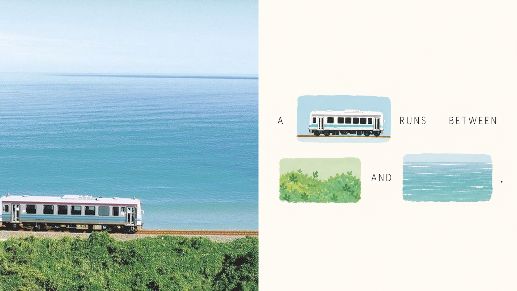
Some photos carry emotions that are difficult to express in a single caption—and those emotions should not be overshadowed by a few decorative images. Panel 107 places the original photo on one side and turns the other into a visual sentence that can genuinely be read: when the text mentions a flower, window, road, or action, that word is directly replaced by a hand-drawn image from the photo. Remove either the words or the images, and the sentence is incomplete. Best for these situations When one caption cannot express the feeling in a photo: Let the subjects, actions, and imagery from the original image truly enter the syntax and take the place of omitted words. When you do not want a “complete title plus a few small pictures” layout: The image must occupy the original position of the word, so readers complete the sentence by following the text and images together. When you want a light, fresh, yet sophisticated visual design: Organize visual poetry with bright, soft color blocks, modern hand-drawn editorial illustrations, and generous negative space. When you need flexible delivery in one consistent style: Support top-and-bottom comparisons, side-by-side comparisons, design-only layouts, multiple aspect ratios, four-sided wallpapers, and batch processing for image catalogs. What it solves for you Turns “the image is merely an illustration” into “the image is the word,” solving the problem of text and visuals telling separate stories. Automatically generates short phrases from a photo’s mood, actions, relationships, setting, or memories, then selects the words best suited for visualization. Uses a clear reading path to avoid sticker walls, card grids, and cluttered collages while preserving a light, elevated sense of space. Get started quickly Use XXD Panel 107 to process this image, and first recommend the most suitable composition and dimensions.
Recommended by
淡苍
Why we love this skill
Turns real images into “image-as-word” poems, embedding visual elements in readable, puzzle-like compositions with flexible layouts, wallpapers, and faithful creative-brief control.
Related Skills
View all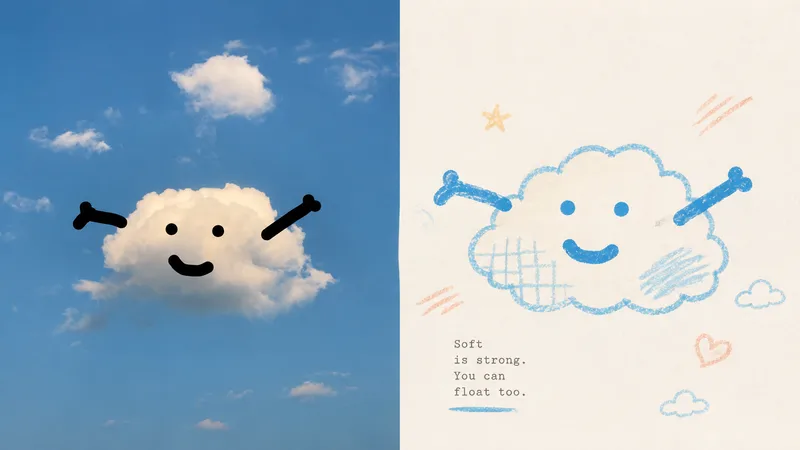 Image
Imagexiaoxiaodong P116 | Doodle
Some photos are truly moving not because of how much information they contain, but because of a single subject, a particular pose, a few colors, and the emotion captured in the image. Panel 116 keeps the real photo in the upper half, then translates the lower half into pastel crayon doodles on an extremely light paper surface: coarse-grain outlines, a few soft color blocks, minimal symbols, and small-scale subjects that leave room to breathe. Ideal for these situations You want to preserve the photo’s identity and natural texture while creating a lighter poster that feels more like an art publication. You don’t want to trace every object, create a realistic redraw, or fill the background with details. You only want to retain the core subject, relationships, and visual memories. You like bright, soothing pastel colors but don’t want anything gloomy, low-contrast, fluorescent, or cheaply candy-colored. You need the same style to produce consistent results across top-and-bottom layouts, left-and-right layouts, pure designs, multiple aspect ratios, four-end wallpapers, or catalog batch processing. What it solves for you It removes secondary information from complex photos so the subject isn’t overwhelmed by details and decoration. It uses clear colored lines and a light paper background to maintain recognizability and keep the subject from blending into the background. It ensures the split composition contains exactly two 50:50 regions, with no title strip, bottom bar, or third section. Each image is generated directly from the current original in a single pass, without sending samples, intermediate results, or work from other Panels back into the model.
 Image
Imagexiaoxiaodong P121 | Doodle
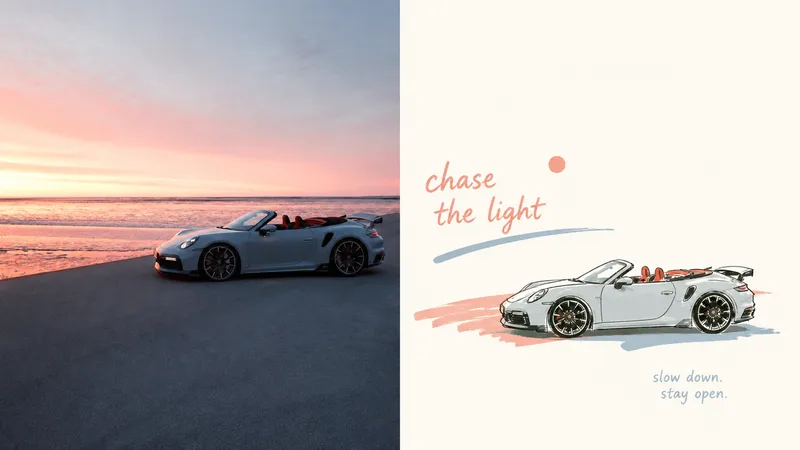
An everyday photo may contain a compelling pose or relationship, yet ordinary composition and a cluttered background can distract from it. Panel 121 preserves the photo’s authentic identity, re-extracts the most recognizable subject, and uses relaxed marker-style doodles, edited handwritten text, and generous negative space to turn a slice of life into a finished work. Best for People, everyday objects, and scenes that need to become independent magazine or lifestyle editorial illustrations. You want to preserve the subject’s outline, pose, and narrative relationships while actively removing most of the background and secondary objects. You like the relaxed feel of naive hand-drawing, while still caring about the mature arrangement of graphics, text, and empty space. You need consistent delivery formats, including top-and-bottom, left-and-right, design-only, multiple aspect ratios, wallpaper, or catalog batches. What it solves Even ordinary photos can establish a new visual focus through reduction, rearrangement, cropping, and changes in scale. Graphics and text first share an invisible grid, visual axes, and a reading path, avoiding “one line of text above, one person below.” Graphic elements occupy only a small proportion of the composition. Negative space provides distance, pauses, and breathing room instead of being filled with random small icons. Comparison images use two strict 50:50 areas and are generated directly from the original image in this run, avoiding a third band and secondary stylization.
 Image
ImageXiaoxiaodong x Pastel P071
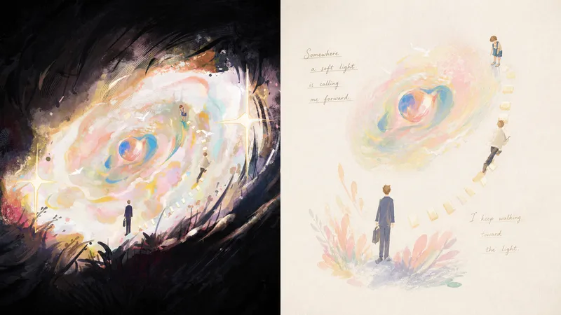
Panel 071 distills the subject, pose, and narrative relationships into a small number of soft, slightly naive forms and color blocks. Pastels, wax crayons, water-soluble colored pencils, and light gouache leave behind traces of rubbing, paper show-through, layered color, and pauses. Elements float, echo, or draw one another across a near-white paper surface like fragments of memory. Fine handwritten lines of poetry, with shifting pressure and drifting baselines, move naturally through the negative space instead of being placed into a title template. Good for these situations Want to preserve a memory rather than recreate a scene: The subject’s identity and key relationships remain recognizable at a glance, while complex backgrounds intentionally recede. Like softness without childishness: Powdery texture, rubbing, and translucent layers add tactility, while mature compositions avoid a children’s-cartoon feel. Need text to truly enter the image: Words grow from movement, sound, emotion, or metaphor, creating a reading rhythm through relaxed handwriting. Need flexible delivery: Supports vertical, horizontal, design-only, multiple aspect ratios, and wallpapers for all four edges, as well as batch processing for image directories.
Information
- Version
- v3
- Last updated
- Runtime credits
- Usage-based
- Models
- Auto