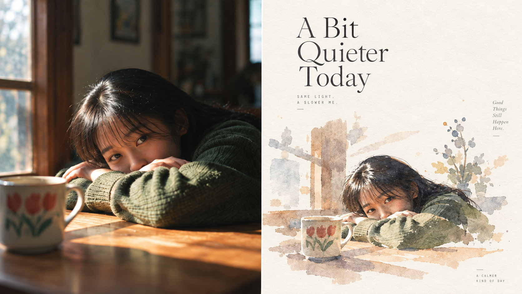
Gray Wash | xiaoxiaodong P193
Created by xiaoxiaodong
Gray Wash | xiaoxiaodong P193
Created by xiaoxiaodong
Showcase
Description
Ideal for organizing personal photography, independent publishing, exhibition studies, and lifestyle-focused visual projects. Even images with ordinary composition, cluttered backgrounds, or small subjects can regain a clear focal point through reduction, reorganization, cropping, and changes in scale—instead of simply applying a filter. The overall look combines small-scale graphic subjects, pedestal-like support, graphic watercolor, gray-pink warm tones with blue-violet cool grays, generous artistic negative space, controlled random brushstrokes, and editorial-style layout. The result resembles an independently published travel journal or a small collection of artistic watercolor studies.
Recommended by
淡苍
Why we love this skill
A restrained gray watercolor style and low base create a quiet, hazy image with visual weight. It captures xiaoxiaodong’s distinctive panel language for turning photos into structured, poetic finished pieces.
Related Skills
View all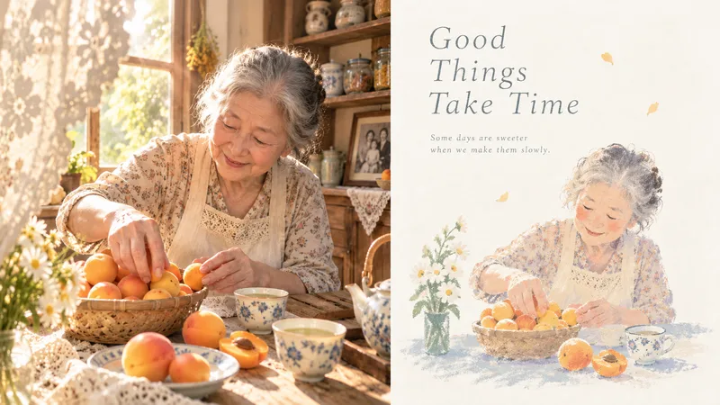 Image
ImageCool-Warm Pastels|xiaoxiaodong
Ideal for organizing personal photography, independent publishing, exhibition studies, and lifestyle-oriented visual work. Even when the original image has an ordinary composition, a cluttered background, or a subject that appears too small, you can reestablish a focal point through subtraction, rearrangement, cropping, and changes in scale—instead of simply applying a filter. The overall look combines a small image format, generous white space, raw pastel colors, a cool-dominant and warm-accent palette, powdery grain, and poetic typography to create a refined visual effect, like an art booklet from an independent press, a personal travel journal, or an illustrated book of poetry. Whether the subject is a person, building, animal, plant, object, or natural landscape, the process centers on selective memory and emotional distillation.
 Image
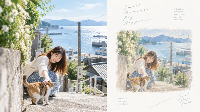
ImageRagged Pastel · xiaoxiaodong
Ideal for personal photo organization, independent publishing, exhibition exercises, and lifestyle-oriented visual creation. Even images with ordinary compositions, cluttered backgrounds, or small subjects can be given a new focal point through reduction, reorganization, cropping, and changes in scale—instead of simply applying a filter. The overall look combines ragged-edged rectangular color fields, small-scale visual vignettes, expansive negative space, continuous horizontal color layers, powdery rubbed-and-blended textures, a cool-dominant palette with warm accents, and poetic typography. Together, these elements create a sophisticated visual aesthetic reminiscent of an independently published art booklet, a private travel journal, or poetry illustrations.
 Image
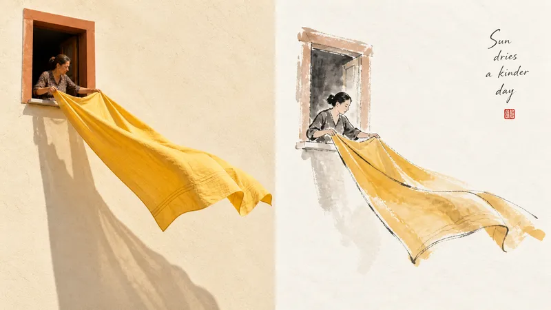
ImageInk Study xiaoxiaodong P181
Suitable for organizing personal photography, independent publishing, exhibition exercises, and lifestyle-focused visual creation. Even images with ordinary compositions, cluttered backgrounds, or undersized subjects can be given a new focal point through subtraction, reorganization, cropping, and changes in scale—not by simply applying a filter. The refined visual effect comes from expressive color-ink styling, vignette-like compositions, ink as the dominant color with supporting accents, generous artistic negative space, and a literati-painting-inspired relationship between image and text. Whether the subject is a person, building, animal, plant, object, vehicle, or natural landscape, the focus should be on “capturing its spirit while leaving out the excess.” Avoid complete ink-wash landscapes, realistic fine rendering, fully filled backgrounds, layered heavy colors, a photographic filter look, cartoon styling, and formulaic Chinese-style poster designs.
Information
- Version
- v3
- Last updated
- Runtime credits
- Usage-based
- Models
- Auto