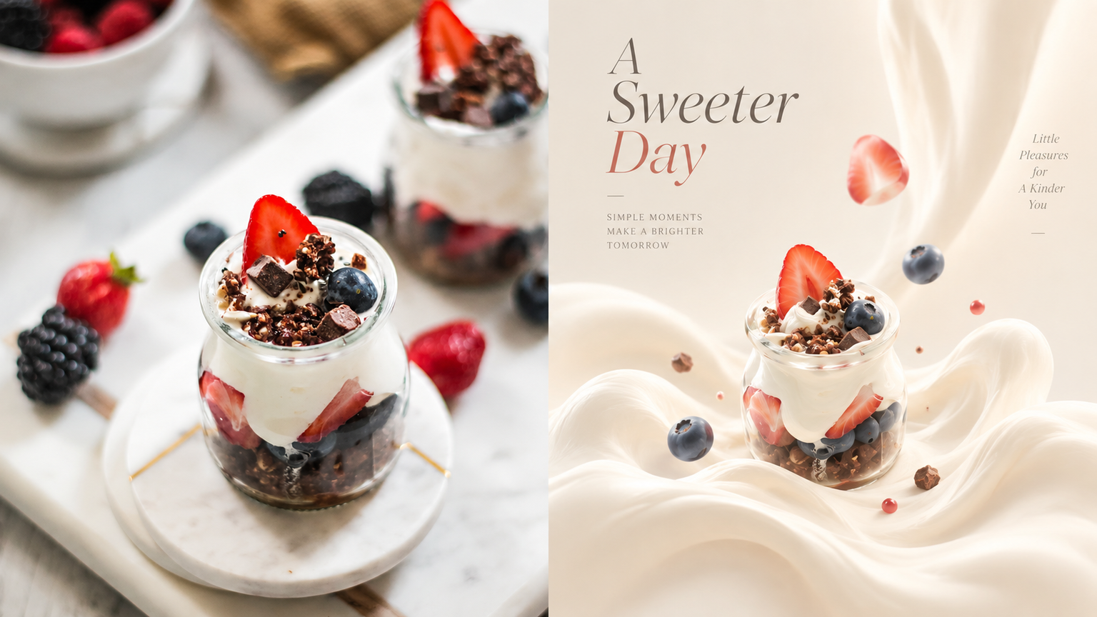
Cream Dream|xiaoxiaodong P258
By xiaoxiaodong
Cream Dream|xiaoxiaodong P258
By xiaoxiaodong
Showcase
Description
Ideal for translating an original object into a new form somewhere between cream, soft clay, and a dreamscape. The top half is the original photo; the bottom half retains the most essential identifying features, while the contours become softer, proportions can be exaggerated, and the form can melt slightly. Keep the subject very small, centered or slightly offset. The background uses minimalist cream-colored geometry and plenty of negative space, with gentle shadows and a subtly lifted effect. Avoid turning the real object directly into a cream product, as well as hard plastic and fully filled-in scenes.
Recommended by
淡苍
Why we love this skill
Transforms user photos into tiny surreal cream-dream works with softened contours, simplified forms, gentle melting, and asymmetric drift in a minimal geometric setting.
Related Skills
View all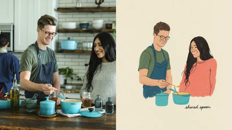 Image
ImageMemory P245 | xiaoxiaodong
Ideal for turning an ordinary photo into a standalone picture-book page or a page in a travel journal: personal photo curation, exhibition practice, and lifestyle visuals. The upper half keeps the original photo recognizable; the lower half does not retell the entire image, but captures only its most distinctive outlines and relationships as a quiet, slightly childlike piece of modern folk art. The subject is small and may be off-center or cropped, surrounded by generous white space. The lines are loose and imperfect, with hints of pauses and corrections. Colors are distilled from the most vibrant hues in the original image into a limited palette of cream white, deep teal green, misty blue, butter yellow, and plant green. Avoid filling the page, smooth vector shapes, a plastic look, fluorescent colors, and commercial illustration.
 Image
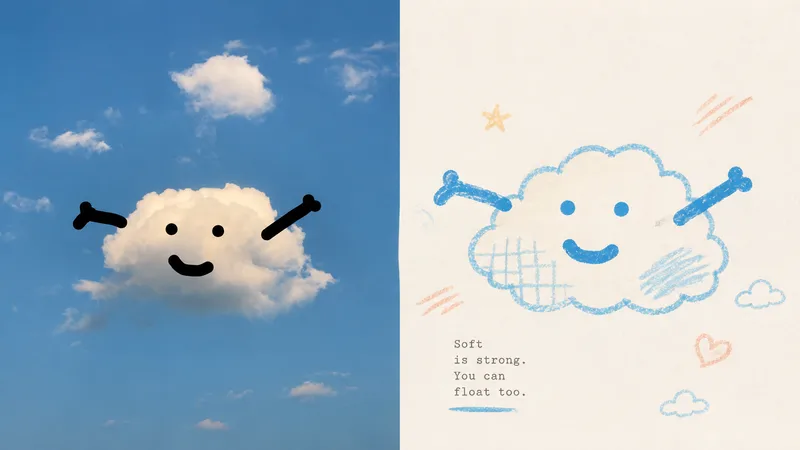
Imagexiaoxiaodong P116 | Doodle
Some photos are truly moving not because of how much information they contain, but because of a single subject, a particular pose, a few colors, and the emotion captured in the image. Panel 116 keeps the real photo in the upper half, then translates the lower half into pastel crayon doodles on an extremely light paper surface: coarse-grain outlines, a few soft color blocks, minimal symbols, and small-scale subjects that leave room to breathe. Ideal for these situations You want to preserve the photo’s identity and natural texture while creating a lighter poster that feels more like an art publication. You don’t want to trace every object, create a realistic redraw, or fill the background with details. You only want to retain the core subject, relationships, and visual memories. You like bright, soothing pastel colors but don’t want anything gloomy, low-contrast, fluorescent, or cheaply candy-colored. You need the same style to produce consistent results across top-and-bottom layouts, left-and-right layouts, pure designs, multiple aspect ratios, four-end wallpapers, or catalog batch processing. What it solves for you It removes secondary information from complex photos so the subject isn’t overwhelmed by details and decoration. It uses clear colored lines and a light paper background to maintain recognizability and keep the subject from blending into the background. It ensures the split composition contains exactly two 50:50 regions, with no title strip, bottom bar, or third section. Each image is generated directly from the current original in a single pass, without sending samples, intermediate results, or work from other Panels back into the model.
 Image
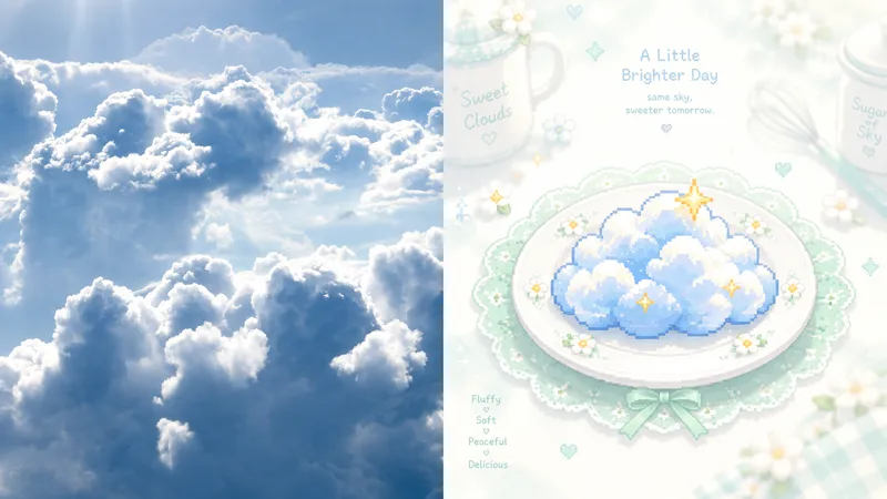
ImageGPT2 x Mint Pixel Cuisine
Ideal for turning photos into light, sweet, quiet pixel art cards: culinary nostalgia, independent stationery, and exhibition vignettes. The upper half preserves the recognizable original image; the lower half reduces the subject to a single central pixel symbol on a pale ceramic plate. A soft white halo, mint-green lace, and tiny floral dots surround it. Cookware in the distance should nearly fade into white. Only the center has clear blocky pixel edges; everything else is mist, bloom, and an almost overexposed pale background. Use mint green, ivory, and cream as the base, with bright orange, coral, golden yellow, or pink appearing only as accents at the center. Avoid dark backgrounds, strong outlines, complex details, and gray, dirty-looking filters.
Information
- Version
- v3
- Last updated
- Runtime credits
- Usage-based
- Models
- Auto