xiaoxiaodong P120 Concepts
By xiaoxiaodong
xiaoxiaodong P120 Concepts
By xiaoxiaodong
Showcase
Description
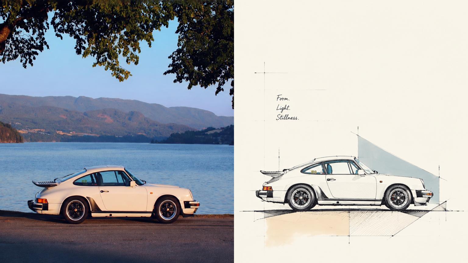
Want to turn a photo into a concept image with a sense of design exploration, without ending up with a fully rendered scene that traces every object? Panel 120 preserves the photo’s identity and spatial memory, distilling its key forms, outlines, and relationships into loose, freehand perspective linework. A few color blocks, geometric guide lines, and generous areas of blank space come together to form the work. Ideal for these situations Architectural, spatial, travel, or object photos need to become concept sketches with an editorial sensibility. The original composition is weak, the background is cluttered, or the subject is small, and you want to reorganize the visual focus through reduction, recomposition, and changes in scale. You want to preserve recognizability and spatial relationships while avoiding full-frame coloring or photorealistic renderings. The same style needs to be delivered in vertical, horizontal, design-only, wallpaper, and catalog batches. What it solves for you Remove backgrounds and secondary objects, leaving the core forms and visual memory points that represent the subject. Use relaxed, restrained, slightly repetitive perspective lines and a few construction lines to express design exploration. Make blank space part of the composition instead of filling the frame with decoration or color blocks. The comparison image contains exactly two equal sections; each source image is generated independently to avoid secondary stylization.
Recommended by
淡苍
Why we love this skill
Turns photos into architectural concept sketches while preserving spatial relationships through relaxed perspective lines, geometric guides, selective color blocks, and generous negative space—with batch-ready outputs for multiple formats.
Related Skills
View all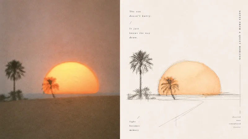 Image
Imagexiaoxiaodong x Sketch Wash P079
Ordinary photo outline filters mechanically copy edges; full watercolor treatments tend to fill the background, making the subject, space, and editorial rhythm feel heavy. Panel 079 keeps only the structures, spaces, gestures, and relationships in the scene most worth remembering: long straight perspective lines, angular lines, and geometric axes build a rational framework; free organic curves, searching lines, and broken lines retain a tactile feel; a small amount of transparent watercolor extracts recognizable colors from the original. Broad areas of natural paper white create air and pauses. Text follows structural lines and whitespace to join the composition, resulting in something like an art-directed architectural travel sketchbook or an independent visual publication. Best suited for these situations - **Architecture, travel, and on-site observation:** Use the strongest straight lines, turns, facets, and proportional relationships to build the space. - **You want to preserve the vitality of an “in-progress drawing”:** Embrace exploratory repeated lines, broken lines, slight misalignment, and unfinished edges. - **You want color drawn from the photo without overfilling the image:** Use a small amount of transparent wash only where needed, layering ink lines, color, and paper white. - **You need flexible delivery:** Supports portrait, landscape, design-only, multiple aspect ratios, and four-edge wallpaper formats, and can batch-process image directories.
 Image
Imagexiaoxiaodong P116 | Doodle
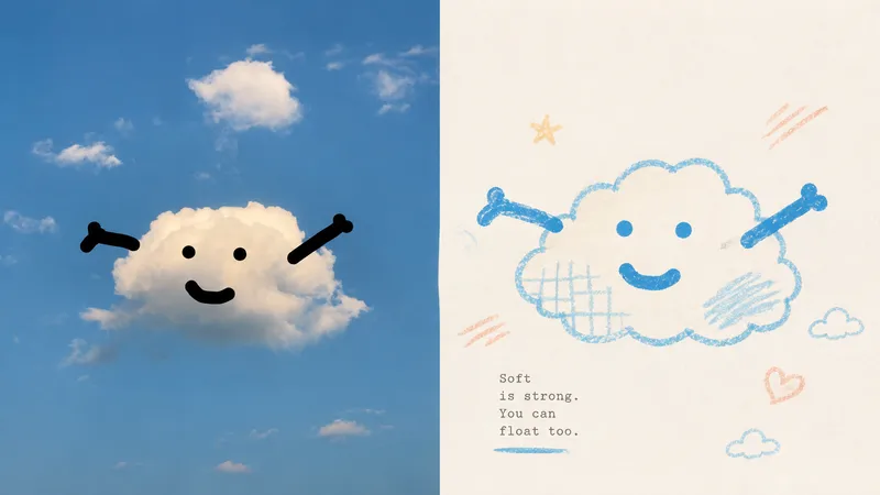
Some photos are truly moving not because of how much information they contain, but because of a single subject, a particular pose, a few colors, and the emotion captured in the image. Panel 116 keeps the real photo in the upper half, then translates the lower half into pastel crayon doodles on an extremely light paper surface: coarse-grain outlines, a few soft color blocks, minimal symbols, and small-scale subjects that leave room to breathe. Ideal for these situations You want to preserve the photo’s identity and natural texture while creating a lighter poster that feels more like an art publication. You don’t want to trace every object, create a realistic redraw, or fill the background with details. You only want to retain the core subject, relationships, and visual memories. You like bright, soothing pastel colors but don’t want anything gloomy, low-contrast, fluorescent, or cheaply candy-colored. You need the same style to produce consistent results across top-and-bottom layouts, left-and-right layouts, pure designs, multiple aspect ratios, four-end wallpapers, or catalog batch processing. What it solves for you It removes secondary information from complex photos so the subject isn’t overwhelmed by details and decoration. It uses clear colored lines and a light paper background to maintain recognizability and keep the subject from blending into the background. It ensures the split composition contains exactly two 50:50 regions, with no title strip, bottom bar, or third section. Each image is generated directly from the current original in a single pass, without sending samples, intermediate results, or work from other Panels back into the model.
 Image
Imagexiaoxiaodong P119 | Fabric
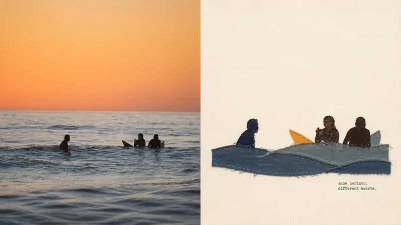
When the people, objects, or actions in a photo are worth preserving but the background is too crowded, Panel 119 distills the central subject into a hand-sewn textile collage. A few large fabric pieces, raw-edge appliqué, and a small amount of embroidery create a compact visual focal point, while generous negative space gives the linen-and-cotton fibers and stitchwork room to be seen. Best for Preserving the true identity of people, everyday objects, and travel memories while adding a warm fabric touch. Distilling the subject, outline, structure, posture, and narrative relationships from a complex photo without redrawing every element of the original scene. Working with lively yet soft 2–4-color fabric palettes and restrained, editorial-style copy. Creating consistent styles for top-and-bottom, left-and-right, pure-design, multiple-aspect-ratio, four-edge wallpaper, or catalog batch processing. What it solves for you It actively removes most of the background and unrelated details to prevent visual information from piling up. It builds recognizability with a few large fabric pieces and hand-stitched details, avoiding a cheap handcrafted look or templated collage style. It strictly uses only two 50:50 areas on the canvas, with no title band, bottom bar, or third section. Each image is generated in a single pass from the current original image, avoiding a second round of stylization on intermediate results.
Information
- Version
- v3
- Last updated
- Runtime credits
- Usage-based
- Models
- Auto