Xiaoxiaodong · P066 Color
By Xiaoxiaodong
Description
Recommended by
淡苍
Why we love this skill
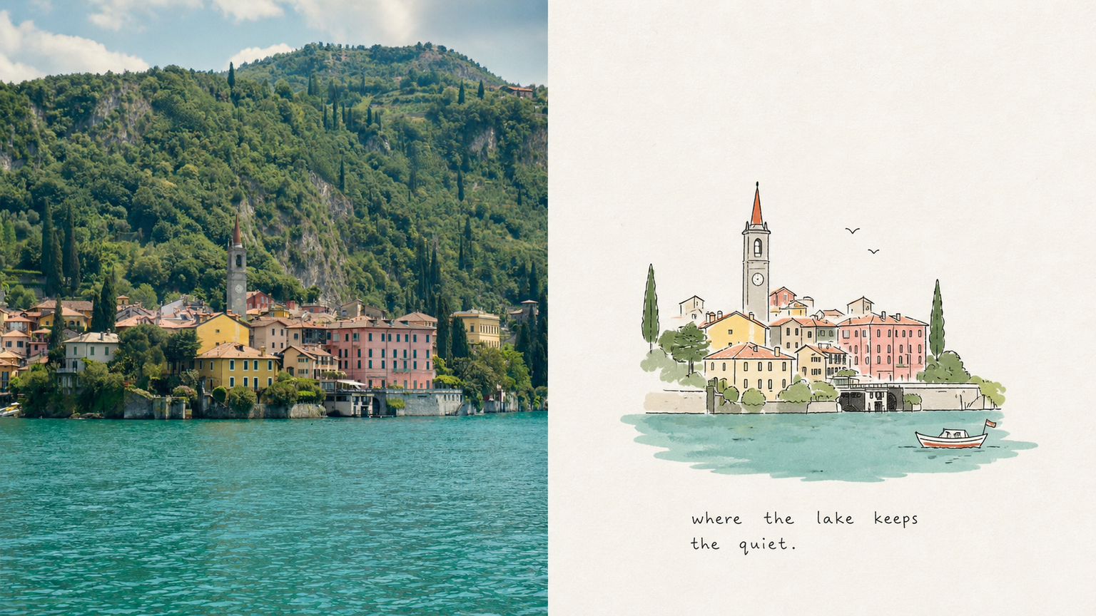
Uses the original creative brief as its sole aesthetic guide, strictly preserving style and text boundaries. Supports multiple output formats and independently generates and quality-checks every result.
If you want to turn an everyday snapshot—such as a cat sunning itself by the roadside, two elderly people sitting side by side in a park, or a half-finished glass of water on a table—into a picture-book interior page with a childhood feel and an exceptionally refined finish, these prompts hit the mark. What makes this style so captivating is how it balances **“childlike innocence” with “art-director-level restraint in the layout”**: ⚬ Awkward yet deeply expressive lines: The subject is captured with fine, slightly wobbly hand-drawn black lines, complete with pauses and broken strokes. Clutter is left out, while complex buildings or people are simplified into charming, pure forms. ⚬ Low-saturation flat color blocks: Three to six of the most pleasing colors are drawn from the original image and blended into clear, soft flat color blocks. One or two bright primary colors add visual accents, keeping the result light and clean without ever applying a dingy, aged filter. ⚬ Generous white space that lets the image breathe: Against a very pale paper-textured background, the subject may be off-center, reduced in scale, or partially cropped. Ample space is left around it, making the image feel like a carefully edited visual essay rather than a child’s assignment covering the entire page. ⚬ Small handwritten notes that look casually written: Stiff commercial type is replaced with a short, naive handwritten phrase featuring slight writing imperfections. It follows the movement or settles naturally into the white space, like a spontaneous mood caption jotted down after finishing the drawing.
Related Skills
View all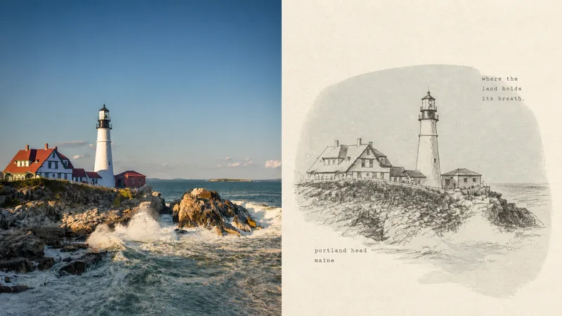 Image
ImageXiaoxiaodong x Crayon x Sketch x P075
Panel 075 preserves the subject’s most essential proportions, direction, structure, and pose, then redraws them with loose, dark crayon lines that retain subtle signs of correction. A low-saturation, irregular color field drawn from the original image’s overall tones provides quiet support, while cream handmade paper and generous negative space carry the mood, distance, and passage of time. A few tiny typewritten words feel like private notes without interrupting the image’s breathing room. Best suited for Tired of formulaic vintage filters: The paper, grain, and imperfect lines all take part in the storytelling rather than applying a uniform effect over the photo. Need to draw less while staying accurate: Details can remain unfinished, but the subject’s key proportions, direction, structure, and pose must remain recognizable. Drawn to a quiet independent-publishing aesthetic: A soft monochrome color field, Risograph grain, generous negative space, and small typewritten text create a restrained layout. Need flexible delivery: Supports portrait, landscape, design-only, multiple aspect ratios, and four-sided wallpapers, and can also process image directories in batches.
Xiaoxiaodong × Journal × P089
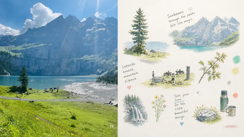
P089 has been experimenting with an AI image style I really love lately. It doesn’t simply turn a photo into a full-bleed scene. Instead: The top half preserves the original photo, while the bottom half automatically creates a set of “floating lifestyle vignette journal” elements. I’ve tried it with all kinds of completely different images: 🥐 Comforting brunches 🌸 Wild roadside flowers 🎒 Everyday essentials 🐱 Sleeping cats 🛋️ Cozy rooms It makes the feeling of everyday life instantly more vivid. The most interesting part is that the AI doesn’t rigidly recreate one entire scene. Instead, it breaks the photo into several independent vignettes floating as scattered details: a central subject paired with nearby food, plants, still-life objects, clothing patterns, and other close-ups. Loose, childlike fine lines, watercolor, and colored pencil add gentle touches, while handwritten reflections on daily life and doodled symbols are woven throughout. The whole page feels relaxed, tender, and full of breathing room.
Xiaoxiaodong × Classic × Title Page × P094
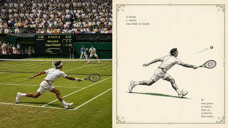
Panel 094 uses delicate ink lines, selective solid black, and minimal hatching to distill a single spot color from a photograph. With generous negative space, an optional hand-drawn decorative border, and classical publishing type, it reconstructs a quiet scene reminiscent of an early 20th-century children’s book or poetry collection title page. Ideal for these situations Want to keep the subject while removing noise: Leave only the cues needed to convey identity, posture, emotion, and narrative relationships. Enjoy classic two-color publications: Pair black ink with one spot color drawn from the original image, ivory paper, and slight misregistration. Need truly meaningful negative space: The subject can be reduced, isolated, or suspended, allowing the empty space to become part of the poetry. Need flexible delivery: Supports top-to-bottom, left-to-right, pure design, multiple aspect ratios, and four-sided wallpapers, as well as batch processing of image directories.
Xiaoxiaodong · P066 Color
By Xiaoxiaodong
Description
Recommended by
淡苍
Why we love this skill
Uses the original creative brief as its sole aesthetic guide, strictly preserving style and text boundaries. Supports multiple output formats and independently generates and quality-checks every result.
If you want to turn an everyday snapshot—such as a cat sunning itself by the roadside, two elderly people sitting side by side in a park, or a half-finished glass of water on a table—into a picture-book interior page with a childhood feel and an exceptionally refined finish, these prompts hit the mark. What makes this style so captivating is how it balances **“childlike innocence” with “art-director-level restraint in the layout”**: ⚬ Awkward yet deeply expressive lines: The subject is captured with fine, slightly wobbly hand-drawn black lines, complete with pauses and broken strokes. Clutter is left out, while complex buildings or people are simplified into charming, pure forms. ⚬ Low-saturation flat color blocks: Three to six of the most pleasing colors are drawn from the original image and blended into clear, soft flat color blocks. One or two bright primary colors add visual accents, keeping the result light and clean without ever applying a dingy, aged filter. ⚬ Generous white space that lets the image breathe: Against a very pale paper-textured background, the subject may be off-center, reduced in scale, or partially cropped. Ample space is left around it, making the image feel like a carefully edited visual essay rather than a child’s assignment covering the entire page. ⚬ Small handwritten notes that look casually written: Stiff commercial type is replaced with a short, naive handwritten phrase featuring slight writing imperfections. It follows the movement or settles naturally into the white space, like a spontaneous mood caption jotted down after finishing the drawing.
Related Skills
View allImageXiaoxiaodong x Crayon x Sketch x P075
Panel 075 preserves the subject’s most essential proportions, direction, structure, and pose, then redraws them with loose, dark crayon lines that retain subtle signs of correction. A low-saturation, irregular color field drawn from the original image’s overall tones provides quiet support, while cream handmade paper and generous negative space carry the mood, distance, and passage of time. A few tiny typewritten words feel like private notes without interrupting the image’s breathing room. Best suited for Tired of formulaic vintage filters: The paper, grain, and imperfect lines all take part in the storytelling rather than applying a uniform effect over the photo. Need to draw less while staying accurate: Details can remain unfinished, but the subject’s key proportions, direction, structure, and pose must remain recognizable. Drawn to a quiet independent-publishing aesthetic: A soft monochrome color field, Risograph grain, generous negative space, and small typewritten text create a restrained layout. Need flexible delivery: Supports portrait, landscape, design-only, multiple aspect ratios, and four-sided wallpapers, and can also process image directories in batches.
Xiaoxiaodong × Journal × P089
P089 has been experimenting with an AI image style I really love lately. It doesn’t simply turn a photo into a full-bleed scene. Instead: The top half preserves the original photo, while the bottom half automatically creates a set of “floating lifestyle vignette journal” elements. I’ve tried it with all kinds of completely different images: 🥐 Comforting brunches 🌸 Wild roadside flowers 🎒 Everyday essentials 🐱 Sleeping cats 🛋️ Cozy rooms It makes the feeling of everyday life instantly more vivid. The most interesting part is that the AI doesn’t rigidly recreate one entire scene. Instead, it breaks the photo into several independent vignettes floating as scattered details: a central subject paired with nearby food, plants, still-life objects, clothing patterns, and other close-ups. Loose, childlike fine lines, watercolor, and colored pencil add gentle touches, while handwritten reflections on daily life and doodled symbols are woven throughout. The whole page feels relaxed, tender, and full of breathing room.
Xiaoxiaodong × Classic × Title Page × P094
Panel 094 uses delicate ink lines, selective solid black, and minimal hatching to distill a single spot color from a photograph. With generous negative space, an optional hand-drawn decorative border, and classical publishing type, it reconstructs a quiet scene reminiscent of an early 20th-century children’s book or poetry collection title page. Ideal for these situations Want to keep the subject while removing noise: Leave only the cues needed to convey identity, posture, emotion, and narrative relationships. Enjoy classic two-color publications: Pair black ink with one spot color drawn from the original image, ivory paper, and slight misregistration. Need truly meaningful negative space: The subject can be reduced, isolated, or suspended, allowing the empty space to become part of the poetry. Need flexible delivery: Supports top-to-bottom, left-to-right, pure design, multiple aspect ratios, and four-sided wallpapers, as well as batch processing of image directories.
Find your next favorite skill
Explore more curated AI skills for research, creation, and everyday work.