YouMind
تسجيل الدخول

Diagram / Chart

استكشف مطالبات صورة مجانية ضمن فئة Diagram / Chart من مكتبة YouMind، والمجمعة تحت الموضوعات. كل مطالبة مختارة من مسارات عمل إبداعية حقيقية وجاهزة للنسخ والتعديل وإعادة الاستخدام.

تحويل المطالبة إلى صورةتحويل الصورة إلى مطالبة
بواسطة @Kurohachi
GPT Image 2.5
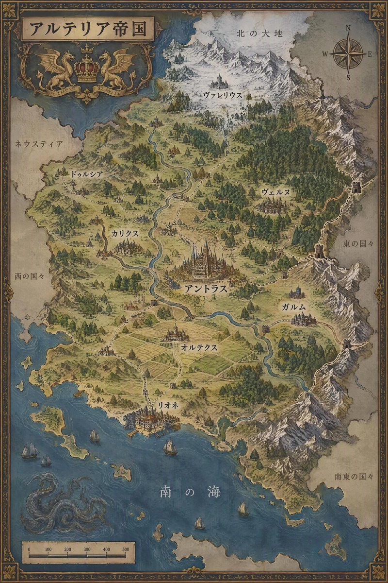
Fictional Country Map Generator
عرض المطالبة كاملة ونسخها

Generate a map of a fictional country. Based on the national settings below, generate a map that fits the setting and enclose it in a border. Do not include any explanatory text; list only place names. With regard to place names, describe only those that are below; do not describe the names of places not mentioned in the text. Depict the terrain in a way that makes it easily recognizable. Map colors should be chosen to match the terrain, and areas should not be distinguished by color. [[Country Name]]:[{argument name="national_settings" default="[Summary and geographical description of the country]"]

إنشاء صورة
بواسطة @カーブミラー
GPT Image 2.5
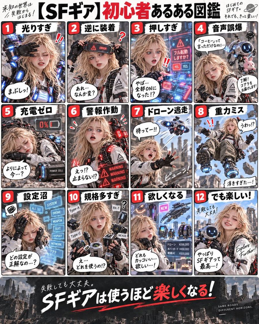
SF Gear Beginner's Guide Infographic
عرض المطالبة كاملة ونسخها

Goal: Create a Japanese educational infographic slide explaining OpenClaw architecture. Canvas: Vertical 4:5 slide with a clean blue-and-white corporate tech style. Layout: Top headline area, central flow diagram, three capability cards, and a bottom summary section. Text content: Preserve key Japanese labels such as 「ゲートウェイ」 and 「交通整理役」 where they appear in the design. Constraints: Use exactly the visible section count, keep icons simple, avoid extra text, no watermark.

إنشاء صورة
بواسطة @Mr.pinecone
GPT Image 2.5
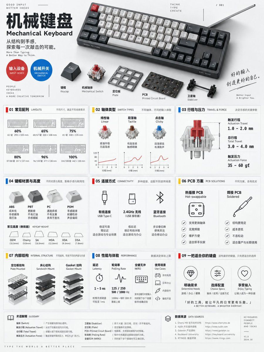
Mechanical Keyboard Encyclopedia Poster Prompt
عرض المطالبة كاملة ونسخها

A 3:4 vertical mechanical keyboard encyclopedia information poster, blending Bauhaus functionalism, industrial design archives, and modern digital lab visuals. The top displays a compact mechanical keyboard in a diagonal composition, alongside exploded views of keycaps, switches, plate, PCB, and stabilizers, with studio hard-soft lighting creating clear micro-shadows; the title "Mechanical Keyboard" is arranged along the left grid, with the English subtitle "Mechanical Keyboard", accompanied by circular category tags "Input Device / Mechanical Switch", structural explosion diagrams, and keyboard size scales. The middle section uses restrained accent colors of red, yellow, and blue with modular geometric cards, fully presenting nine types of information: common layouts (60%, 65%, 75%, 80%, 96%, 100%); tactile curves for linear, tactile, and clicky switches; pre-travel and total travel; actuation force; common keycap materials and profiles; connection methods (wired, 2.4GHz, Bluetooth); differences between hot-swap and soldered PCBs; internal structures like plates, sandwich, and gasket mounts; latency, polling rate, N-key rollover, and usage scenarios. Each module retains only one main graphic to avoid visual clutter. Uses a 12-column grid, 48pt margins, 8pt baseline, and uniform 2pt linear icons. Background is near-white light gray, text is dark gray, data uses monospaced fonts. The bottom includes glossary and parameter source bars, stating "differences exist across brands and models", prohibiting fabrication of specific model performance or non-existent technical standards.

إنشاء صورة
بواسطة @Mr.pinecone
GPT Image 2.5
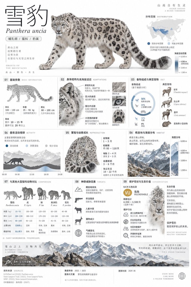
Snow Leopard Encyclopedia Card Prompt
عرض المطالبة كاملة ونسخها

A 2:3 vertical minimalist art style snow leopard encyclopedia info card, museum exhibit level visual quality, adopting Swiss International Style and premium natural history atlas language. Top ~30%: Adult snow leopard cutout studio-style full-body side close-up on pure white background, realistically retaining grey-white fur, black ring patterns, thick long tail, wide paws and facial details, not anthropomorphic; paired with super-large thin-line title "Snow Leopard", small italic "Panthera uncia", capsule tags "Mammalia/Felidae/Panthera", Asia distribution mini-map and altitude activity range axis. Middle ~60%: Based on 12-column and 8pt grid, clearly arranging nine major modules - basic parameters of body length, weight, tail length and lifespan; body structure and high-altitude adaptation features; food composition and typical prey; diurnal/nocturnal activity patterns; breeding cycle and cub growth; habitat types and altitude distribution; comparison with other large felids; population threat factors; conservation status, actions and ecological value. Charts use outline proportion diagrams, footprint size charts, altitude distribution maps, prey network graphs and concise timelines. Bottom ~10% marks conservation status, data year, source and update time. Main colors glacier grey, snow white, rock brown and graphite black, with minor cold blue accents; Source Han Sans Light, DIN and Roboto Mono, 2pt linear icons, 0.5pt light dividers, large whitespace. All biological data must be accurate and verifiable, no fabricated population numbers, no exaggerated descriptions, Chinese clearly readable, no garbled text.

إنشاء صورة
بواسطة @Snow
GPT Image 2.5
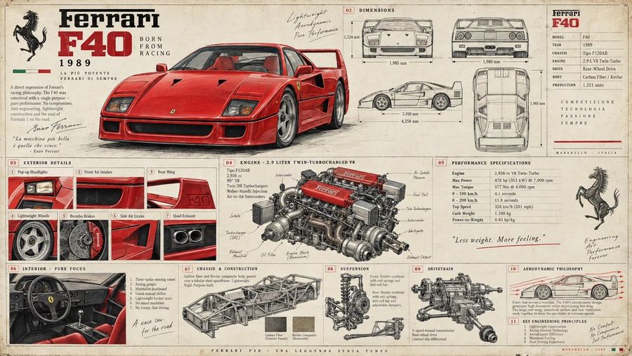
Vintage Automotive Engineering Poster
عرض المطالبة كاملة ونسخها

Create a collectible vintage automotive engineering poster featuring four legendary classic supercars: Ferrari F40 (1989), Lamborghini Countach 5000 QV (1985), Porsche 959 (1986), and McLaren F1 (1994). Use an aged cream paper background with subtle fibers, faded ink, pencil-and-ink technical illustrations and authentic 1980s–90s factory-document aesthetics. Give each car a prominent realistic 3/4 hero view, surrounded by front, side, rear and top technical drawings with dimensions. Include concise specification panels explaining each car’s engine, horsepower, torque, drivetrain, suspension, brakes, aerodynamics, weight, acceleration and top speed. Add detailed mechanical illustrations of the engines, chassis and drivetrain, plus small studies of headlights, wheels, brakes, intakes, spoilers and interiors. Use numbered callouts, arrows, measurement lines, engineering annotations and period-style typography. Make the information feel like an authentic factory engineering sheet rather than a modern infographic. Highly detailed, realistic automotive rendering blended with hand-drawn technical artwork, sophisticated archival print texture, 16:9 landscape, ultra-high resolution.

إنشاء صورة
بواسطة @Gadgetify
GPT Image 2.5
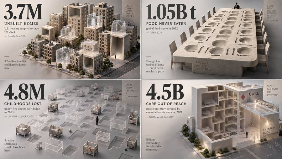
Minimalist 3D Infographic Visualization
عرض المطالبة كاملة ونسخها

2x2 grid, 16:9, AI infers viral topics: Create a haunting, minimalist 3D visualization that represents what is missing, lost, avoided, delayed, or erased because of [TOPIC]. The AI should choose a statistic involving loss: missing sleep, lost time, extinct species, unbuilt homes, unpaid wages, wasted food, lost attention, preventable deaths, disappearing land, delayed care, or unrealized potential. Instead of showing the object directly, represent it as negative space: empty chairs, ghost outlines, hollow cubes, missing city blocks, erased silhouettes, transparent containers, absent books, unfilled beds, or a carved-out void in a solid mass. The missing quantity should feel physically present through absence. Style: museum-grade isometric 3D render, matte clay and translucent materials, soft directional lighting, quiet shadows, neutral grey backdrop. Use one oversized numeral as a solemn anchor. Caption: what is missing, time period, metric, and source year. Add a tiny human silhouette for emotional scale. The spirit: make absence feel heavier than presence.

إنشاء صورة
بواسطة @Vitamin CPU
GPT Image 2.5
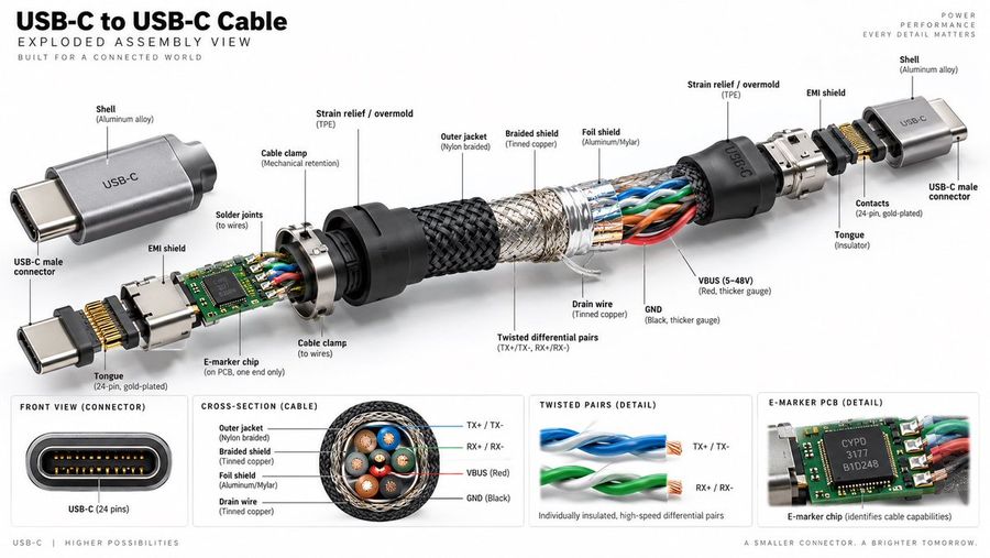
USB-C Cable Exploded Assembly Infographic
عرض المطالبة كاملة ونسخها

Create a hyper-realistic, high-resolution technical exploded assembly view of a USB-C to USB-C cable against a clean white background. The image should be wide format (16:9) and resemble a premium product infographic. **Layout & Structure:** - **Header:** Top left text reads "USB-C to USB-C Cable" in large bold black font, followed by "EXPLODED ASSEMBLY VIEW" and smaller text "BUILT FOR A CONNECTED WORLD". Top right has faint grey text: "POWER PERFORMANCE EVERY DETAIL MATTERS". - **Main Visual:** A central horizontal exploded diagram showing the internal components of the cable separated from left to right. - **Bottom Panels:** Four distinct rectangular detail boxes along the bottom edge. **Exploded View Details (Left to Right):** 1. **Left Connector Assembly:** A silver aluminum shell labeled "Shell (Aluminum alloy)" with "USB-C" engraved on it. Below it, a separate connector head labeled "USB-C male connector". Internal parts include a green PCB with an "E-marker chip", gold pins labeled "Tongue (24-pin, gold-plated)", and a metal shield labeled "EMI shield". 2. **Strain Relief:** A black rubber cone labeled "Strain relief / overmold (TPE)". 3. **Cable Layers (Center):** The cable is peeled back to reveal layers: - Outer layer: Black woven texture labeled "Outer jacket (Nylon braided)". - Middle layer: Silver mesh labeled "Braided shield (Tinned copper)". - Inner layer: Foil labeled "Foil shield (Aluminum/Mylar)". - Core wires: Visible twisted pairs of blue, orange, green, and red wires. Labels point to "Twisted differential pairs (TX+/TX-, RX+/RX-)", "VBUS (5-48V) (Red, thicker gauge)", "GND (Black, thicker gauge)", and "Drain wire (Tinned copper)". 4. **Right Connector Assembly:** Mirrors the left side but without the PCB/chip visible inside the immediate neck. Shows the metal shell, strain relief, and connector tongue. **Bottom Detail Panels (Left to Right):** 1. **Front View:** A close-up of the oval connector port showing the 24 pins. Label: "FRONT VIEW (CONNECTOR)" and "USB-C (24 pins)". 2. **Cross-Section:** A circular cutaway of the cable showing the concentric rings of insulation, shielding, and the four colored wire bundles inside. Label: "CROSS-SECTION (CABLE)" with legend for Outer jacket, Braided shield, Foil shield, Drain wire. 3. **Twisted Pairs:** Close-up of two twisted wire pairs (blue and green). Label: "TWISTED PAIRS (DETAIL)" and "Individually insulated, high-speed differential pairs". 4. **PCB Detail:** Close-up of the green circuit board chip. Label: "E-MARKER PCB (DETAIL)" and "E-marker chip (identifies cable capabilities)". **Style:** Photorealistic rendering, studio lighting, sharp focus, technical illustration style with thin black leader lines connecting labels to parts.

إنشاء صورة
بواسطة @小小东
GPT Image 2
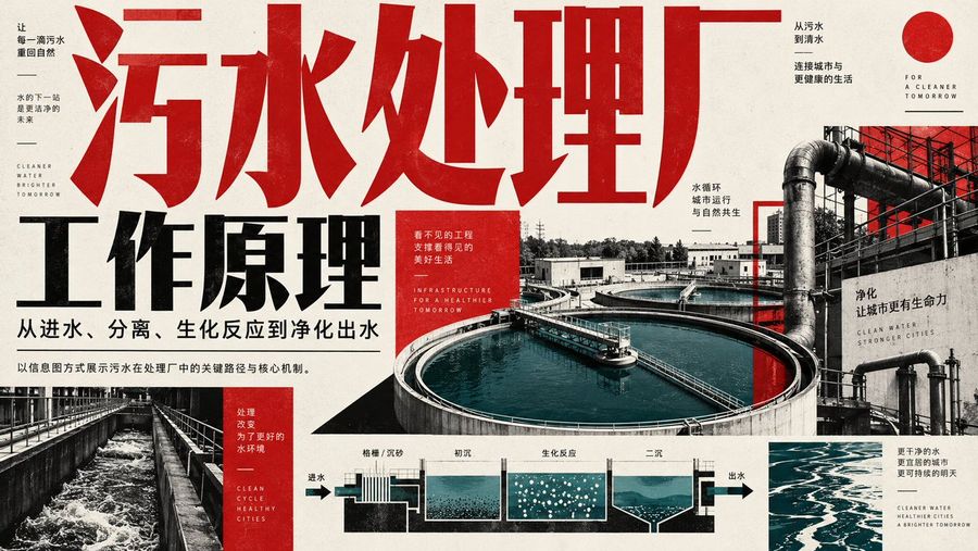
Wastewater Treatment Plant Infographic
عرض المطالبة كاملة ونسخها

Create a horizontal infographic poster explaining the working principles of a wastewater treatment plant. The design style is industrial, modern, and high-contrast, utilizing a color palette of deep red, black, white, and teal/blue for water elements. **Layout & Text Elements:** 1. **Top Left/Center (Headline):** Large, bold, distressed red Chinese characters "污水处理厂" (Wastewater Treatment Plant) spanning across the top. Below it, large black bold text "工作原理" (Working Principles). Smaller black text underneath: "从进水、分离、生化反应到净化出水" (From influent, separation, biochemical reaction to purified effluent). 2. **Left Sidebar:** Vertical layout with small text blocks. Top block: "让每一滴污水重回自然" (Let every drop of sewage return to nature), "水的下一站是更洁净的未来" (Water's next stop is a cleaner future), English text "CLEANER WATER BRIGHTER TOMORROW". Bottom block (red background): "处理改变为了更好的水环境" (Treatment changes for a better water environment), English text "CLEAN CYCLE HEALTHY CITIES". 3. **Right Side (Background Image):** A large photographic collage showing an aerial view of circular clarifier tanks filled with blue-green water, connected by pipes and walkways. Overlay text on the right: "从污水到清水" (From sewage to clear water), "连接城市与更健康的生活" (Connecting cities with healthier lives), "FOR A CLEANER TOMORROW", "水循环 城市运行 与自然共生" (Water cycle, city operation, symbiosis with nature), "净化 让城市更有生命力" (Purification makes cities more vibrant), "CLEAN WATER STRONGER CITIES". 4. **Bottom Center (Process Diagram):** A schematic cross-section diagram showing the flow of water through different stages. Arrows indicate direction from left to right. Labels above the sections: "格栅 / 沉砂" (Screening/Grit Chamber), "初沉" (Primary Sedimentation), "生化反应" (Biochemical Reaction - depicted with bubbles), "二沉" (Secondary Sedimentation). Labels at ends: "进水" (Influent) on left, "出水" (Effluent) on right. 5. **Bottom Right:** Small text block: "更干净的水 更宜居的城市 更可持续的明天" (Cleaner water, more livable cities, more sustainable tomorrow), English text "CLEANER WATER HEALTHIER CITIES A BRIGHTER TOMORROW". 6. **Center Red Box:** A small red square containing white text: "看不见的工程 支撑看得见的美好生活" (Invisible engineering supports visible good life), English text "INFRASTRUCTURE FOR A HEALTHIER TOMORROW". **Visual Style Details:** * Use a grainy texture overlay on the entire image to give it a printed paper feel. * The typography should be heavy sans-serif for Chinese characters. * The water in the photos and diagrams should be a distinct teal/cyan color against the grayscale/red/black background.

إنشاء صورة
GPT Image 2.5
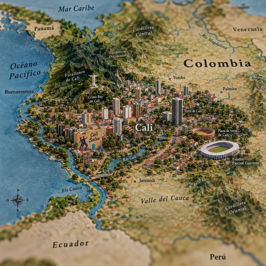
Isometric Miniature Map of Cali
عرض المطالبة كاملة ونسخها

Create a highly detailed, isometric 3D miniature map illustration of the city of Cali, Colombia. The style should resemble a realistic diorama or clay model with soft lighting and vibrant colors. The central focus is the dense urban sprawl of Cali, featuring numerous skyscrapers, residential blocks, and lush green palm trees interspersed throughout the city. Key landmarks must be clearly visible and labeled in Spanish: - **Cristo Rey de Cali**: A statue of Christ standing atop the hills to the northwest (Farallones de Cali). - **Torre de Cali**: A prominent modern skyscraper in the city center. - **Plaza de toros de Cali**: A circular bullring structure on the east side. - **Estadio Pascual Guerrero**: A large white oval stadium on the southeast side. - **Río Cali**: A river winding through the city. Surrounding geographical features include the 'Mar Caribe' at the top, 'Océano Pacífico' on the left, and neighboring countries like 'Panamá', 'Venezuela', 'Ecuador', and 'Perú' in the background. Mountain ranges are labeled 'Cordillera Occidental' and 'Cordillera Central'. Include smaller towns like 'Buenaventura', 'Yumbo', 'Palmira', and 'Jamundí'. Add a compass rose in the bottom-left corner. The text labels should be elegant serif fonts, integrated naturally into the terrain.

إنشاء صورة
GPT Image 2.5
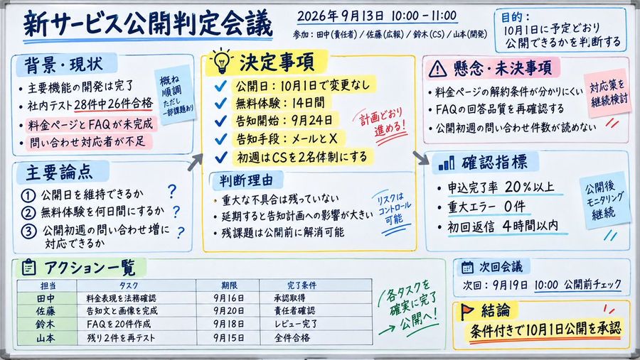
Japanese Whiteboard Meeting Minutes
عرض المطالبة كاملة ونسخها

Goal: Create a realistic photo of a whiteboard filled with handwritten Japanese meeting minutes for a new service launch decision. Canvas: Horizontal aspect ratio, bright lighting, clean white surface. Layout: Structured into distinct sections using colored boxes (blue, yellow, pink) and arrows to show flow. Top header contains the title and date/time info. Text content: Preserve all Japanese text exactly as shown in the image. Subject details: - Header: Title '新サービス公開判定会議' (New Service Launch Decision Meeting). Date '2026年9月13日 10:00 - 11:00'. Attendees listed below. - Purpose Box (Top Right): Blue box labeled '目的' (Purpose) stating '10月1日に予定どおり公開できるかを判断する' (Decide if we can launch on Oct 1st as planned). - Background Section (Left): Blue box '背景・現状' (Background/Current Status). Bullet points about development completion, test results (28 tests, 26 passed), and unfinished pricing page/FAQ. Sticky note overlay: '概ね順調 ただし一部課題あり' (Generally smooth but some issues). - Decisions Section (Center): Yellow box '決定事項' (Decided Matters). Checklist items: Launch date Oct 1st, Free trial 14 days, Notification start Sept 24th, Channels Email/X, Support team size. Red stamp overlay: '計画どおり進める!' (Proceed as planned!). - Concerns Section (Right): Pink box '懸念・未決事項' (Concerns/Pending Items). Points about unclear cancellation terms, FAQ quality, and unknown inquiry volume. Sticky note overlay: '対応策を継続検討' (Continue considering countermeasures). - Discussion Points (Bottom Left): Blue box '主要論点' (Main Discussion Points). Numbered list 1-3 regarding launch date maintenance, trial duration, and support capacity. - Judgment Reason (Center Bottom): Light blue box '判断理由' (Reason for Judgment). Points about no critical bugs, impact of delay, and resolving remaining tasks before launch. Handwritten note: 'リスクはコントロール可能' (Risk is controllable). - Metrics (Right Middle): Blue box '確認指標' (Confirmation Metrics). Stats: Application completion rate >20%, Critical errors 0, First reply <4 hours. Sticky note: '公開後モニタリング継続' (Continue monitoring after launch). - Action List (Bottom Left Table): Green box 'アクション一覧' (Action List). Table columns: Person (Tanaka, Sato, Suzuki, Yamamoto), Task, Deadline, Completion Condition. Handwritten arrow pointing to table: '各タスクを確実に完了 → 公開へ!' (Ensure each task is completed -> Launch!). - Next Meeting & Conclusion (Bottom Right): Blue box '次回会議' (Next Meeting) date Sept 19th. Yellow box '結論' (Conclusion) with flag icon: '条件付きで10月1日公開を承認' (Approve Oct 1st launch with conditions). Visual style: Professional office setting, clear handwriting, use of highlighters (yellow, blue, pink) for emphasis.

إنشاء صورة
Nano Banana Pro
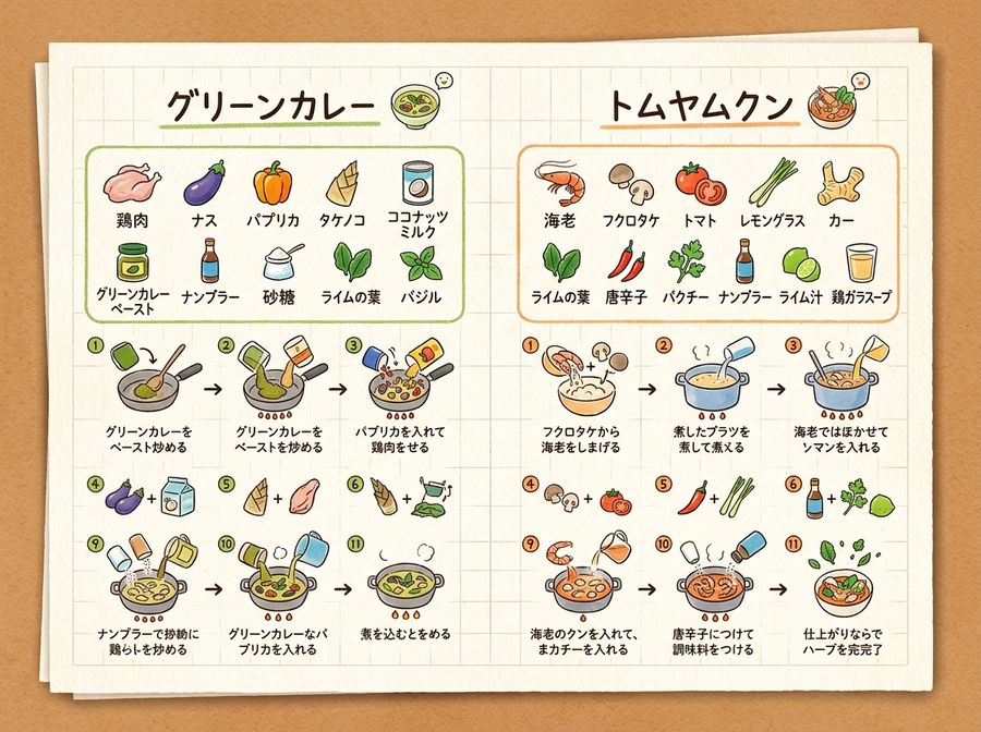
Handwritten Memo Recipe Illustration
عرض المطالبة كاملة ونسخها

[Input Data] - Dish Name (Left Page): Green Curry - Ingredients List (Left Page): {ingredientsLeft} - Cooking Steps (Left Page): ①{stepLeft1} → ②{stepLeft2} → ③{stepLeft3} - Dish Name (Right Page): Tom Yum Goong - Ingredients List (Right Page): {ingredientsRight} - Cooking Steps (Right Page): ①{stepRight1} → ②{stepRight2} → ③{stepRight3} - Color Theme: organic natural colors [Structure and Layout Specifications] - Style: A flat 2D handwritten-style infographic recipe illustration drawn on a piece of rustic off-white notepad paper (grid paper) with thin grid lines and warm paper texture. - Background and Composition Constraints: Do not draw physical books, three-dimensional notebook outlines, page thickness, shadows, or realistic photo background elements like wooden tables (Absolutely NO wooden table, NO realistic book mockup, NO book thickness, NO notebook pages, NO realistic photo background. It must be a flat 2D vector layout directly on the textured grid notepad paper canvas). - Left Side Layout: - Large handwritten Japanese title "{dishLeft}" at the top. - Below that, the ingredient list "{ingredientsLeft}" drawn with neat vertical bullet points in handwritten Japanese and simple food illustrations. - The lower half features cooking steps "①{stepLeft1} → ②{stepLeft2} → ③{stepLeft3}" arranged in a horizontal or vertical arrow flow. Include cute hand-drawn illustrations that match each step's content (e.g., cutting, stir-frying, simmering). - A delicious-looking illustration of the finished "{dishLeft}" dish in the bottom left. - Right Side Layout: - Large handwritten Japanese title "{dishRight}" at the top. - Below that, the ingredient list "{ingredientsRight}" drawn in handwritten Japanese with simple food illustrations. - The lower half features cooking steps "①{stepRight1} → ②{stepRight2} → ③{stepRight3}" arranged in a horizontal or vertical arrow flow. Include cute hand-drawn illustrations matching each step's content. - A delicious-looking illustration of the finished "{dishRight}" dish in the bottom right. - Colors: A gentle, warm organic tone based on "{colorTheme}". [Quality and Exclusion Constraints (Mandatory)] - Absolutely no date-related elements like dates (e.g., "8/7"), days of the week (e.g., "SUN"), calendar frames, or date stamps (NO date stamp, NO calendar, NO day of the week, NO timeline stamp). - Fonts should be friendly handwritten-style Japanese (Gothic or rounded) accurately drawing the input Japanese without distortion or spelling errors. - Aspect Ratio: --ar 4:3

إنشاء صورة
Nano Banana Pro
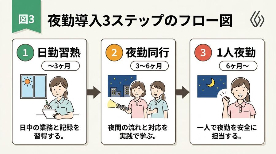
Handwritten Style 3-Step Process Slide
عرض المطالبة كاملة ونسخها

[Input Data] - Overall Title: 3-Step Flowchart for Night Shift Introduction - Step 1: Title "Day Shift Mastery" / Period "{step1Period}" / Description "{step1Desc}" - Step 2: Title "{step2Title}" / Period "{step2Period}" / Description "{step2Desc}" - Step 3: Title "{step3Title}" / Period "{step3Period}" / Description "{step3Desc}" - Color Theme: green [Structure and Layout Specifications] - Style: A clean and friendly 3-step flowchart illustration suitable for Japanese business slides, educational manuals, or internal documents. 16:9 landscape slide configuration. - Background: Clean off-white or solid white background. - Top Title: - Place "Figure 3" or a step badge in the upper left, and to its right, draw a large Japanese main title "{mainTitle}" in a bold, easy-to-read Gothic font. Place a small, clean abstract logo mark at the right edge. - Step Card Arrangement: - Three beautiful rectangular cards arranged side-by-side. Placed in order from left to right, connected by thick arrows. Each card border is color-coded neatly according to the color theme ({colorTheme}). - Card 1 (Left) Interior: - Draw a circular badge "1" and the Japanese title "{step1Title}" prominently. Below that, a capsule label saying "{step1Period}". - In the center, place an illustration of a Japanese woman with a gentle hand-drawn touch taking notes, and a window showing the sun. - At the bottom, place the Japanese description "{step1Desc}". - Card 2 (Center) Interior: - Draw a circular badge "2" and the Japanese title "{step2Title}" prominently. Below that, a capsule label saying "{step2Period}". - In the center, place an illustration of two Japanese women with a flashlight, night sky, and buildings. - At the bottom, place the Japanese description "{step2Desc}". - Card 3 (Right) Interior: - Draw a circular badge "3" and the Japanese title "{step3Title}" prominently. Below that, a capsule label saying "{step3Period}". - In the center, place an illustration of the night sky and crescent moon, and a Japanese woman smiling with a victory pose. - At the bottom, place the Japanese description "{step3Desc}". [Quality and Font Specifications] - Simple, clean 2D illustration, flat design, crisp clear line art. - All text must be accurately drawn in readable Japanese fonts (Gothic) without spelling errors. - Exclude all 3D effects, shadows, laptop mockup backgrounds, or camera tilt; display the flat diagram itself across the entire screen. - Aspect Ratio: --ar 16:9

إنشاء صورة
بواسطة @Talos
GPT Image 2.5
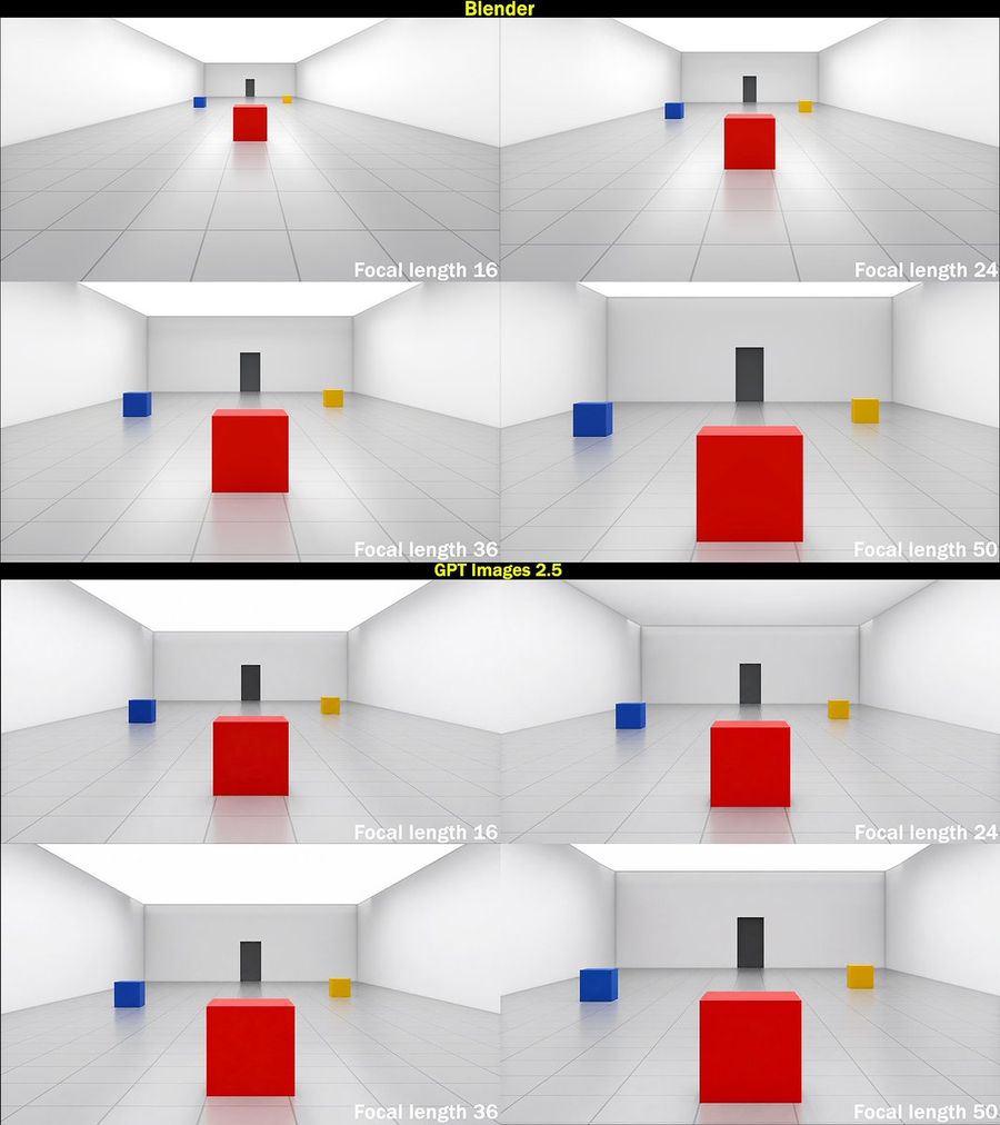
Focal Length Comparison Grid
عرض المطالبة كاملة ونسخها

Goal: Create a square technical comparison graphic showing how focal length changes perspective in a simple 3D room scene, comparing Blender renders against GPT Images 2.5 outputs. Canvas: Square image, approximately 1080 x 1080 px, with thin black outer border and two horizontal black title bars. The graphic contains exactly 8 rendered panels arranged as two stacked 2 x 2 grids. Layout: The upper half is labeled Blender in bold yellow text centered on a black bar at the very top. The lower half is labeled GPT Images 2.5 in bold yellow text centered on a black divider bar between the two grids. Each section contains exactly 4 panels: top-left focal length 16, top-right focal length 24, bottom-left focal length 36, bottom-right focal length 50. In every panel, place the focal-length label in bold white text at the lower-right corner: “Focal length 16”, “Focal length 24”, “Focal length 36”, and “Focal length 50”. Scene repeated in all panels: A clean minimalist 3D test room with white walls, white ceiling, glossy pale gray tiled floor with visible grid lines, and a rear wall with a centered dark gray vertical door or rectangular panel. Place exactly 3 colored cubes in the scene: 1 large glossy red cube in the foreground center, 1 small glossy blue cube to the mid-left, and 1 small glossy yellow cube to the mid-right. The cubes cast subtle soft reflections on the polished floor. Use symmetrical perspective lines converging toward the back wall. Panel-specific camera behavior: In the Blender section, make the focal length progression visually accurate: 16 mm appears very wide-angle with the red cube smaller and farther away, strong room expansion and visible side walls; 24 mm slightly less wide with the red cube larger; 36 mm more zoomed with the red cube prominent; 50 mm most zoomed with the red cube very large and the side cubes closer to the edges. In the GPT Images 2.5 section, show the same scene and same four labels, but make the 16 mm and 24 mm panels less wide than expected, with object scale changing only modestly across focal lengths; the 16 mm panel should not shrink the objects as much as the Blender 16 mm panel. Visual style: Clean synthetic 3D render, soft global illumination, high-key white room, subtle shadows and reflections, crisp tiled floor, no people, no extra objects, no watermark. Maintain exact count: 2 labeled sections, 8 panels, 4 focal-length labels per section, and 3 cubes per panel.

إنشاء صورة
بواسطة @Miles Ma
GPT Image 2.5
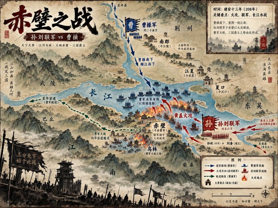
Battle of Red Cliffs Map
عرض المطالبة كاملة ونسخها

Goal: Create a richly detailed ancient Chinese ink-and-wash strategic visualization map of 赤壁之战, showing the Battle of Red Cliffs as a historical military map with painterly mountains, rivers, fleets, arrows, burning ships, labeled cities, and parchment texture. Canvas: Horizontal 4:3 map poster, aged tan rice-paper background with darkened worn edges, decorative corner border ornaments, ink stains, faded seals, and a hand-painted Song/Ming dynasty atlas aesthetic. Use a slightly elevated bird’s-eye view with the Yangtze River as the dominant blue waterway cutting across the center. Main title area: Place a huge black-and-dark-red Chinese brush-calligraphy title in the upper left reading 赤壁之战. Beneath it, add a dark red banner subtitle reading 孙刘联军 vs 曹操. Add a small supporting line below in fine Chinese type: “天下大势 · 江河为战 · 火映赤壁 · 三国鼎立”. Map geography and labels: Show exactly 11 major geographic/place labels in Chinese across the map: 1) 武陵 on the left-central mountains, 2) 巴丘 lower left of the river, 3) 长江 written large on the central river, 4) 南郡(今江陵)upper center-right, 5) 荆州 upper right, 6) 江夏(今武昌)right of river, 7) 夏口(今汉口)far right river bend, 8) 东吴 far right, 9) 赤壁(今赤壁市)near the central fire battle, 10) 乌林(曹军大败之地)below Red Cliffs, 11) 柴桑 lower right. Include misty mountain ranges, watchtowers, walled towns, small villages, docks, and forested islands. Battle layout: Depict exactly 2 opposing forces. The northern/upper force is Cao Cao’s army, colored blue, with a blue vertical banner “曹” and a label “曹操军 约二十余万”; show blue infantry ranks and fleets moving south along the river. The southern/lower-right force is the Sun–Liu allied army, colored red, with a large red banner “孙” and label “孙刘联军 约五六万”; show red infantry ranks and warships launching the attack. Use dramatic red fire arrows and burning ships at the central river near Red Cliffs. Add the key action label “黄盖火攻” in red near the flames, and label the blue fleet formation “曹军水军布阵(以铁链连船)”. Movement arrows: Include exactly 4 arrow systems: 1) blue dashed arrows descending from the north labeled “曹操南下 顺江而下”, 2) red attack arrows curving from the southeast toward the burning fleet labeled “黄盖火攻”, 3) green dashed retreat arrows running west/southwest labeled “曹军大败 向华容道撤退” and “至华容道(曹军败退)”, 4) red reinforcement arrows from the far right labeled “来自江上游(孙刘联军会师)” and “至柴桑(朱吴后方)”. Inset information panel: In the upper right, add a parchment-framed rectangular inset with a small monochrome river battle illustration and exactly 4 Chinese text lines: 1) “时间:建安十三年(208年)”, 2) “关键看点:火攻、联军、长江水战”, 3) “曹操南下,意图一统江南;”, 4) “孙刘联手于赤壁以火攻破敌,曹军大败,三国鼎立之势由此形成。” Add a small red seal marked “三国”. Legend and scale: In the lower right, create a framed legend titled “图例” with exactly 6 legend items: 1) blue dashed arrow “进军路线(曹操军)”, 2) red arrow “火攻方向(孙刘联军)”, 3) green dashed arrow “败退路线(曹操军)”, 4) blue boat icon “曹操军战船”, 5) red boat icon “孙刘联军战船”, 6) flame icon “火攻地点”. Include a simple scale bar marked 0, 25, 50, 100 里 and a compass rose labeled 北. Foreground atmosphere: Along the bottom edge, add a dark silhouetted battlefield foreground with wooden watchtowers, banners, spears, soldiers, smoky mist, and a broken black war flag bearing the phrase “一分天下 始于此战”. Visual style: Classical Chinese shanshui map painting mixed with modern infographic clarity; sepia parchment, muted teal-blue river, black ink mountains, red and blue army color coding, delicate Chinese typography, dramatic but readable. Use dense historical detail but keep all labels legible and map symbols consistent. No photorealism, no modern objects, no watermark.

إنشاء صورة
GPT Image 2.5
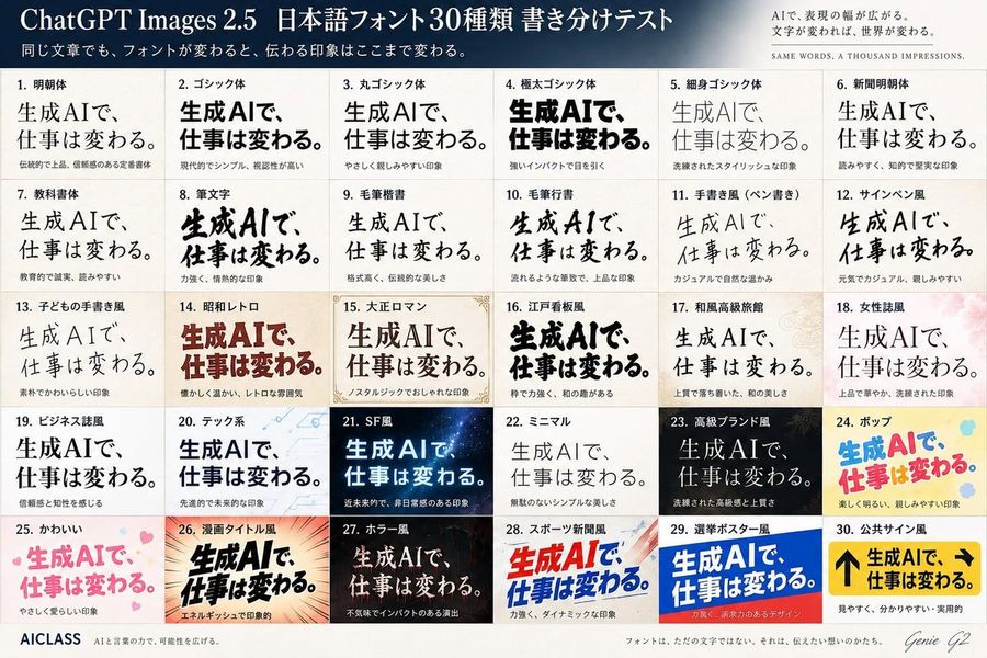
Japanese Font Comparison Poster
عرض المطالبة كاملة ونسخها

Goal: Create a polished Japanese typography comparison poster testing 30 different font styles for the same phrase, in a premium editorial infographic style for ChatGPT Images 2.5. Canvas: Landscape 3:2 poster, approximately 1200×800 px, ivory paper background with subtle texture, thin gray grid lines, high-resolution print layout. Header: A dark navy-to-slate gradient banner across the top. Large white serif title on the left: 「ChatGPT Images 2.5 日本語フォント30種類 書き分けテスト」. Smaller white subtitle underneath: 「同じ文章でも、フォントが変わると、伝わる印象はここまで変わる。」 On the upper right, add a small refined slogan block: 「AIで、表現の幅が広がる。文字が変われば、世界が変わる。」 and below it in tiny spaced English capitals: “SAME WORDS, A THOUSAND IMPRESSIONS.” Main layout: Below the header, create an exact 5-row by 6-column grid containing exactly 30 numbered font sample cards. Each card has a small bold Japanese label at the top, one large sample phrase in the specified font style, and a tiny Japanese impression note below. The repeated sample phrase must be 「生成AIで、仕事は変わる。」. Keep the phrase visually dominant in every cell while changing only typography, weight, color, texture, and decorative background according to the style. The 30 cards, in order from left to right, top to bottom: 1. 「明朝体」 elegant traditional Mincho serif, black, formal and trustworthy. 2. 「ゴシック体」 modern bold Gothic sans, black, simple and highly legible. 3. 「丸ゴシック体」 rounded Gothic, soft friendly black text. 4. 「極太ゴシック体」 very heavy extra-bold black Gothic, strong impact. 5. 「細身ゴシック体」 thin stylish Gothic, light gray-black, refined. 6. 「新聞明朝体」 newspaper-style Mincho, readable and intellectual. 7. 「教科書体」 textbook style, clean educational Japanese letterforms. 8. 「筆文字」 bold expressive brush calligraphy, energetic ink strokes. 9. 「毛筆楷書」 formal brush kaisho, traditional and dignified. 10. 「毛筆行書」 flowing semi-cursive brush script, elegant. 11. 「手書き風(ペン書き)」 casual pen handwriting, warm and natural. 12. 「サインペン風」 marker-pen handwriting, casual and cheerful. 13. 「子どもの手書き風」 childlike handwritten style, cute uneven strokes. 14. 「昭和レトロ」 warm retro Showa-era display type, deep red-brown, nostalgic. 15. 「大正ロマン」 Taisho romantic serif display, framed with delicate ornamental corner borders and beige paper. 16. 「江戸看板風」 Edo-period signboard style, thick black lively characters. 17. 「和風高級旅館」 refined Japanese luxury ryokan style, calm serif over pale patterned background. 18. 「女性誌風」 women’s magazine style, elegant thin serif over soft pink floral background. 19. 「ビジネス誌風」 business magazine style, serious black serif, trustworthy. 20. 「テック系」 tech style, blue-black sans over pale circuit-line background. 21. 「SF風」 science-fiction style, glowing cyan-white text on dark starry space background. 22. 「ミニマル」 minimalist thin sans/serif, lots of whitespace, quiet beauty. 23. 「高級ブランド風」 luxury brand style, white serif on black background with subtle gold accents. 24. 「ポップ」 playful pop style, bright blue and pink rounded letters on yellow with colorful dots. 25. 「かわいい」 cute pastel pink rounded letters with small hearts. 26. 「漫画タイトル風」 manga title style, bold black dynamic letters with speed lines and orange burst background. 27. 「ホラー風」 horror style, distressed pale text on dark red-black eerie background. 28. 「スポーツ新聞風」 sports newspaper style, bold red and blue italic headline with dynamic diagonal shapes. 29. 「選挙ポスター風」 election poster style, bold white text on blue and red campaign-poster blocks. 30. 「公共サイン風」 public sign style, yellow signboard with black arrows and heavy black text, practical and highly readable. Footer: A clean footer strip along the bottom. Left: “AICLASS” in bold dark type, followed by tiny Japanese tagline 「AIと言葉の力で、可能性を広げる。」 Center: small Japanese sentence 「フォントは、ただの文字ではない。それは、伝えたい想いのかたち。」 Right: handwritten signature-style text “Genie G2”. Visual style: Crisp Japanese typography specimen sheet, professional magazine design, accurate grid alignment, varied font rendering, subtle paper grain, balanced margins, no random extra panels. Use exactly 30 cards and keep every card numbered.

إنشاء صورة
بواسطة @OrcDev
GPT Image 2
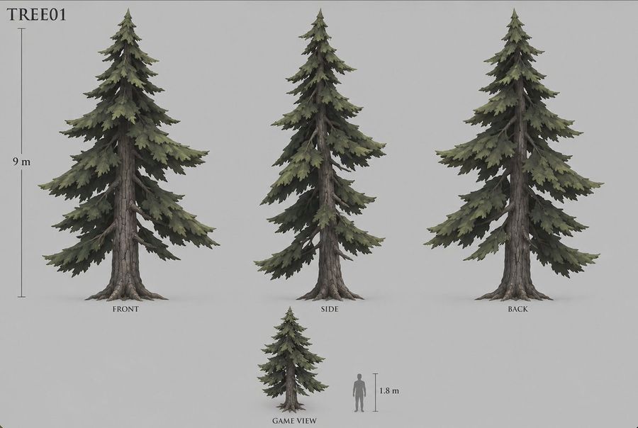
Stylized Pine Tree Game Asset Sheet
عرض المطالبة كاملة ونسخها

Goal: Create a clean game-asset concept sheet for a stylized conifer tree labeled TREE01, designed for conversion into a 3D model. Canvas: Wide horizontal concept-art sheet on a plain light gray background, soft studio lighting, no environment, no decorative border. Use muted natural colors and a painterly semi-realistic fantasy game style. Layout: Show exactly 4 tree depictions: 1 large front view on the left, 1 large side view in the center, 1 large back view on the right, and 1 smaller game-scale view near the bottom center. Add exactly 2 scale references: a vertical height ruler beside the large front tree labeled 9 m, and a gray human silhouette beside the small game view with a short vertical ruler labeled 1.8 m. Place view labels under the trees: FRONT, "SIDE", "BACK", and "GAME VIEW". Subject details: The tree is a tall spruce or fir with a rugged straight trunk, visible gray-brown cracked bark, exposed root flares at the base, and layered drooping branch tiers. The foliage is dense but irregular, made of jagged clustered needle masses in desaturated olive green, dark pine green, and shadowed charcoal green. The silhouette is triangular and natural, with a pointed crown, asymmetric branch lengths, some bare branch sections visible near the trunk, and broad lower boughs tapering upward. The side view should look narrower with overlapping branches, while the back view should reveal similar foliage massing and trunk structure from behind. The small game view should repeat the same tree design at reduced scale, next to the human silhouette for proportion. Typography and annotations: Put the asset code in the upper-left corner in a simple serif typeface, large and black. Use small black serif labels beneath each view. Rulers are thin dark gray vertical lines with small caps and understated measurement text. Constraints: Keep the sheet uncluttered and orthographic, with consistent scale among the three large views. Use exactly the 4 tree depictions and 2 scale references described, avoid extra plants, rocks, UI elements, textures, logos, watermarks, or background scenery.

إنشاء صورة
جارٍ تحميل مزيد من المطالبات

الأسئلة الشائعة

من أين تأتي مطالبات YouMind؟
تختار YouMind أمثلة عالية الجودة لمطالبات الذكاء الاصطناعي من مجتمعات المبدعين ومسارات العمل الإبداعية العامة. تركز المكتبة على المطالبات المفيدة للدراسة وإعادة الاستخدام والتعديل.
كيف تُنظم فئات مطالبات الصور؟
تُجمع مطالبات الصور حسب حالات الاستخدام والأنماط والموضوعات. تصف حالات الاستخدام المهمة المطلوبة، وتصف الأنماط المعالجة البصرية، بينما تحدد الموضوعات المحتوى الرئيسي للصورة.
كيف تُسند المطالبات إلى الفئات؟
تستخدم YouMind الذكاء الاصطناعي لتحليل كل مطالبة من نوع صورة وعنوانها وبياناتها الوصفية والنتيجة المنشأة عند توفرها، ثم تسندها إلى أقرب الفئات. ويمكن للمحررين تحسين الفئات مع تطور نظام التصنيف.
ما YouMind؟
YouMind مساحة عمل مدعومة بالذكاء الاصطناعي لتحويل الأبحاث والأفكار والمراجع الإبداعية إلى مخرجات قابلة للاستخدام. مكتبة المطالبات جزء عام من هذا المسار، وقد صُممت لمساعدة المبدعين على التعلم بسرعة من الأمثلة القوية.