인용구 카드

인용구 카드

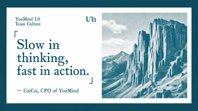
텍스트에서 레터프레스 인용 카드를 생성합니다. 다국어 지원.

설치 수
51
카테고리이미지
출처YouMind
YouMind Product Manager: 1.0, the choices we made

Labeling a product as 1.0 is more than just moving the version number forward one digit; it's a sense of confirmation: YouMind has finally come to fruition. So, taking this opportunity, I'd like to share some candid thoughts from a startup team's perspective on our recent product, team, and development.

The current state of survival for small teams

We recently did a cost breakdown, and the good news is that YouMind's overall investment and returns are currently in a very healthy state. However, we sometimes need to plan ahead, because the healthier the situation, the more important it is to carefully consider whether this health can continue.

Here's the situation: let's start by looking at the costs. We found that heavy users of YouMind were spending far more each month than we expected. On one hand, we're happy because the product is very popular with users and creates value for them. On the other hand, we're also considering how to gradually optimize the cost structure while maintaining quality.

Optimizing the cost structure is essentially about giving us more initiative in our future development. Offering trial services to new users is always a significant expense, and if these users don't pay, spread the word, or provide feedback, it represents a direct loss for us.

This isn't a complaint; it's the reality for most startups.

The AI ​​era has changed the economic models of many software products. The traditional approach of "building a large user base first and then monetizing" is becoming increasingly inapplicable. The reason is simple: every time an AI product interacts with another user and generates an image, it incurs costs. Often, it doesn't operate mechanically according to a program, but rather it consumes real money.

If a startup doesn't have very strong capital backing, then the "burn money first, then monetize" model is no longer reliable. We must find a healthy growth curve in the early stages.

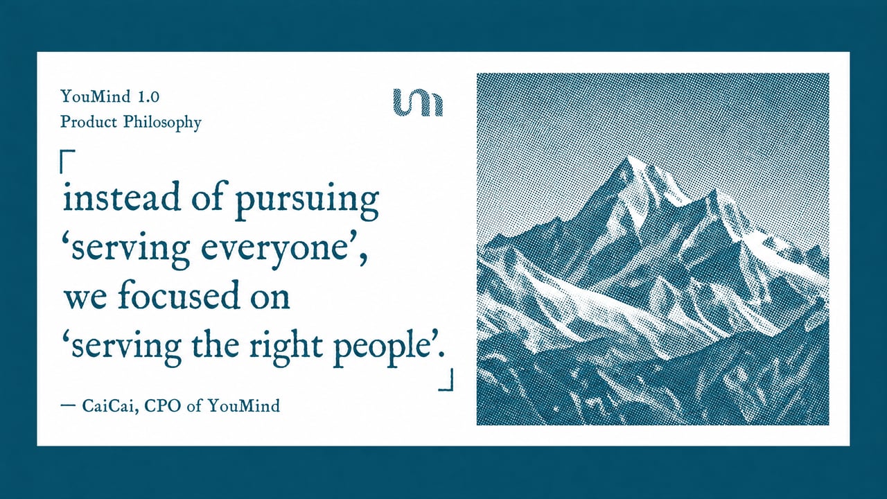
So we made a choice: instead of pursuing "serving everyone", we focused on "serving the right people".

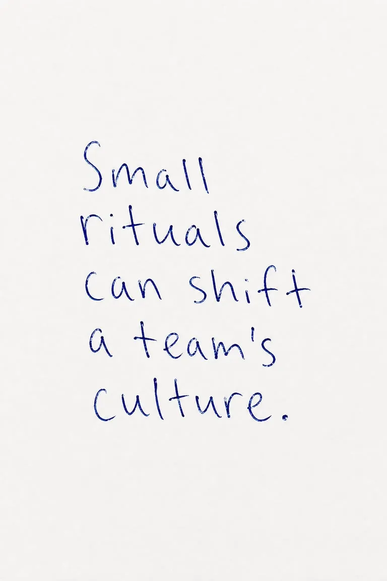
{"alt":"Quote Card: Serving the Right People","id":"imageId-68a9f005-6622-48e5-b63e-f6f88a78a1f9","width":1066,"height":600}

<EMPTY_PARAGRAPH>

If "serving the right people" is our choice on the user side, then on the product side, we face another kind of anxiety.It's not that I can't think of what to do, but rather that there are too many things I want to do and can do.

AI amplifies possibilities and improves everyone's output efficiency, making everyone eager to try new ideas, and innovation surges. However, for small teams, what is truly scarce is never ideas, but time.

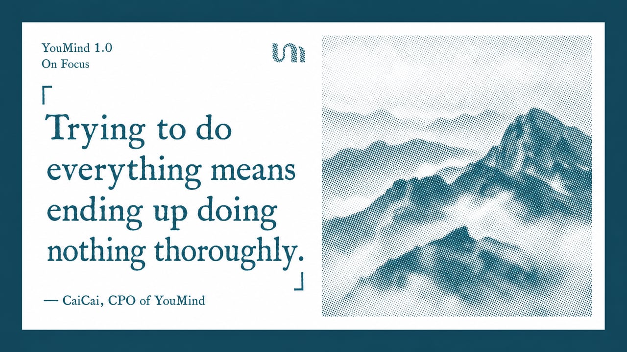
Trying to do everything means ending up doing nothing thoroughly.

{"alt":"Quote Card: Doing Nothing Thoroughly","id":"imageId-28ae376b-f655-40e8-a1f7-036473ae782e","width":1066,"height":600}

So when making choices, one topic we have to discuss is how to ensure we're still on the right track.

In a world of infinite possibilities, hold fast to the main storyline.

Over the past month, we've experimented with some new iteration methods, dividing R&D into several groups that can independently advance their tasks and directions. The experiments have yielded some benefits, but have also exposed some iteration-related issues.

Trying multiple groups has the most direct impact of multiple breakthroughs, which seems to speed up the iteration process. However, people will gradually forget our main focus and core principles because they are often more interested in trying new things than anything else.

The most fascinating, yet also the most dangerous, aspect of the AI ​​era is that every path seems correct, and every idea could become the next opportunity. We often cling to the hope that "it might just work out." But the problem is, most ideas don't actually lead to anything. Small teams also don't have the resources to gamble. Resources are finite; no matter how many agents you deploy, individual bandwidth is ultimately limited. If you can't even think through the intricacies of a single issue, scaling up the process is meaningless.

설명

이 스킬을 추천하는 이유

텍스트와 기사를 우아한 레터프레스 명언 카드로 변환합니다. 독특한 빈티지 미학은 하프톤 산 풍경과 전문적인 다국어 타이포그래피를 결합하여 가장 영향력 있는 통찰력을 위한 세련된 인쇄 품질의 비주얼을 만들어냅니다.

좋아하는 인용구와 통찰력 있는 구절을 아름답게 제작된 레터프레스 스타일 카드로 변환하세요. 이 스킬은 제공한 기사 텍스트, 웹 페이지 URL 또는 문서에서 '황금 인용구'를 추출한 다음, 빈티지 인쇄 미학을 지닌 일련의 우아한 가로형 인용 카드를 생성하는 데 특화되어 있습니다. 각 카드는 순수한 흰색 배경을 가지며, 선택한 인용구를 왼쪽에 배치하고 잉크 누락과 고르지 않은 획과 같은 정통 레터프레스의 불완전함으로 렌더링합니다. 오른쪽에는 안개 낀 산등성이부터 눈 덮인 봉우리까지 다양한 독특한 하프톤 풍경 사진이 자연의 평온함을 더하며, 전체적으로 세련된 액센트 색상으로 물들여집니다. 긴 보고서에서 지혜를 정리하거나 온라인 기사에서 핵심 내용을 강조하든, 이 도구는 모든 카드가 일관되고 정제된 디자인을 유지하도록 보장합니다. 생성된 각 인용 카드를 문서 또는 새로 만든 기사의 원래 맥락에 다시 배치하여, 시대를 초월한 시각적 매력으로 깊은 아이디어를 쉽게 공유하거나 다시 볼 수 있게 합니다.

관련 스킬

전체 보기
이미지

小小东 x 실크스크린 x 판화 x P086

Panel 086은 화면을 성립시키는 시각 정보 3–5개만 남기고, 실루엣·기하학적 형태·간결한 색면으로 주제를 재구성합니다. 그런 다음 사진에서 가져온 2–4가지 별색과 dry-brush, brayer texture, dragged ink, broken ink, uneven coverage를 활용해 중세 모더니즘 실크스크린 판화를 완성합니다. 구성은 언제나 명확한 초점 하나, 주요 방향 하나, 의미 있는 여백을 추구합니다. 이런 경우에 적합합니다 사진에 더 명확한 시각적 질서를 부여하고 싶을 때: 핵심 시각 정보 3–5개만 남기고 실루엣·기하학적 형태·색면으로 분명한 초점을 만듭니다. 실제 판화의 질감을 원할 때: 드라이 브러시, 롤러 잉크, 가로 방향 잉크 끌기, 잉크 날림, 끊긴 잉크와 고르지 않은 잉크 커버리지를 화면의 언어로 활용합니다. 색감은 선명하지만 절제되기를 원할 때: 원본의 가장 생생한 색 관계를 2–4가지 별색으로 압축하고, 종이 바탕과 여백이 구성에 실질적으로 참여하도록 합니다. 유연한 결과물이 필요할 때: 상하형, 좌우형, 순수 디자인, 다양한 비율과 사방형 벽지를 지원하며 이미지 디렉터리도 일괄 처리할 수 있습니다.

1200
이미지

小小东 x 선묘 x 점묘 x P084

Panel 084는 검은색 또는 짙은 색의 가는 선으로 주제, 건축물, 도로와 공간의 관계를 정리하고, 세로선·가로선·꺾은선·곡선과 원근 유도선으로 기하학적 골격을 세웁니다. 그런 다음 stippling/dotted texture의 밀도 변화를 활용해 하늘, 지면, 원경, 나뭇가지 그림자, 조명과 주제 주변의 공기감과 깊이감을 표현합니다. 복잡한 배경은 과감히 덜어내고, 선명한 초점과 넓은 여백, 그리고 출처가 분명한 소량의 강조색만 남깁니다. 이런 경우에 적합합니다 도시, 건축물과 공간의 관계를 분명하게 보여주고 싶을 때: 기하학적인 가는 선, 원근 유도선과 핵심 윤곽선으로 도로, 건축물과 장면의 구조를 정리합니다. 텍스처를 가득 채우지 않고 공기감, 빛과 원근감을 표현하고 싶을 때: stippling/dotted texture의 밀도 변화를 통해 차분한 깊이감을 만듭니다. 절제된 제한 색상을 선호할 때: 청회색, 미색과 따뜻한 흰색을 중심으로 사용하고, 원본 이미지에서 가져온 소량의 spot color만 초점을 밝혀 줍니다. 유연한 결과물 전달이 필요할 때: 상하·좌우·순수 디자인·다양한 비율·4방향 배경화면을 지원하며, 이미지 폴더도 일괄 처리할 수 있습니다.

0200
이미지

小小东 x 낙서 x 서투름 x P083

Panel 083은 먼저 사진을 다시 판단해 가장 기억할 만한 주체 하나와 필요한 환경 암시를 최대 한두 개만 남깁니다. 그런 다음 특정 비율, 동작, 표정 또는 구조를 의도적으로 비틀고 서툴고 조금은 우스꽝스럽게 그립니다. 떨리는 윤곽선, 일부러 어긋난 비율, 거친 크레용 터치와 여백이 어우러져 Ugly-cute naïve doodle을 만듭니다. 주체의 정체성은 정확해야 하며, 유머는 임의로 덧붙이는 것이 아니라 원본 이미지에서 나와야 합니다. 이런 경우에 적합합니다 사진 속에서 확대할 만한 성격의 순간이 있을 때: 동작, 표정, 비율 또는 대비에서 유머를 찾아내며, 기계적으로 선화로 변환하지 않습니다. 못생겼지만 귀여운 느낌을 원하지만 값싼 귀여움은 피하고 싶을 때: 일부러 비틀고 서툴고 약간 우스꽝스럽게 그리면서도 주체를 한눈에 알아볼 수 있게 합니다. 복잡한 장면을 간결하고 정확하게 만들고 싶을 때: 주체 하나와 필요한 환경 암시를 최대 한두 개만 남기고, 거친 채색과 넓은 여백으로 기억에 남는 요소를 강조합니다. 유연한 결과물이 필요할 때: 상하형, 좌우형, 순수 디자인, 다양한 비율과 4단말 배경화면을 지원하며, 이미지 폴더를 일괄 처리할 수도 있습니다.

0200

다음으로 즐겨 쓸 스킬을 찾아보세요

연구, 창작, 일상 업무에 유용한 엄선된 AI 스킬을 더 탐색해 보세요.

모든 스킬 탐색