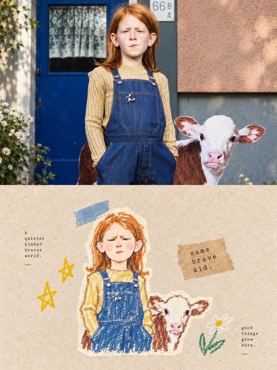
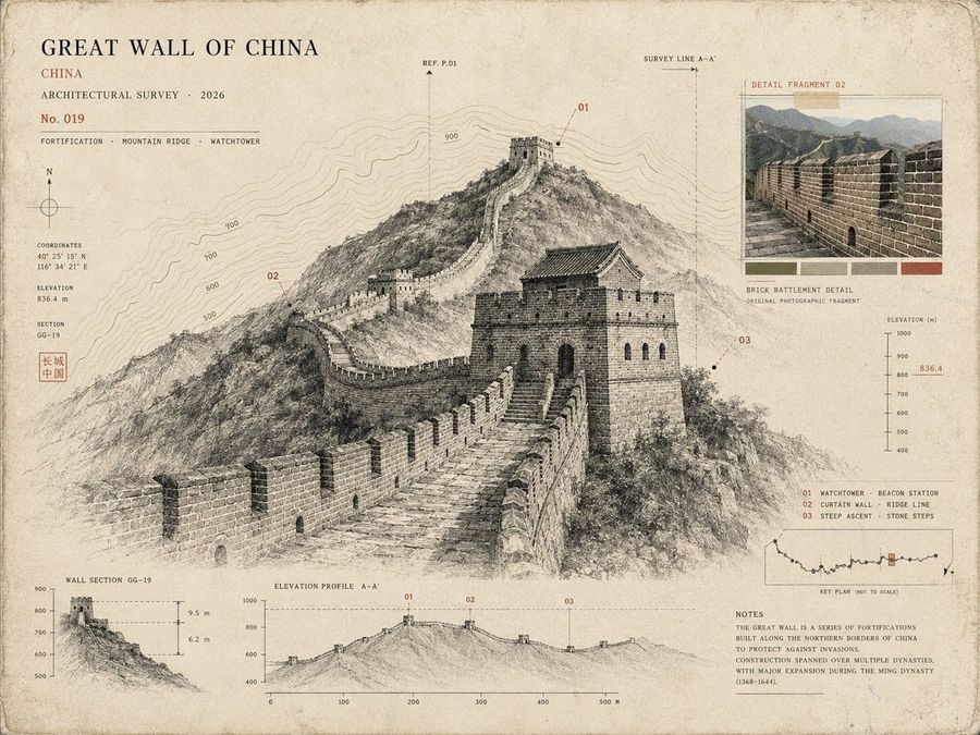
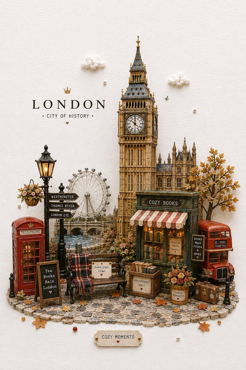
A comprehensive prompt for creating high-end healing aesthetic posters in a vintage crayon and pastel drawing style, featuring a unique split-screen layout that transforms photos into art.
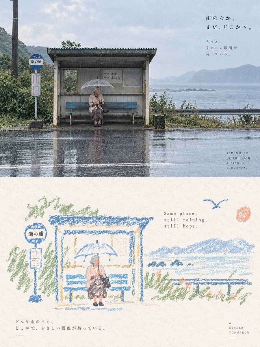
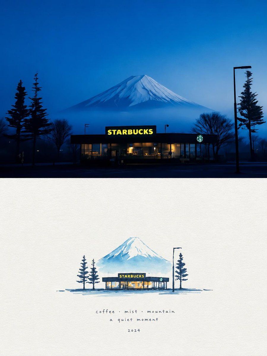
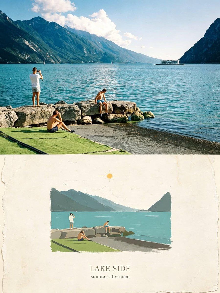
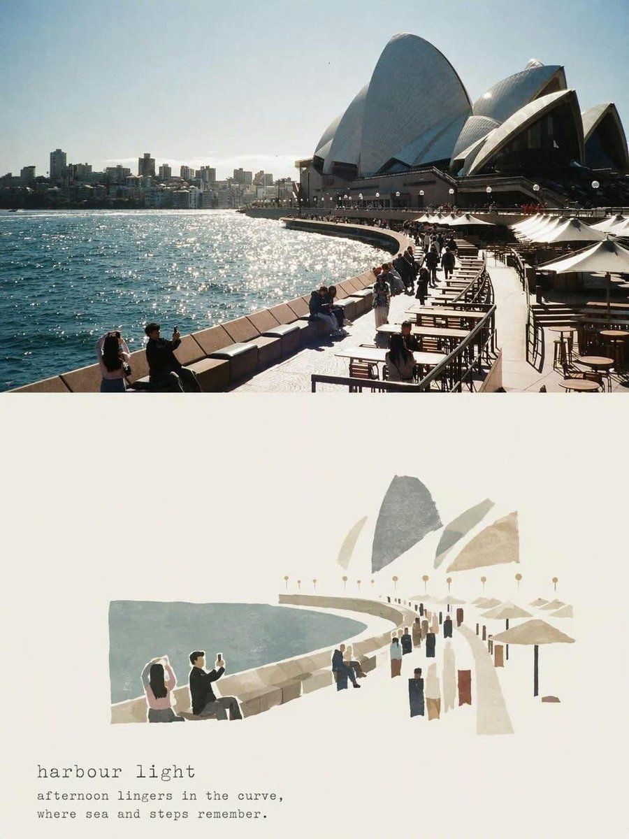
Please turn each photo I uploaded into an independent high-end design poster, no multi-image stitching, each photo output individually. The overall composition uses a 3:4 vertical composition, with the upper and lower areas strictly 1:1, each occupying 50% of the screen.
The upper part preserves the original photo, maintaining the subject's identity, structure, posture, authentic texture, natural lighting, and original color atmosphere, with only slight professional color grading to give it the quality of an art magazine, independent publication, or exhibition image. The environment background can be naturally extended to fit the frame, but the subject must not be stretched, distorted, or changed.
The lower part first understands the **core theme, subject relationship, structural trends, emotions, and visual metaphors** of the original photo, and then reconstructs it as a **vintage paper texture pastel crayon graffiti illustration**. Do not copy every object from the photo, nor completely redraw all content. Only retain the outlines, postures, directions, and visual memory points that best represent the original. Through deletion, generalization, slight exaggeration, and reorganization, make people immediately feel the correspondence between it and the photo above.
The subject uses **coarse-grained chalk / crayon-style hand-drawn outlines**: lines are slightly thick, loose, dry, with powder particles, intermittent color loss, slight shaking, and incomplete closed edges, with naturally rounded tips. Only a very small amount of pastel color blocks, simple grids, stripes, dots, or random smears are added inside the subject, using minimal information to suggest structure, without realistic volume or complete details.
The surrounding small elements use the **same line language** as the subject, but are further compressed into graffiti symbols identifiable in one or a few strokes. Stars, flowers, plants, artifacts, environmental clues, or abstract symbols should be simple, naive, open, and not completely closed, mainly single-line outlines with very little coloring. Do not draw them as exquisite icons, stickers, or independent small illustrations.
The composition maintains the relationship between **small scale stamps and large areas of white space**, freely arranged according to the subject's own direction, proportion, and visual center of gravity, which can be eccentric, edge-aligned, suspended, or partially cropped. The subject and a very small number of graffiti symbols form a loose but clear visual community, and the remaining space is actively left empty. **White space itself is the main compositional element**, forming a sense of breathing, distance, and pause through the relationship between empty and solid, gathered and scattered, large contrast, and asymmetry; better to draw less than to fill it up.
The background must use an **extremely light, bright, clean paper base color**, such as cream white, ivory white, light beige, pale apricot white, very light gray-white, or a near-white paper color intelligently matched based on the original image's overall color temperature. The paper only retains very slight fibers and particles, and must not be brownish, yellowish, grayish, or look old. **The background brightness must be significantly higher than the subject lines and color blocks to ensure that all crayon outlines, small symbols, and text are clearly visible and do not blur with the background.**
The color palette is extracted from the 2–4 most vivid, approachable, and representative colors from the upper photo, converted into bright and soft pastel crayon colors. This can naturally form light colors such as peach pink, apricot orange, cream yellow, mint green, sky blue, and light purple; the subject lines prioritize using coral pink, soft blue, cyan, warm orange, light purple, or cream dark tones that are clearer than the background, and small elements only sporadically repeat these colors to form an echo. The overall relationship maintains a contrast of **light background + clear colored lines + a small amount of soft color blocks**, which is bright, healing, relaxed, and has a sense of life. Avoid dark, dirty brown, dull Morandi, low contrast, fluorescent colors, and cheap candy feeling.
A small amount of text is involved, with no language restrictions. Short sentences or text fragments can be freely extracted from the subject, action, emotion, memory, or metaphor, using a **thin, sparse, typing layout font with slight uneven spacing and old-fashioned mechanical printing errors**, and the color uses a clear but not dazzling gray-brown, soft black, deep blue-gray, or a dark color echoing the subject, ensuring sufficient readability on the light paper surface. The text is naturally scattered in the white space area, mixed with the subject and graffiti, without fixed title templates.
The overall presentation is a high-end healing visual composed of **extremely light paper, coarse-grained crayon outlines, a small amount of pastel coloring, minimalist graffiti symbols, small-scale subjects, and a large amount of artistic white space**. The key is to make the subject and small elements float clearly on the light-colored paper, while maintaining a loose, naive, gentle, and mature editorial composition awareness. Avoid dark kraft paper, dark brown backgrounds, low-contrast lines, blurring background and subject, fine strokes, realistic redrawing, complex small icons, filling the background, smooth vectors, 3D feeling, and commercial template feeling.