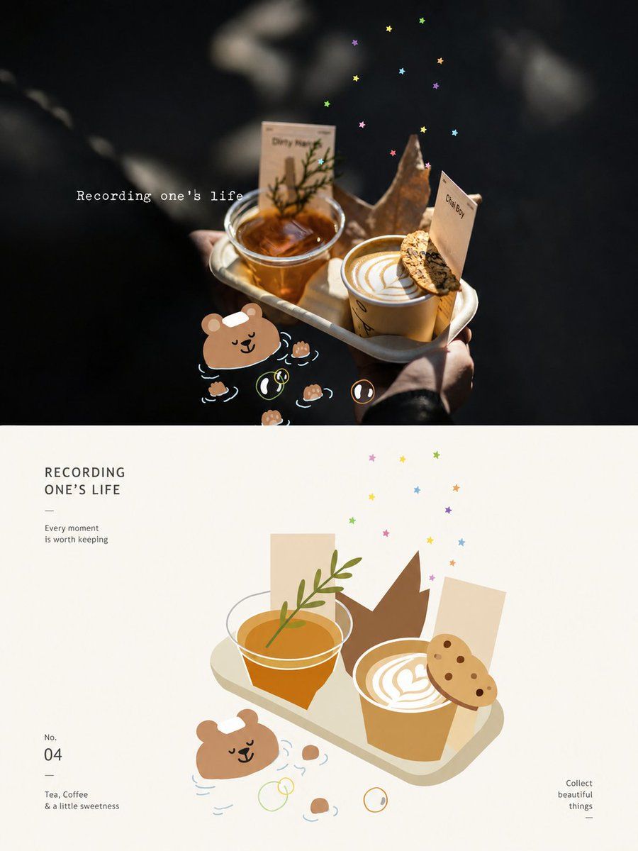
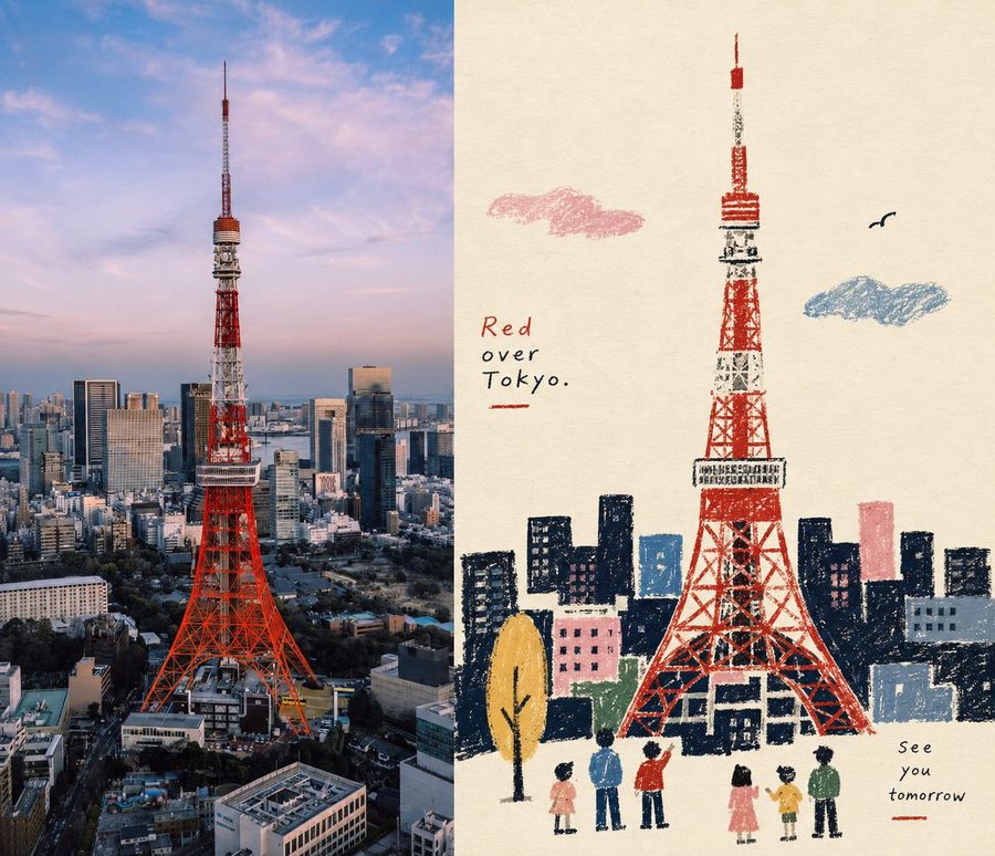
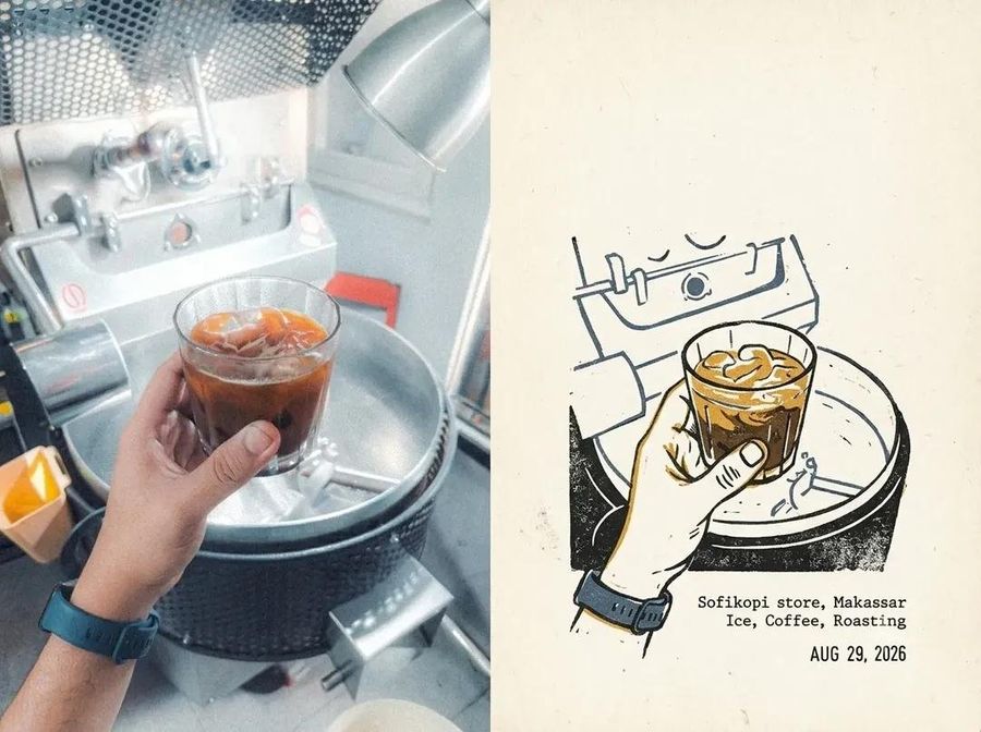
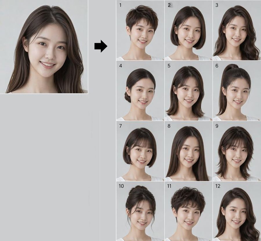
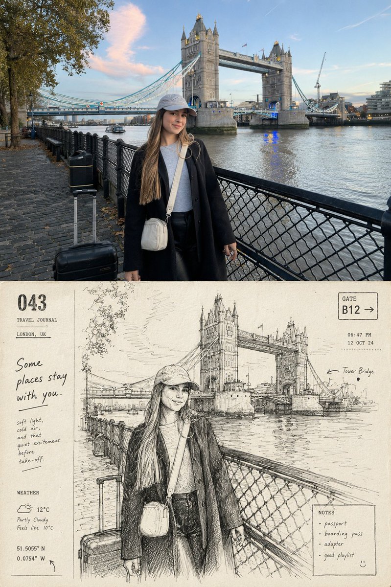
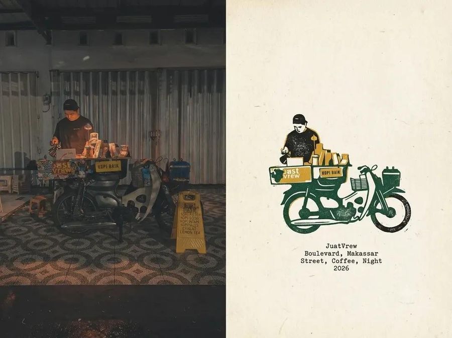
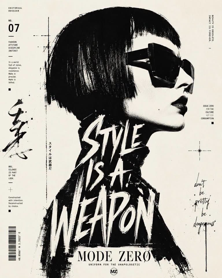
A prompt for creating minimalist, geometric posters by reconstructing uploaded photos into flat-style art with a 50/50 split layout.
Please turn each photo I upload into an independent high-end design poster, not a multi-image collage, with each photo output individually. The overall composition adopts a 3:4 vertical layout, with the upper and lower regions strictly 1:1 in height, each occupying 50% of the frame. The upper part retains the original photo, maintaining the subject's identity, structure, posture, realistic texture, natural lighting, and original color atmosphere, with only slight high-end color grading to give it the texture of art magazines, independent publications, and exhibition images. To adapt to the aspect ratio, the environment background can be naturally extended, but the subject must not be stretched, distorted, or changed. The lower part extracts the most recognizable **subject, silhouette, structure, posture, and narrative relationship** of the photo's subject, retaining only the most memorable core image and silhouette, and reconstructing it into a **geometric and flattened** artistic expression. Do not use realistic illustrations or copy original image details; instead, use simple geometric shapes, flat color blocks, clear outlines, fine lines, and negative space to compress complex information into a few key visual elements. The core identifying features of the original object must be preserved so people can recognize it at a glance as being from the same image above. The composition of the lower part should be more professional, emphasizing **layout order, visual center of gravity, primary and secondary hierarchy, positive and negative space relationships, rhythm of negative space, and balance between text and graphics**. The subject can remain centered or slightly offset, but the overall look must be balanced, restrained, and quiet, avoiding complex accumulation. Use off-white or a very light color intelligently matched with the original image for the background, retaining large areas of negative space, allowing the subject to be placed in a clean, rational layout like a refined memory specimen. The color palette is extracted from the brightest, most vivid, and most energetic colors in the photo above and reorganized, transformed into a clearer, softer, and more healing **humanistic healing style** color temperament. Improve overall brightness and color purity, establishing an atmosphere with a light, clean, and warm comprehensive color relationship; color blocks are distinct but not harsh, providing a soft, fresh, quiet, yet energetic visual experience. Avoid gray/dirty, dull, old, heavy, fluorescent colors, and a cheap candy-like feel. A small amount of text can be involved, adding concise titles, numbers, or micro-annotations, forming a natural layout relationship with the subject and negative space. The overall text should be restrained, exquisite, and have an editorial feel, like small annotations in international design studios, architectural posters, art exhibition posters, or high-end brand visual systems, not overpowering the main subject but helping to establish a higher-level graphic and textual order. The overall style refers to international design studios, architectural posters, art exhibition posters, and high-end brand visual systems, presenting a **high-end, modern, elegant, restrained, geometric, flattened, and highly healing** visual effect. Avoid excessive filters, cheap plastic textures, cartoonish looks, strong computer-generated feel, templated effects, and meaningless decorations.